From 21 Steps to 1, Decreasing Time to Value When Onboarding
User Research
Experimentation
Process Mapping
Overview
We radically reimagined our onboarding experience, going from a 21-step guided flow to a lightweight behaviour-led model.
Extensive research and small front-end changes more than doubled both cloud integration rates and trial-to-paid conversion rates, establishing experimentation as a new norm across the product org.
Involvement

Lead designer and researcher

~2 month from initial A/B test

Figma, Dovetail and Posthog
Impact
+25%
First Targets added by trial users
+138%
Cloud Integrations added by trial users
+177%
Trial-to-Paid Conversion (3.25% → 9%)
Challenge
Shortly before I joined, Intruder had just launched a new onboarding flow, it was rigid and assumption-based, with no post-release validation.
Only 3% of users converted, with most dropping off before step two. Success was measured only by top-line outcomes, providing no insight into user behaviour or friction points.
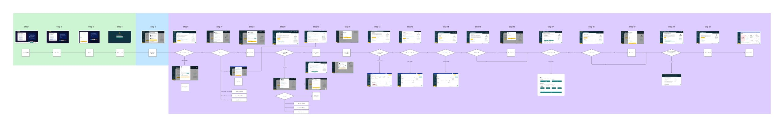
The onboarding flow we inherited was a 21 step process aimed at getting the customer to hit milestones correlated with conversion.
Approach
Research & Discovery
We began with a analytics deep-dive that revealed a 96% drop-off rate during onboarding. Session recordings added to this by showing that users wanted to skip ahead and explore directly, rather than being forced through each step.
Competitor analysis confirmed our suspicions, their flows were far shorter and more flexible, while ours dragged on with 21 rigid steps. Finally, both customer interviews and stakeholder feedback reinforced the same message: the onboarding experience was obstructive.
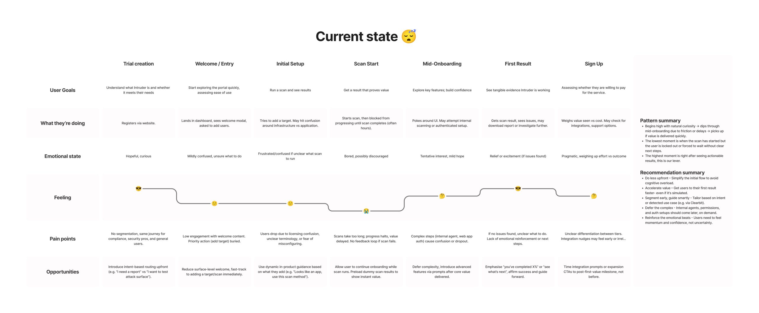
We used a mixture of quantitative and qualitative research methods to pull together a user journey map of the existing experience.
Building Organisational Buy-In
Given the high drop-off rate, I proposed removing onboarding entirely for a test group. Leadership initially resisted due to perceived risk and sunk cost. Despite this over 12 months, I built cross-departmental consensus to run the A/B test.
Solution and Results
A/B Test Design
To validate our findings, we designed an A/B test.
- Control group experienced the existing 21-step onboarding flow, the same rigid journey we knew was causing high drop-off.
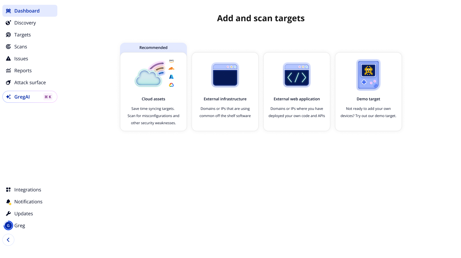
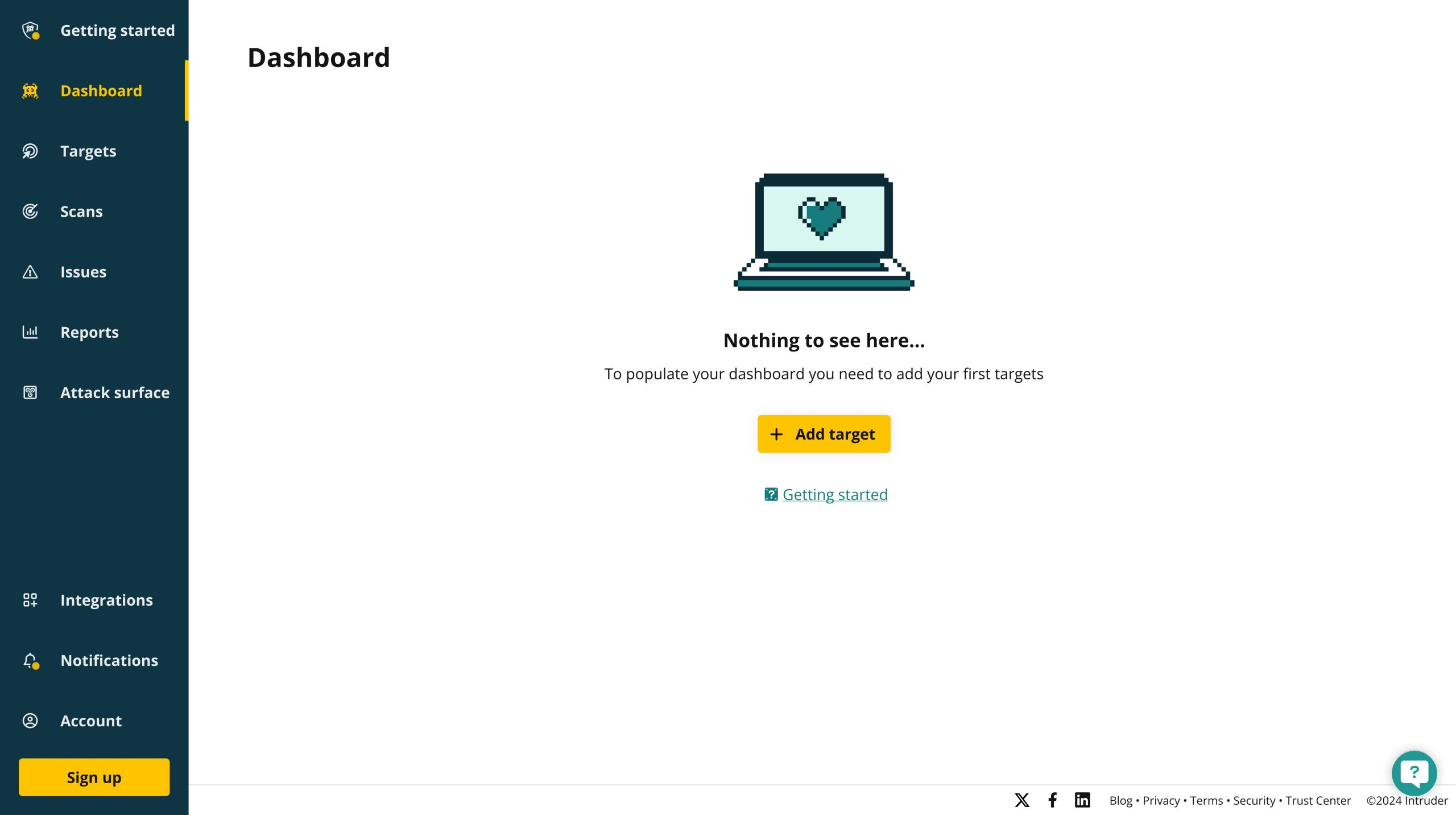
- Test group had onboarding disabled entirely. Instead, they were dropped directly into the product’s empty state, which simply prompted them toward the first key action: Add a target.
This test isolated the effect of removing friction altogether, allowing us to compare whether users made faster progress—and with less drop-off—when guided by a minimal entry point rather than a lengthy prescribed flow.
Impact
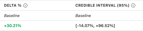
30% immediate increase in conversion, followed by iterative improvements that ultimately increased conversion from 3% to 9.5% - a 177% improvement.
This validated that reducing friction, not adding structure, drove better outcomes. We immediately launched a lightweight redesign improving the empty state experience.
Key Design Shifts
We moved away from linear flows and toward contextual suggestions, so users get help only when they need it, not all at once upfront.
Instead of driving users toward step completion, we reframed onboarding around meaningful first actions, prioritising value delivery over box-ticking.
And where the old experience created immediate friction, we shifted to deferred complexity, introducing advanced features only after users had grasped the core value of the product.
The old empty state
The revised empty state
Follow-Up Experiments
Our research revealed that time to first report strongly predicted engagement, leading to the proposition of additional tests to capitalise on the gains here:
- Auto-adding user email domains as scan targets
- Introducing faster scan types for quicker results
- Previewing example reports during initial scans
- Increasing trial access to additional (premium) scanners
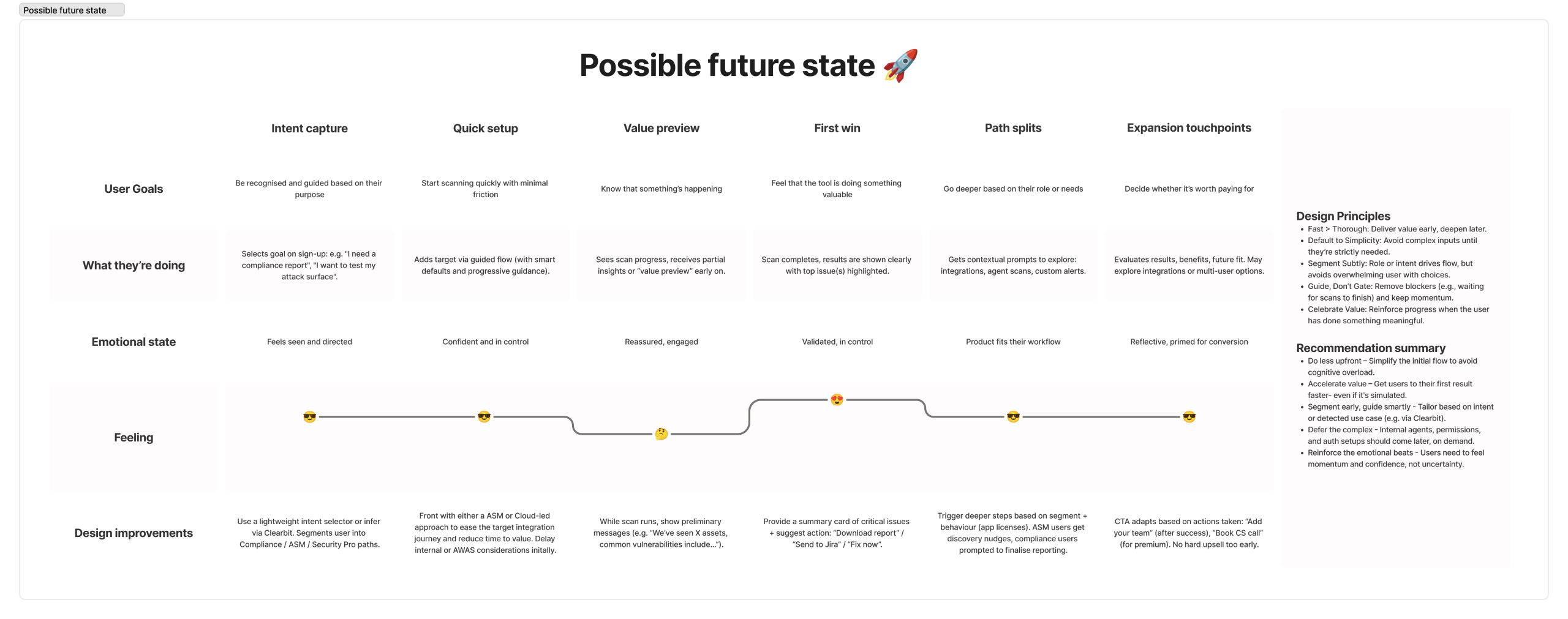
Taking onboard the findings of our first user journey map we revised it to highlight how the experience could change if we capitalised on the opportunities we identified.
Outcome
The complete redesign ultimately improved conversion from 3.25% to 9% - a 177% increase.
By June 2025, we achieved significant year-over-year gains across the onboarding funnel through cultural shift toward experimentation and evidence-based iteration.
Post-release evaluation became standard practice, establishing a foundation for scalable improvements and data-informed decision making.
Key Learnings
One of the biggest lessons was that less can be more, the strongest design decisions often come from knowing what to remove, not just what to add.
We also saw the power of putting data over opinions. User insights and metrics consistently led to better decisions than assumptions or internal debate.
Another takeaway was the importance of value over process. Onboarding should shorten the path to core value, rather than serving as a showcase of every feature.
Finally, we learned that culture change doesn’t always come from big launches. Even lightweight experiments can shift organisational mindset and open the door to new ways of thinking.
Interested in discussing this project?
From 21 Steps to 1, Decreasing Time to Value When Onboarding
User Research
Experimentation
Process Mapping
Overview
We radically reimagined our onboarding experience, going from a 21-step guided flow to a lightweight behaviour-led model.
Extensive research and small front-end changes more than doubled both cloud integration rates and trial-to-paid conversion rates, establishing experimentation as a new norm across the product org.
Involvement
Lead designer and researcher
~2 month from initial A/B test
Figma, Dovetail and Posthog
Impact
+25%
Improvement
+25%
Improvement
+25%
Improvement
Challenge
Shortly before I joined, Intruder had just launched a new onboarding flow, it was rigid and assumption-based, with no post-release validation.
Only 3% of users converted, with most dropping off before step two. Success was measured only by top-line outcomes, providing no insight into user behaviour or friction points.
The onboarding flow we inherited was a 21 step process aimed at getting the customer to hit milestones correlated with conversion.
Approach
Research & Discovery
We began with a analytics deep-dive that revealed a 96% drop-off rate during onboarding. Session recordings added to this by showing that users wanted to skip ahead and explore directly, rather than being forced through each step.
Competitor analysis confirmed our suspicions, their flows were far shorter and more flexible, while ours dragged on with 21 rigid steps. Finally, both customer interviews and stakeholder feedback reinforced the same message: the onboarding experience was obstructive.
We used a mixture of quantitative and qualitative research methods to pull together a user journey map of the existing experience.
Building Organisational Buy-In
Given the high drop-off rate, I proposed removing onboarding entirely for a test group. Leadership initially resisted due to perceived risk and sunk cost. Despite this over 12 months, I built cross-departmental consensus to run the A/B test.
Solution and Results
A/B Test Design
To validate our findings, we designed an A/B test.
- Control group experienced the existing 21-step onboarding flow, the same rigid journey we knew was causing high drop-off.
- Test group had onboarding disabled entirely. Instead, they were dropped directly into the product’s empty state, which simply prompted them toward the first key action: Add a target.
This test isolated the effect of removing friction altogether, allowing us to compare whether users made faster progress—and with less drop-off—when guided by a minimal entry point rather than a lengthy prescribed flow.
Impact
30% immediate increase in conversion, followed by iterative improvements that ultimately increased conversion from 3% to 9.5% - a 177% improvement.
This validated that reducing friction, not adding structure, drove better outcomes. We immediately launched a lightweight redesign improving the empty state experience.
Key Design Shifts
We moved away from linear flows and toward contextual suggestions, so users get help only when they need it, not all at once upfront.
Instead of driving users toward step completion, we reframed onboarding around meaningful first actions, prioritising value delivery over box-ticking.
And where the old experience created immediate friction, we shifted to deferred complexity, introducing advanced features only after users had grasped the core value of the product.
The old empty state
The revised empty state
Follow-Up Experiments
Our research revealed that time to first report strongly predicted engagement, leading to the proposition of additional tests to capitalise on the gains here:
- Auto-adding user email domains as scan targets
- Introducing faster scan types for quicker results
- Previewing example reports during initial scans
- Increasing trial access to additional (premium) scanners
Taking onboard the findings of our first user journey map we revised it to highlight how the experience could change if we capitalised on the opportunities we identified.
Outcome
The complete redesign ultimately improved conversion from 3.25% to 9% - a 177% increase.
By June 2025, we achieved significant year-over-year gains across the onboarding funnel through cultural shift toward experimentation and evidence-based iteration.
Post-release evaluation became standard practice, establishing a foundation for scalable improvements and data-informed decision making.
Key Learnings
One of the biggest lessons was that less can be more, the strongest design decisions often come from knowing what to remove, not just what to add.
We also saw the power of putting data over opinions. User insights and metrics consistently led to better decisions than assumptions or internal debate.
Another takeaway was the importance of value over process. Onboarding should shorten the path to core value, rather than serving as a showcase of every feature.
Finally, we learned that culture change doesn’t always come from big launches. Even lightweight experiments can shift organisational mindset and open the door to new ways of thinking.
Interested in discussing this project?
From 21 Steps to 1, Decreasing Time to Value When Onboarding
User Research
Experimentation
Process Mapping
Overview
We radically reimagined our onboarding experience, going from a 21-step guided flow to a lightweight behaviour-led model.
Extensive research and small front-end changes more than doubled both cloud integration rates and trial-to-paid conversion rates, establishing experimentation as a new norm across the product org.
Involvement
Lead designer and researcher
~2 month from initial A/B test
Figma, Dovetail and Posthog
Impact
+25%
First Targets added by trial users
+138%
Cloud Integrations added by trial users
+177%
Trial-to-Paid Conversion (3.25% → 9%)
Challenge
Shortly before I joined, Intruder had just launched a new onboarding flow, it was rigid and assumption-based, with no post-release validation.
Only 3% of users converted, with most dropping off before step two. Success was measured only by top-line outcomes, providing no insight into user behaviour or friction points.
The onboarding flow we inherited was a 21 step process aimed at getting the customer to hit milestones correlated with conversion.
Approach
Research & Discovery
We began with a analytics deep-dive that revealed a 96% drop-off rate during onboarding. Session recordings added to this by showing that users wanted to skip ahead and explore directly, rather than being forced through each step.
Competitor analysis confirmed our suspicions, their flows were far shorter and more flexible, while ours dragged on with 21 rigid steps. Finally, both customer interviews and stakeholder feedback reinforced the same message: the onboarding experience was obstructive.
We used a mixture of quantitative and qualitative research methods to pull together a user journey map of the existing experience.
Building Organisational Buy-In
Given the high drop-off rate, I proposed removing onboarding entirely for a test group. Leadership initially resisted due to perceived risk and sunk cost. Despite this over 12 months, I built cross-departmental consensus to run the A/B test.
Solution and Results
A/B Test Design
To validate our findings, we designed an A/B test.
- Control group experienced the existing 21-step onboarding flow, the same rigid journey we knew was causing high drop-off.
- Test group had onboarding disabled entirely. Instead, they were dropped directly into the product’s empty state, which simply prompted them toward the first key action: Add a target.
This test isolated the effect of removing friction altogether, allowing us to compare whether users made faster progress—and with less drop-off—when guided by a minimal entry point rather than a lengthy prescribed flow.
Impact
The result resulted in a 30% increase in conversion. This validated that reducing friction, not adding structure, drove better outcomes. We immediately launched a lightweight redesign improving the empty state experience.
Key Design Shifts
We moved away from linear flows and toward contextual suggestions, so users get help only when they need it, not all at once upfront.
Instead of driving users toward step completion, we reframed onboarding around meaningful first actions, prioritising value delivery over box-ticking.
And where the old experience created immediate friction, we shifted to deferred complexity, introducing advanced features only after users had grasped the core value of the product.
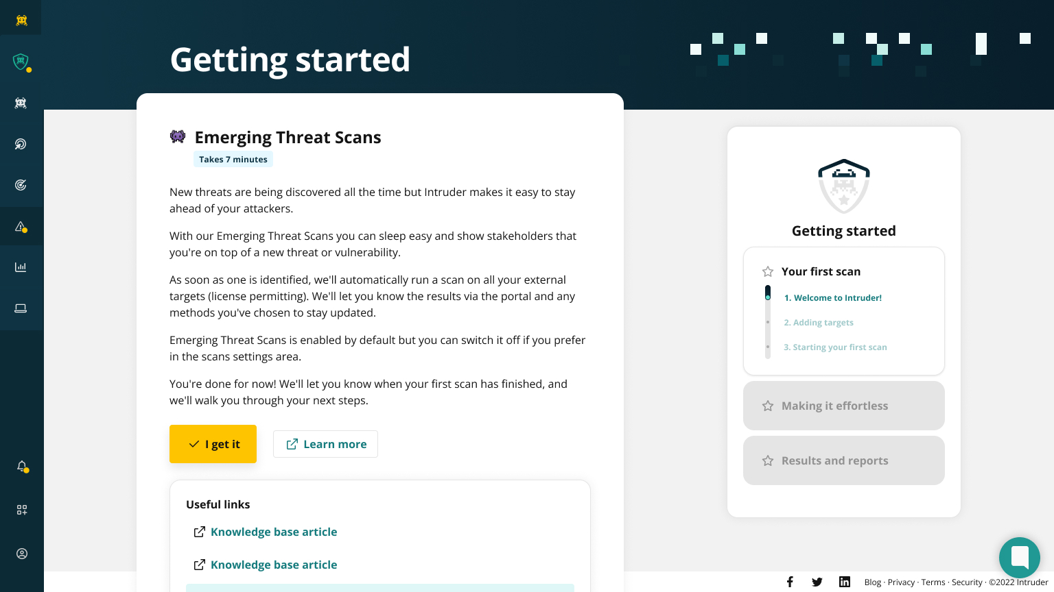
The old empty state. This is where the users were directed in the A/B test so no design work was done initially to keep the change as lightweight as possible.
The revised empty state. Whilst this reflects a later UI update the actual work to implement this was ~2 weeks.
Follow-Up Experiments
Our research revealed that time to first report strongly predicted engagement, leading to the proposition of additional tests to capitalise on the gains here:
- Auto-adding user email domains as scan targets
- Introducing faster scan types for quicker results
- Previewing example reports during initial scans
- Increasing trial access to additional (premium) scanners
Taking onboard the findings of our first user journey map we revised it to highlight how the experience could change if we capitalised on the opportunities we identified.
Outcome
The complete redesign ultimately improved conversion from 3.25% to 9% - a 177% increase.
By June 2025, we achieved significant year-over-year gains across the onboarding funnel through cultural shift toward experimentation and evidence-based iteration.
Post-release evaluation became standard practice, establishing a foundation for scalable improvements and data-informed decision making.
Key Learnings
One of the biggest lessons was that less can be more, the strongest design decisions often come from knowing what to remove, not just what to add.
We also saw the power of putting data over opinions. User insights and metrics consistently led to better decisions than assumptions or internal debate.
Another takeaway was the importance of value over process. Onboarding should shorten the path to core value, rather than serving as a showcase of every feature.
Finally, we learned that culture change doesn’t always come from big launches. Even lightweight experiments can shift organisational mindset and open the door to new ways of thinking.
Interested in discussing this project?