Modernising Intruder’s look and feel while creating consistency
Systems Thinking
Design Leadership & Alignment
Creative Direction
Overview
The project balanced creative exploration with system thinking, resulting in a sharper first impression, a coherent design library, and a brand presence ready for the next stage of growth.
I oversaw the refresh as Design Manager, aligning the CEO’s vision with execution. This resulted in a updated palette, type, and visual language that were realised in our public presence in the web and online.
Involvement

Design and Project Lead

~2 month duration (Oct - Nov ‘24)

Figjam, Figjam, Linear
Impact
Improved market perception
A more modern and professional first impression for prospects, helping Intruder stand out in a crowded cybersecurity market.
Unified brand presence
Marketing and product surfaces aligned under one consistent system, reducing design debt and ensuring customers had a seamless experience.
Scaled execution
A tokenised component library and visual guidelines enabled quicker marketing iterations and reduced bottlenecks for designers and marketers, making brand execution more efficient.
Challenge
The CEO of Intruder approached me with a request to update the visual language of Intruder. Prior to this point my focus had contained to the Product itself but the project was sorely needed.
Whilst people loved the core of Intruder’s visual identity it hadn’t kept pace with growth and despite it’s retro influence was looking dated.
He wanted to ensure Intruder made a strong first impression that still drew on Intruder’s love of retro-gaming but avoided the impression that it wasn’t cutting edge.
This was a great opportunity not just to get creative but also scale our internal design systems and create consistency across marketing and product surfaces.
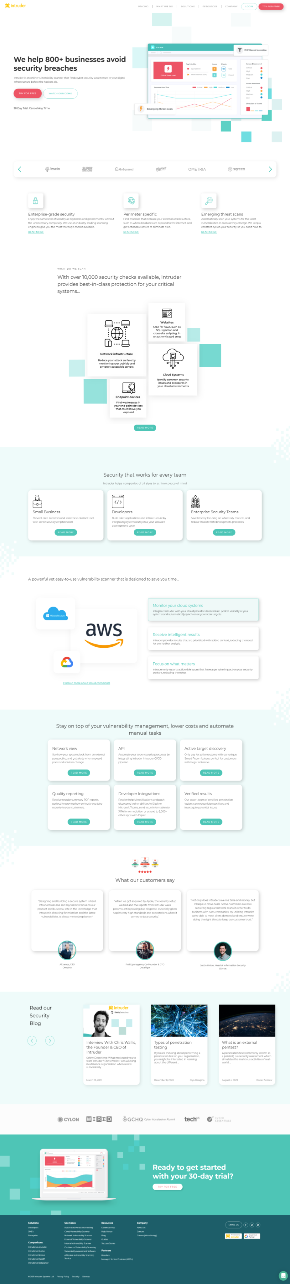
Audit: The original marketing site was dated and hadn’t kept up with the brands development. Before going any further we began by taking an inventory of brand assets so that they could be approached holistically.
Approach
I oversaw the refresh process, was hands on in the project itself and worked closely with the CEO to balance vision with execution. We started by reviewing the strengths of the existing identity whilst soliciting feedback about where company leadership wanted the company taken.
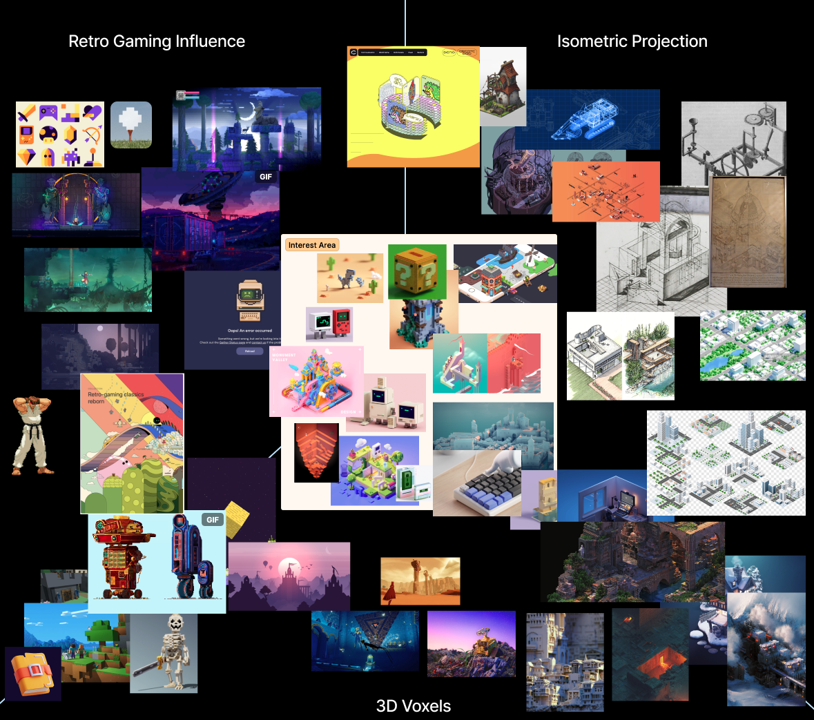
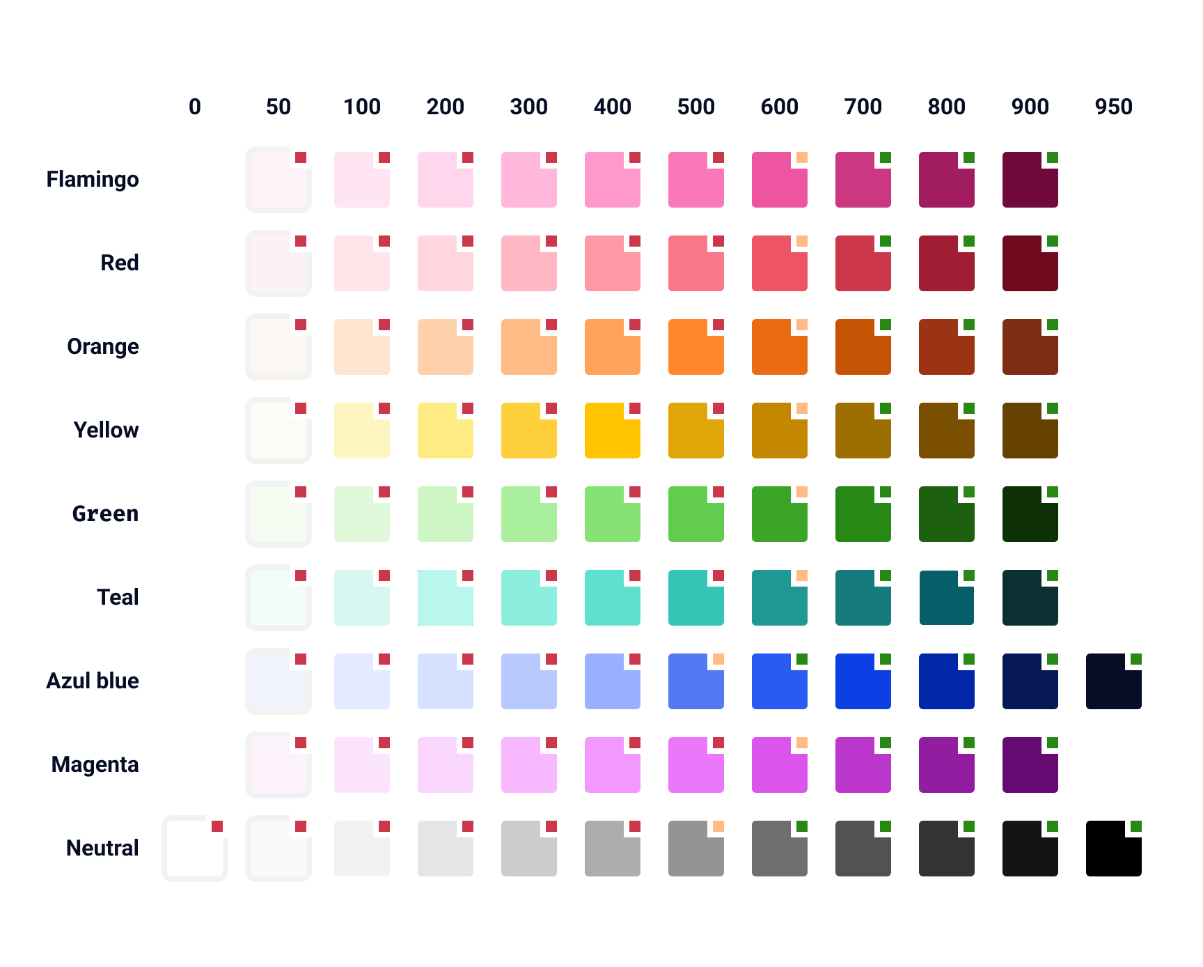
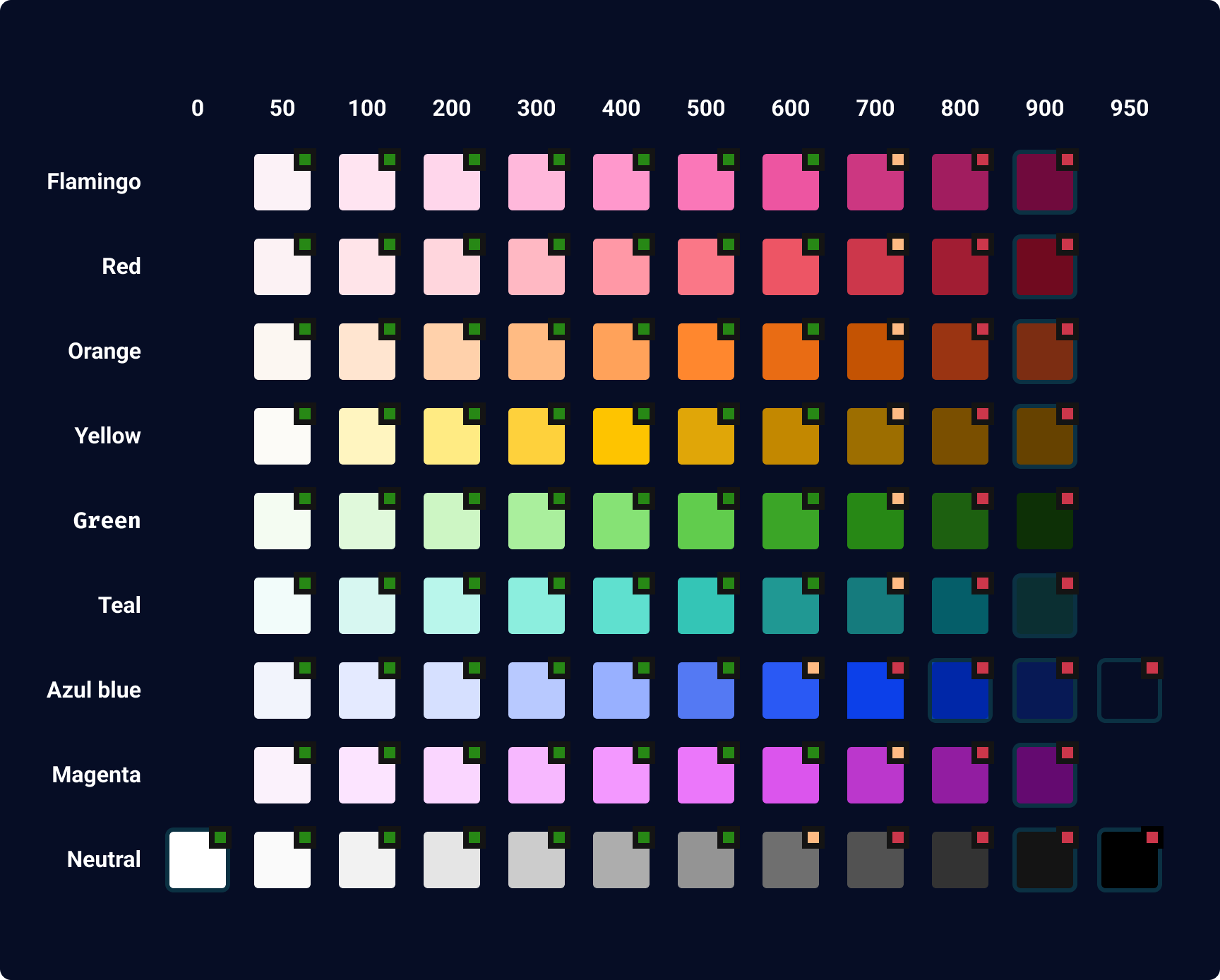
We started looking and broad concepts before beginning with our brands approach to typography, and colour. Intruder’s logo was yellow and this needed to be retained so we knew a bold contrast was needed to ensure it had the prominence it deserved.
Throughout I synched closely with the CEO and with trusted customers who loved the brand alongside scaling our concepts with revised components and visual guidelines. I then project managed the implementation of these changes myself across our public facing surfaces.
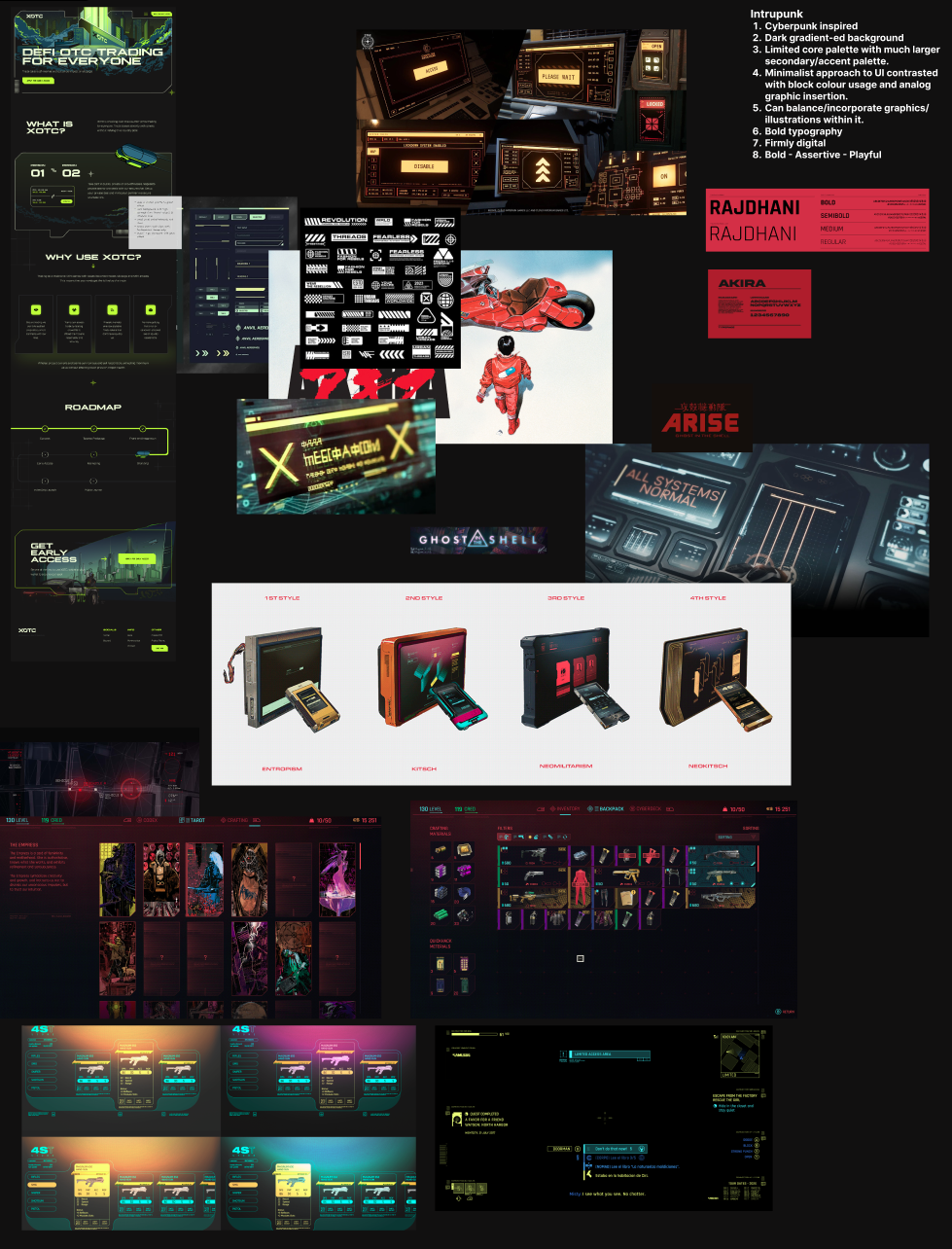
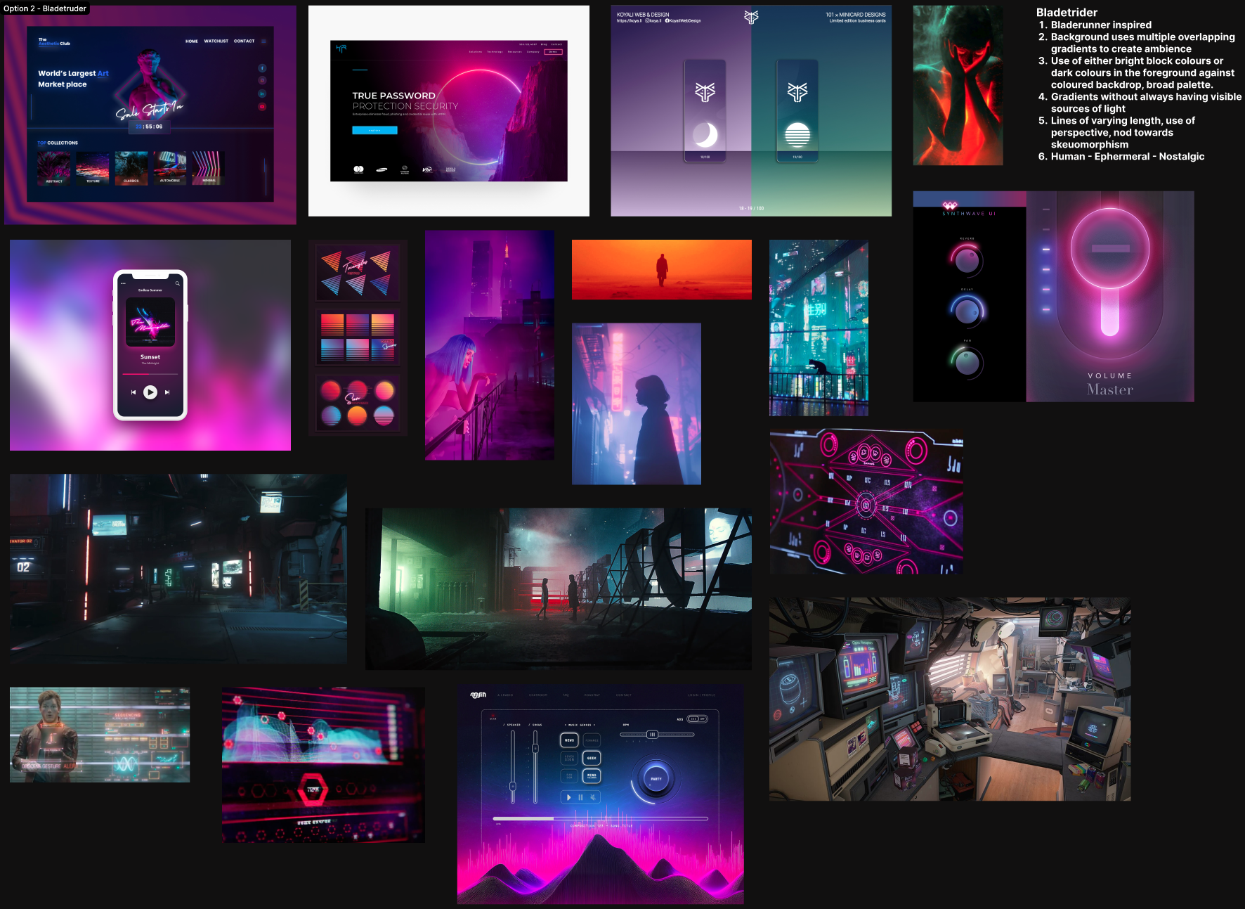
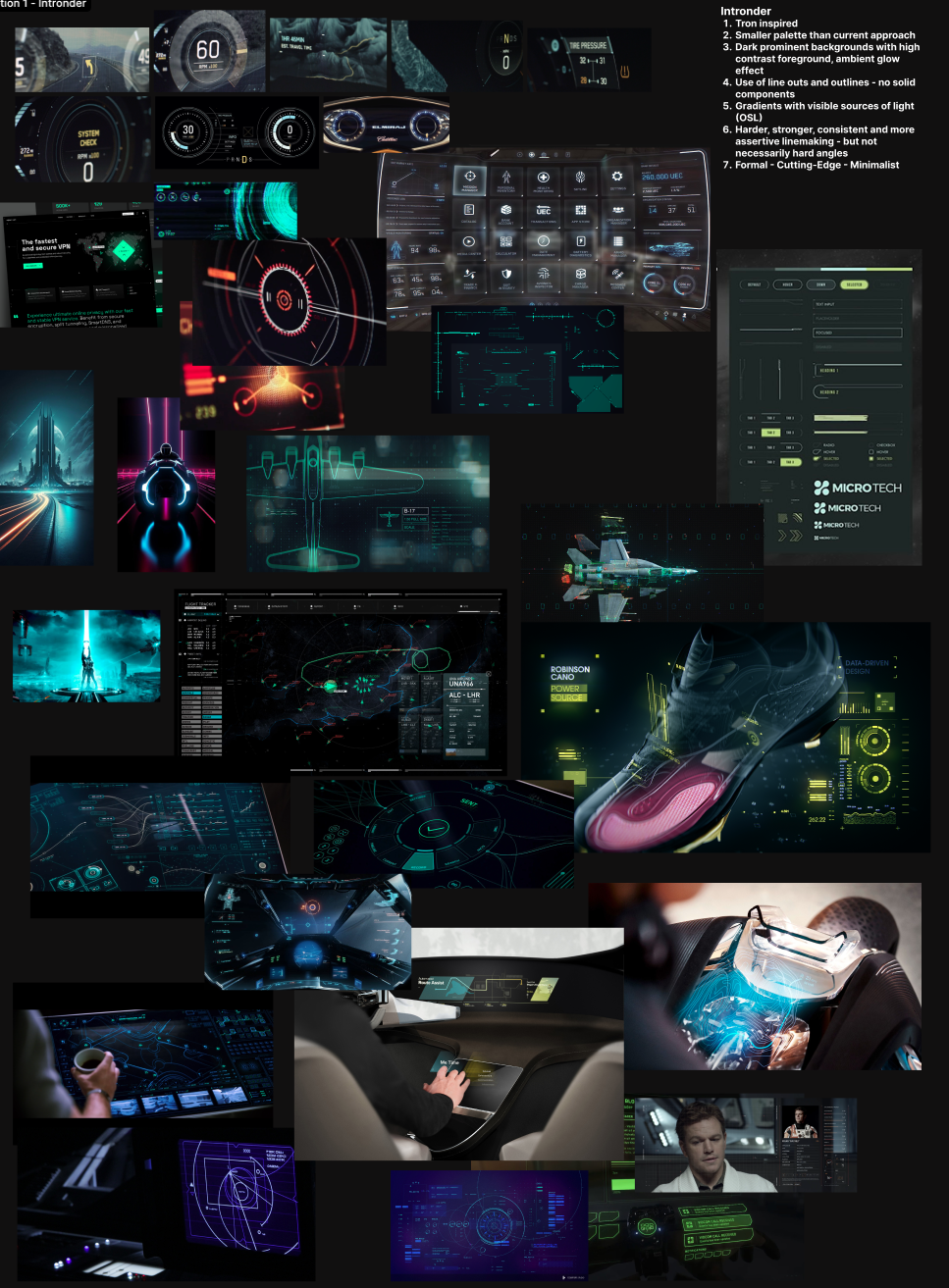
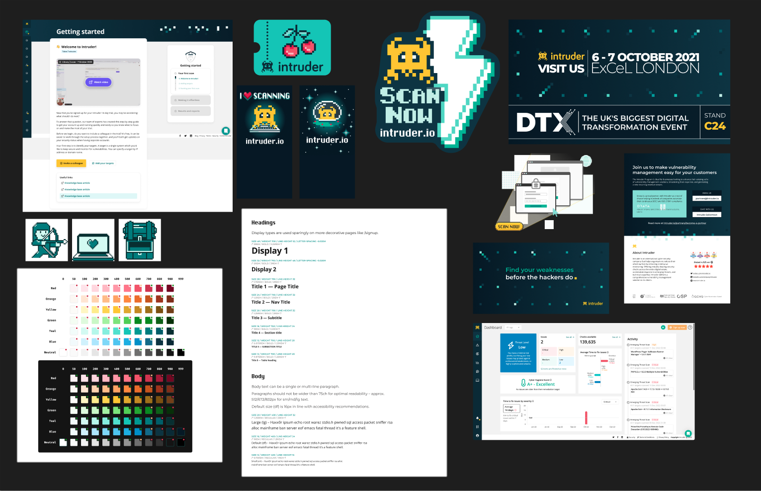
Exploration: We then began to explore various brand and colour concepts as part of a broader effort to define clear concepts we could feedback to leadership.
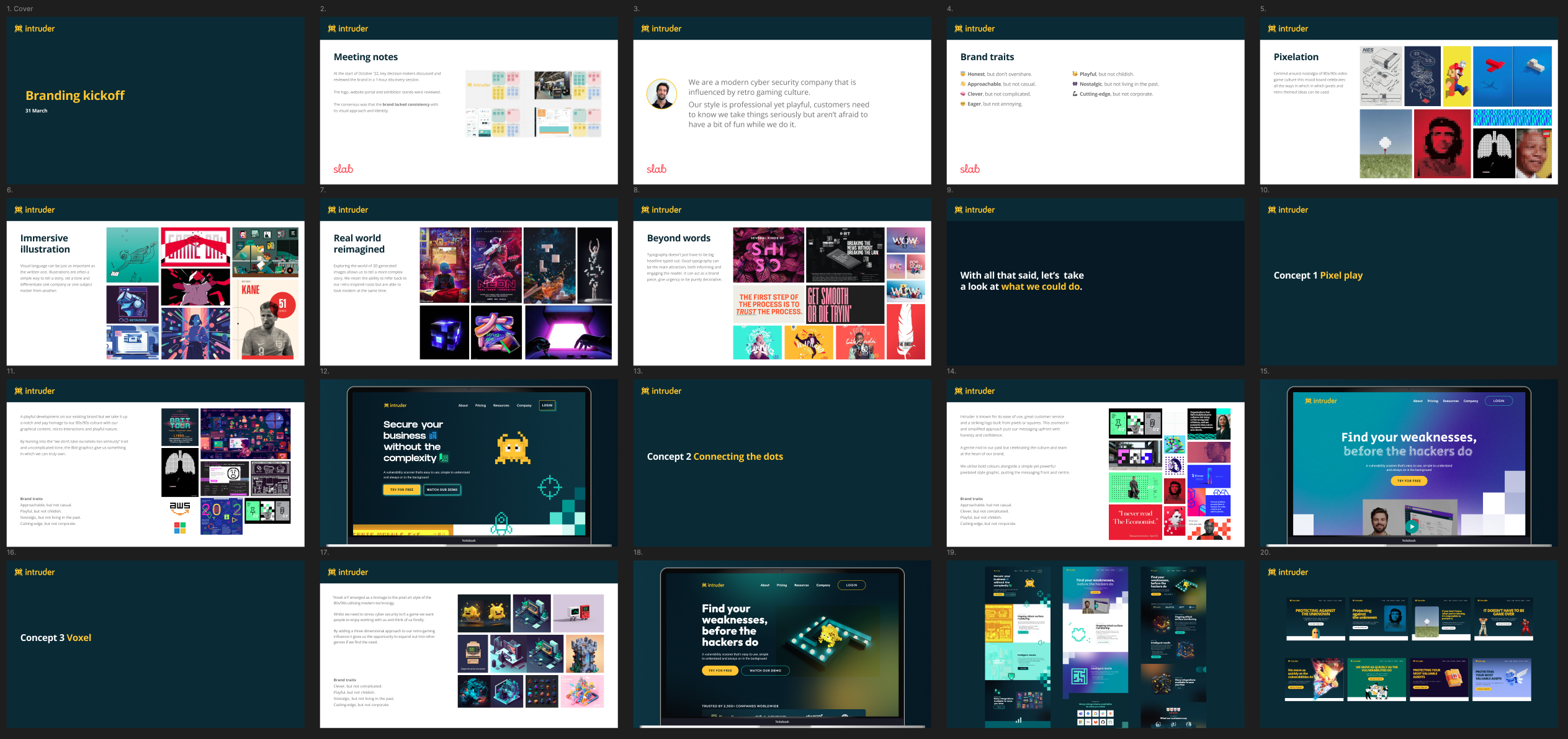
A deck pitching early brand concepts to company leadership. Using the old brand styling.
Alignment: We then presented the concepts as we had them back to company leadership for feedback to give a steer on what they felt was working vs what didn’t. This allowed us to iterate further.

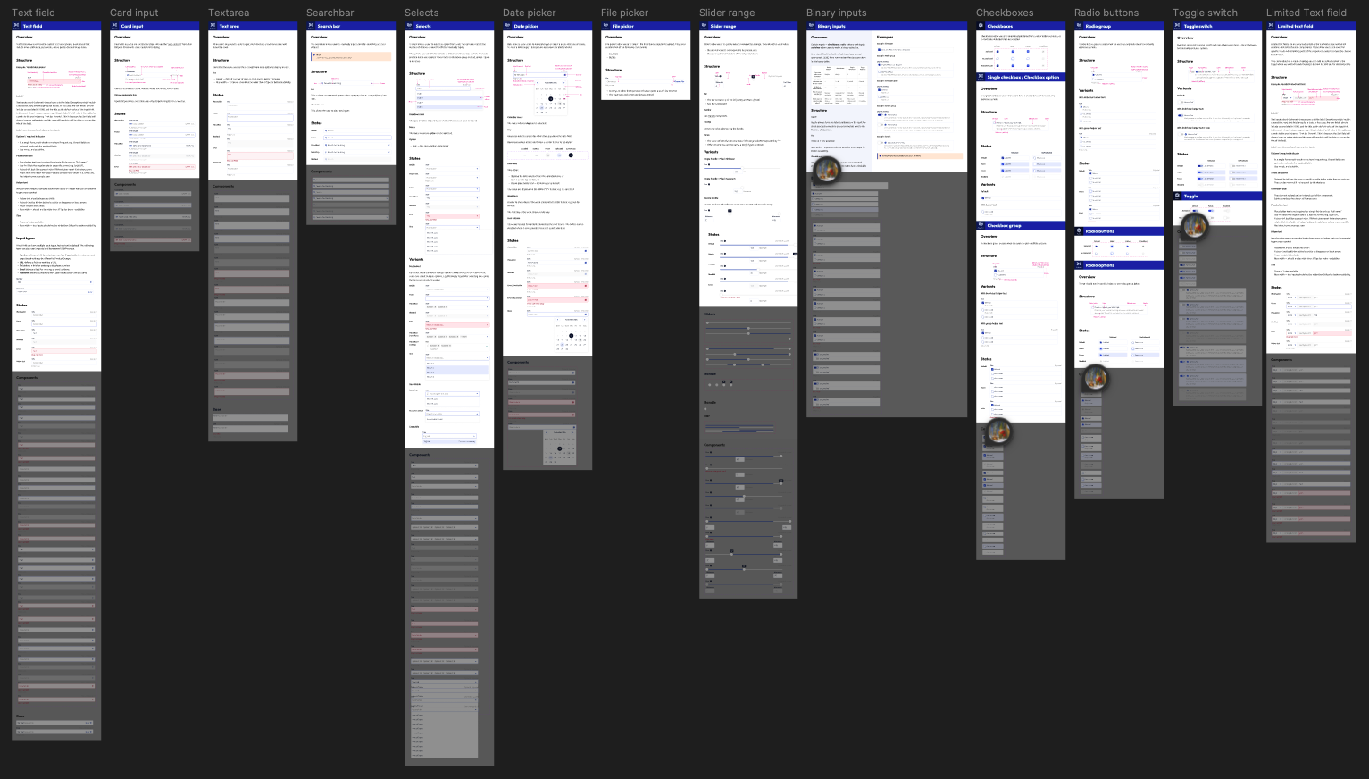
Systematisation: As we began to iterate on the new visual guidelines we ensured this was built out from a centralised atomic design library with a consistent set of visual guidelines
Solution & Results
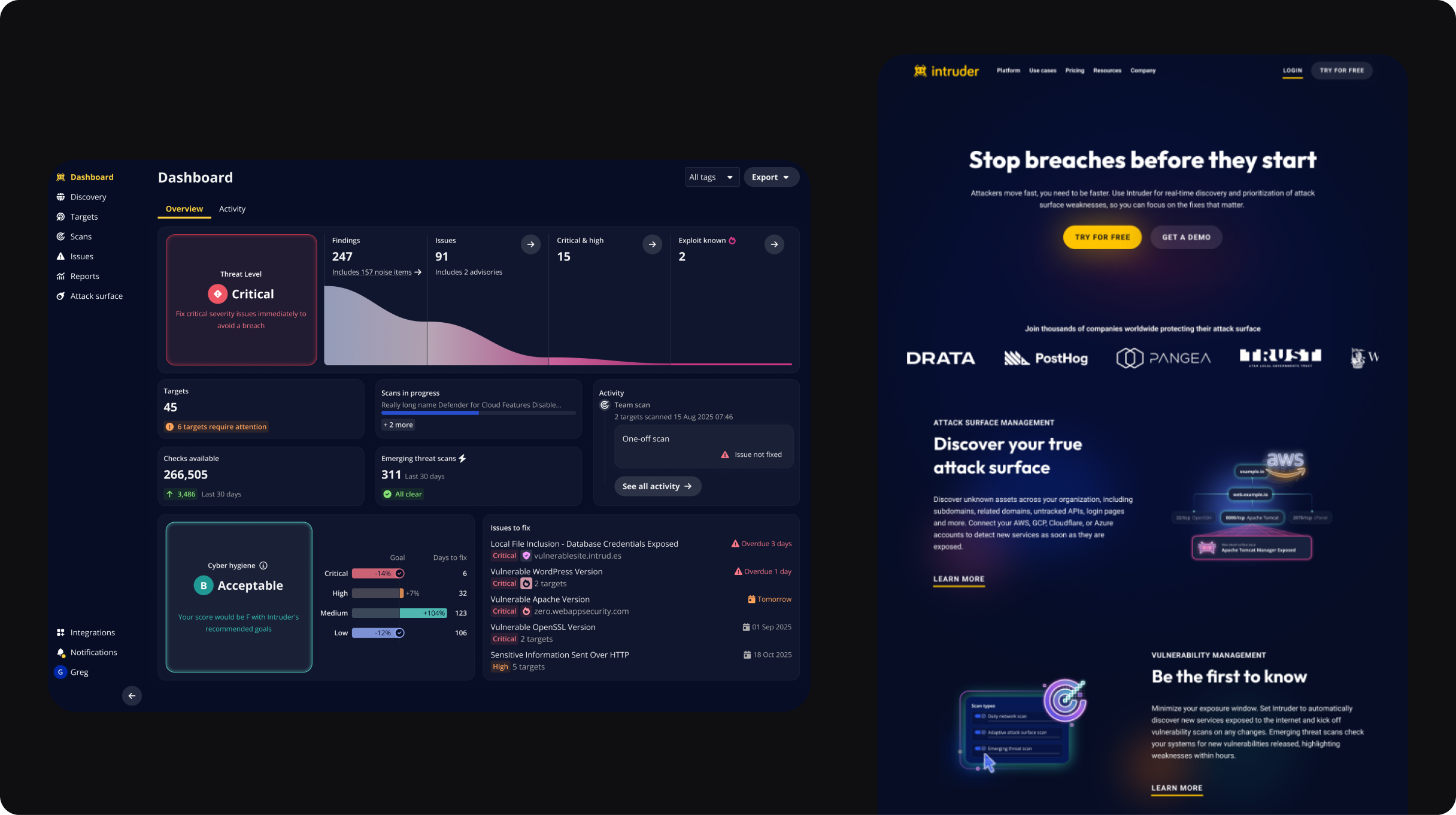
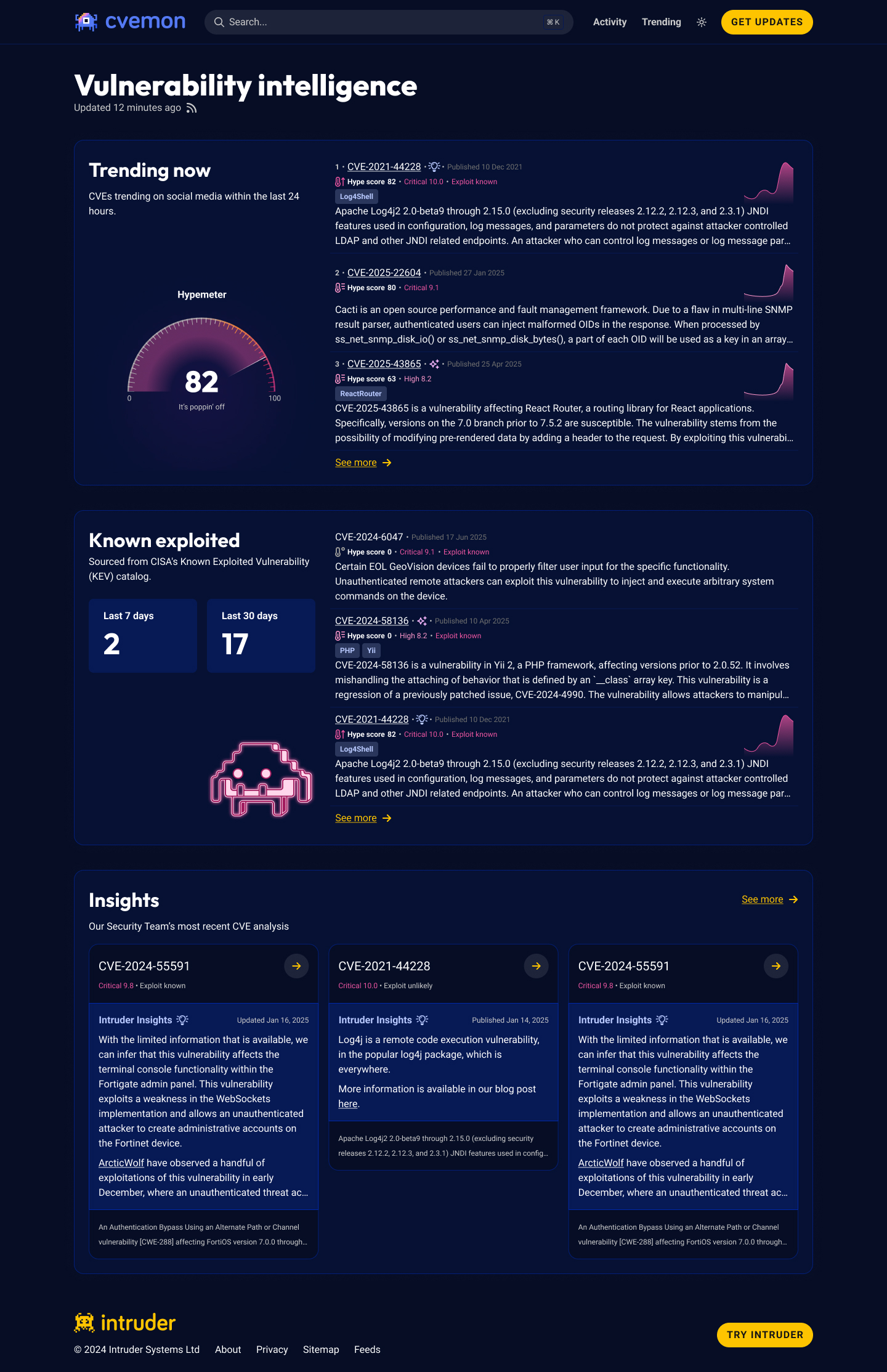
The new theme benefitted from a refined colour palette and set of visual guidelines that made it easy to copy across the marketing site as well as other customer facing brand surfaces.
With these changes we were also able to continue building out our own graphic style in a sustainable and time efficient way.
I then personally oversaw the rollout of the changes across the marketing site towards the end of 2024 and the product equivalent in 2025.
This was one of the first revised graphics reflecting the new approach Intruder’ was taking. This was
This was one of the first revised graphics reflecting the new approach Intruder’ was taking. This was

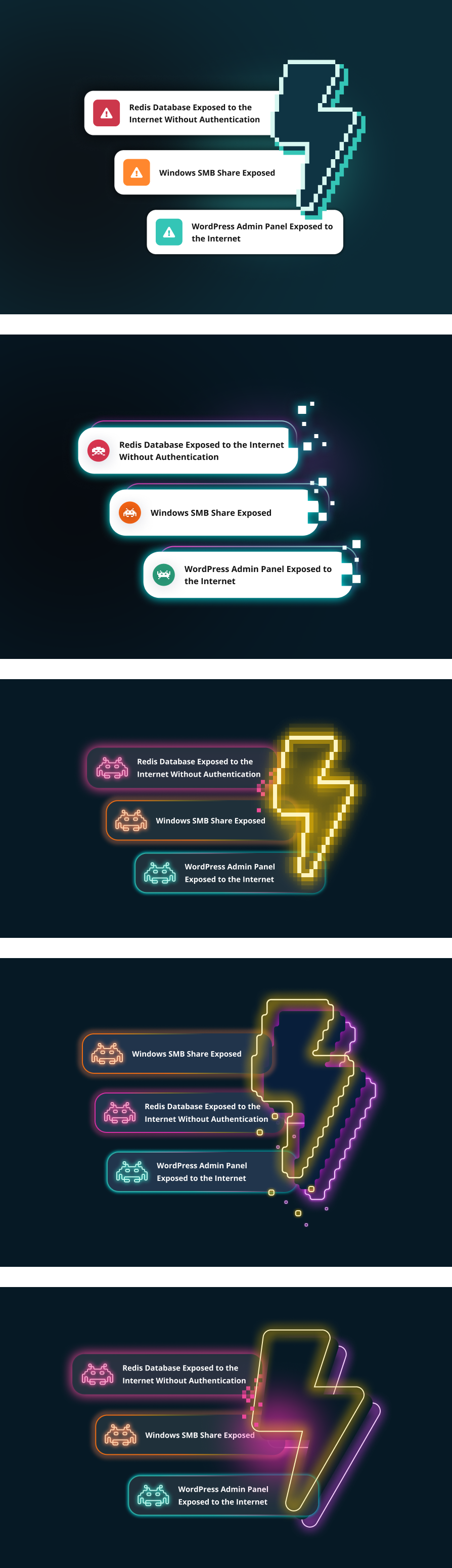
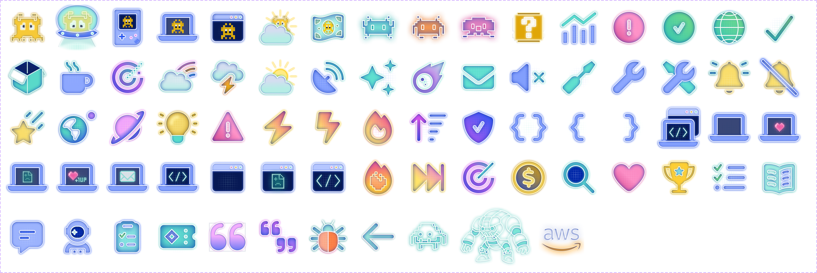
We later came up with a treatment of our existing icon library increasing the number of graphics we could produce exponentially.
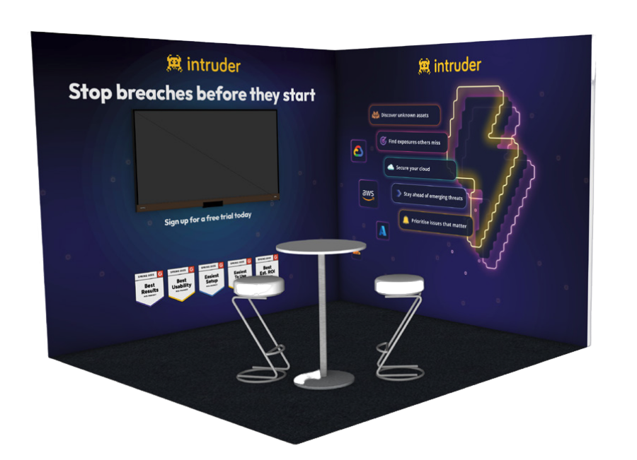

This was one of the first revised graphics reflecting the new approach Intruder’ was taking. This was
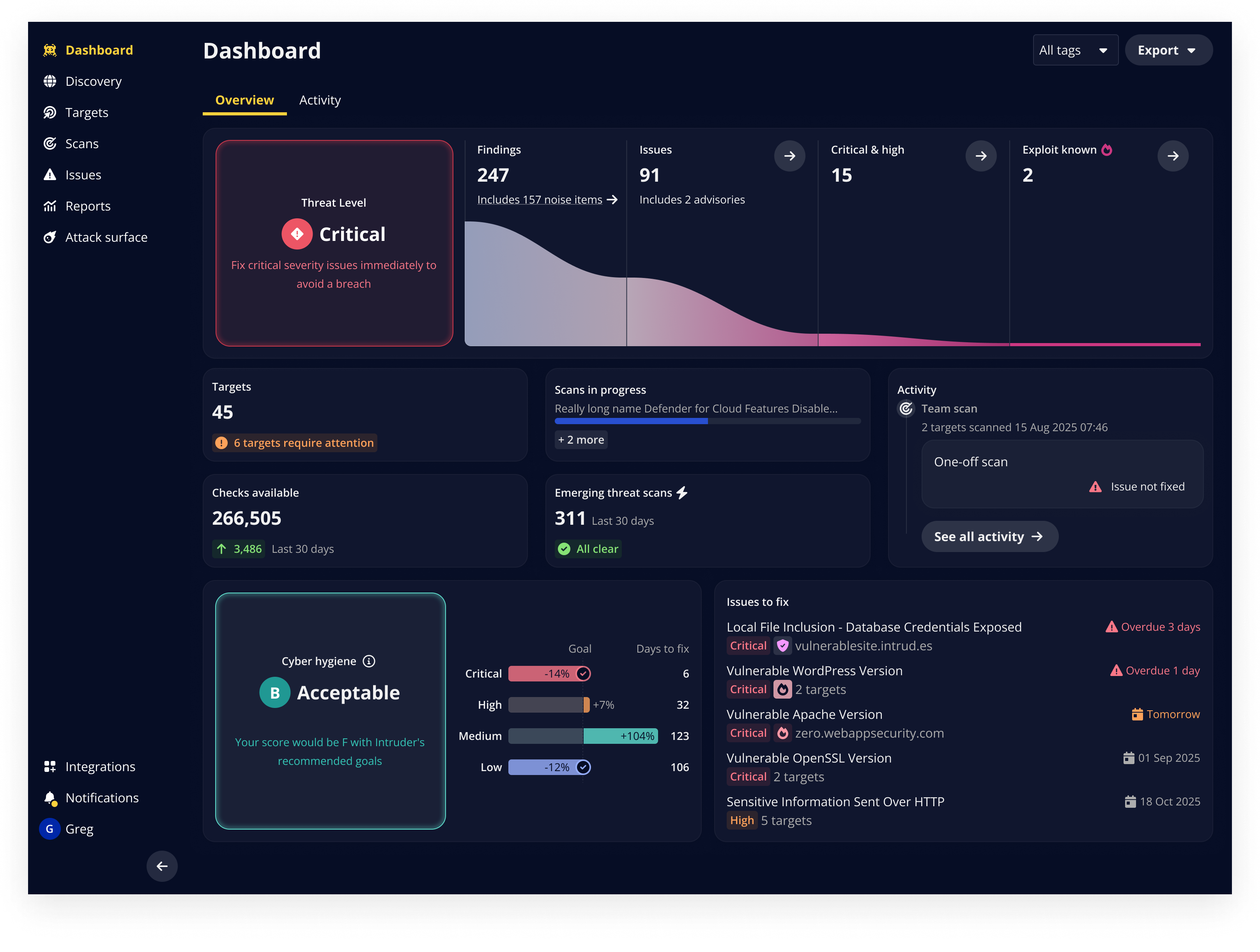
This was one of the first revised graphics reflecting the new approach Intruder’ was taking. This was
Impact
The level of brand integration hadn’t existed within Intruder before now. More than that customers really seemed to love the change too. When we interviewed them before and after the release, and monitored their feedback in the form of micro-surveys post release the feedback was overwhelmingly positive.
Wherever we surfaced the brand it now drew from the same design library consistently and the Product Design team shifted to being a team that oversaw design as a whole at Intruder.
This led to much closer ongoing work with Marketing in addition to Product and the scaling of the team in time to meet demand.
This was one of the first revised graphics reflecting the new approach Intruder’ was taking. This was
Want to chat?
I’m always interested to hear about new opportunities, chances to collaborate,
or even just ideas people are exploring. Let’s connect.
Modernising Intruder’s look and feel while creating consistency
Systems Thinking
Design Leadership & Alignment
Creative Direction
Overview
The project balanced creative exploration with system thinking, resulting in a sharper first impression, a coherent design library, and a brand presence ready for the next stage of growth.
I oversaw the refresh as Design Manager, aligning the CEO’s vision with execution. This resulted in a updated palette, type, and visual language that were realised in our public presence in the web and online.
Involvement
Design and Project Lead
~2 month duration (Oct - Nov ‘24)
Figjam, Figjam, Linear
Impact
Improved market perception
A more modern and professional first impression for prospects, helping Intruder stand out in a crowded cybersecurity market.
Unified brand presence
Marketing and product surfaces aligned under one consistent system, reducing design debt and ensuring customers had a seamless experience.
Scaled execution
A tokenised component library and visual guidelines enabled quicker marketing iterations and reduced bottlenecks for designers and marketers, making brand execution more efficient.
Challenge
The CEO of Intruder approached me with a request to update the visual language of Intruder. Prior to this point my focus had contained to the Product itself but the project was sorely needed.
Whilst people loved the core of Intruder’s visual identity it hadn’t kept pace with growth and despite it’s retro influence was looking dated.
He wanted to ensure Intruder made a strong first impression that still drew on Intruder’s love of retro-gaming but avoided the impression that it wasn’t cutting edge.
This was a great opportunity not just to get creative but also scale our internal design systems and create consistency across marketing and product surfaces.
Audit: The original marketing site was dated and hadn’t kept up with the brands development. Before going any further we began by taking an inventory of brand assets so that they could be approached holistically.
Approach
I oversaw the refresh process, was hands on in the project itself and worked closely with the CEO to balance vision with execution. We started by reviewing the strengths of the existing identity whilst soliciting feedback about where company leadership wanted the company taken.
We started looking and broad concepts before beginning with our brands approach to typography, and colour. Intruder’s logo was yellow and this needed to be retained so we knew a bold contrast was needed to ensure it had the prominence it deserved.
Throughout I synched closely with the CEO and with trusted customers who loved the brand alongside scaling our concepts with revised components and visual guidelines. I then project managed the implementation of these changes myself across our public facing surfaces.
Exploration: We then began to explore various brand and colour concepts as part of a broader effort to define clear concepts we could feedback to leadership.
A deck pitching early brand concepts to company leadership. Using the old brand styling.
Alignment: We then presented the concepts as we had them back to company leadership for feedback to give a steer on what they felt was working vs what didn’t. This allowed us to iterate further.
Systematisation: As we began to iterate on the new visual guidelines we ensured this was built out from a centralised atomic design library with a consistent set of visual guidelines
Solution & Results
The new theme benefitted from a refined colour palette and set of visual guidelines that made it easy to copy across the marketing site as well as other customer facing brand surfaces.
With these changes we were also able to continue building out our own graphic style in a sustainable and time efficient way.
I then personally oversaw the rollout of the changes across the marketing site towards the end of 2024 and the product equivalent in 2025.
This was one of the first revised graphics reflecting the new approach Intruder’ was taking. This was
This was one of the first revised graphics reflecting the new approach Intruder’ was taking. This was
We later came up with a treatment of our existing icon library increasing the number of graphics we could produce exponentially.
This was one of the first revised graphics reflecting the new approach Intruder’ was taking. This was
This was one of the first revised graphics reflecting the new approach Intruder’ was taking. This was
Impact
The level of brand integration hadn’t existed within Intruder before now. More than that customers really seemed to love the change too. When we interviewed them before and after the release, and monitored their feedback in the form of micro-surveys post release the feedback was overwhelmingly positive.
Wherever we surfaced the brand it now drew from the same design library consistently and the Product Design team shifted to being a team that oversaw design as a whole at Intruder.
This led to much closer ongoing work with Marketing in addition to Product and the scaling of the team in time to meet demand.
This was one of the first revised graphics reflecting the new approach Intruder’ was taking. This was
Want to chat?
I’m always interested to hear about new opportunities, chances to collaborate,
or even just ideas people are exploring. Let’s connect.
Modernising Intruder's look and feel while creating consistency
Systems Thinking
Design Leadership & Alignment
Creative Direction
Overview
The project balanced creative exploration with system thinking, resulting in a sharper first impression, a coherent design library, and a brand presence ready for the next stage of growth.
I oversaw the refresh as Design Manager, aligning the CEO’s vision with execution. This resulted in a updated palette, type, and visual language that were realised in our public presence in the web and online.
Involvement
Design and Project Lead
~2 month duration (Oct - Nov ‘24)
Figjam, Figjam, Linear
Impact
Improved market perception
A more modern and professional first impression for prospects, helping Intruder stand out in a crowded cybersecurity market.
Unified brand presence
Marketing and product surfaces aligned under one consistent system, reducing design debt and ensuring customers had a seamless experience.
Scaled execution
A tokenised component library and visual guidelines enabled quicker marketing iterations and reduced bottlenecks for designers and marketers, making brand execution more efficient.
Challenge
The CEO of Intruder approached me with a request to update the visual language of Intruder. Prior to this point my focus had contained to the Product itself but the project was sorely needed.
Whilst people loved the core of Intruder’s visual identity it hadn’t kept pace with growth and despite it’s retro influence was looking dated.
He wanted to ensure Intruder made a strong first impression that still drew on Intruder’s love of retro-gaming but avoided the impression that it wasn’t cutting edge.
This was a great opportunity not just to get creative but also scale our internal design systems and create consistency across marketing and product surfaces.
Audit: The original marketing site was dated and hadn’t kept up with the brands development. Before going any further we began by taking an inventory of brand assets so that they could be approached holistically.
Approach
I oversaw the refresh process, was hands on in the project itself and worked closely with the CEO to balance vision with execution. We started by reviewing the strengths of the existing identity whilst soliciting feedback about where company leadership wanted the company taken.
We started looking and broad concepts before beginning with our brands approach to typography, and colour. Intruder’s logo was yellow and this needed to be retained so we knew a bold contrast was needed to ensure it had the prominence it deserved.
Throughout I synched closely with the CEO and with trusted customers who loved the brand alongside scaling our concepts with revised components and visual guidelines. I then project managed the implementation of these changes myself across our public facing surfaces.
Exploration: We then began to explore various brand and colour concepts as part of a broader effort to define clear concepts we could feedback to leadership.
A deck pitching early brand concepts to company leadership. Using the old brand styling.
Alignment: We then presented the concepts as we had them back to company leadership for feedback to give a steer on what they felt was working vs what didn’t. This allowed us to iterate further.
Systematisation: As we began to iterate on the new visual guidelines we ensured this was built out from a centralised atomic design library with a consistent set of visual guidelines
Solution & Results
The new theme benefitted from a refined colour palette and set of visual guidelines that made it easy to copy across the marketing site as well as other customer facing brand surfaces.
With these changes we were also able to continue building out our own graphic style in a sustainable and time efficient way.
I then personally oversaw the rollout of the changes across the marketing site towards the end of 2024 and the product equivalent in 2025.
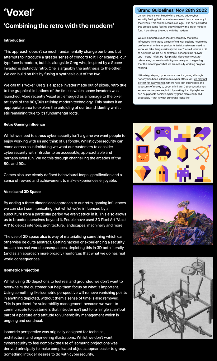
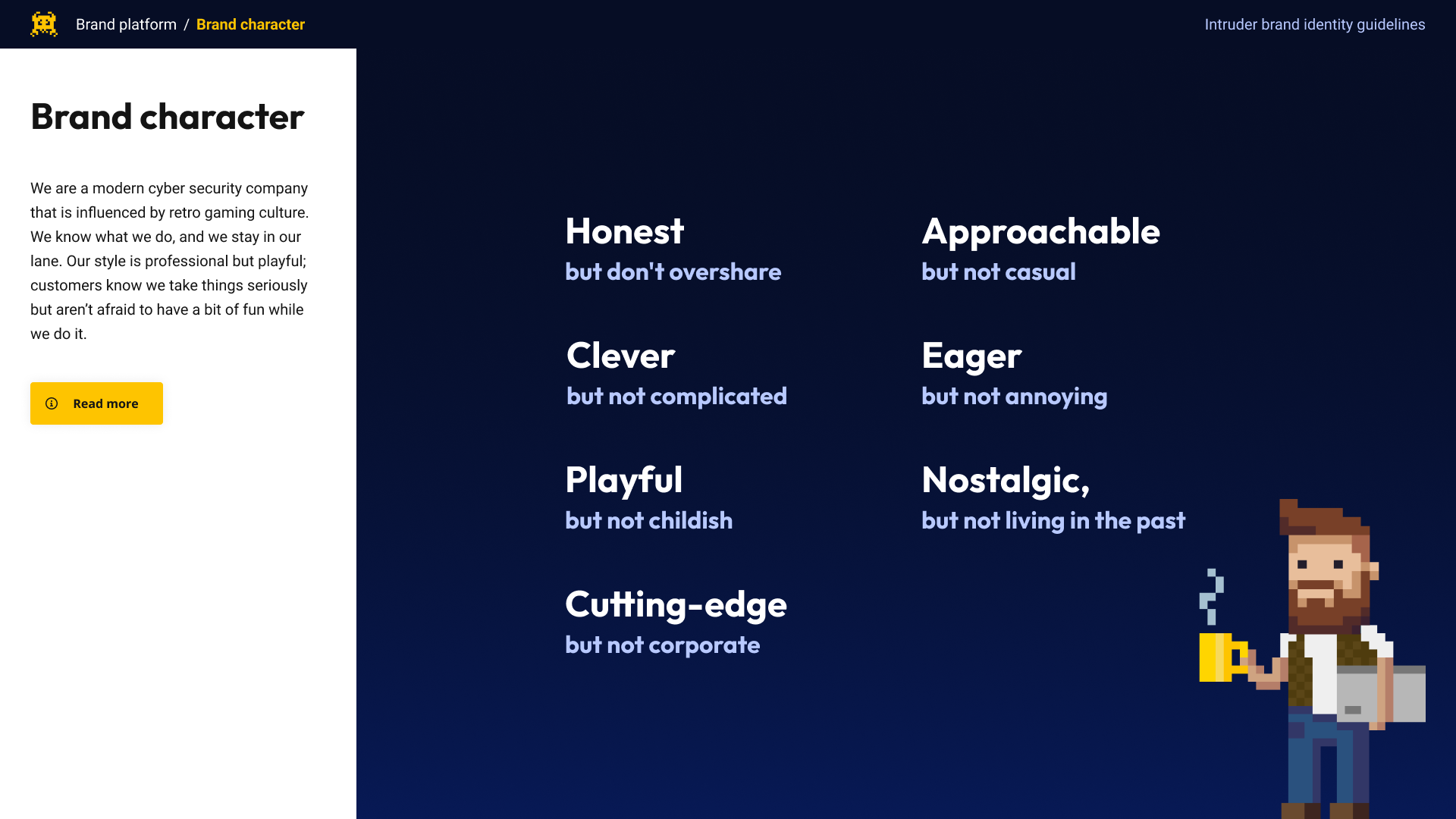
Part of this exercise involved me defining Intruder’s brand character. This process involved looking at customer impressions of where we were currently in the eyes of our users and where we wanted to be.
I then guided the exec through a process to codify and define our brand character in a way which went on to inform the shape of every customer touch point Intruder has.
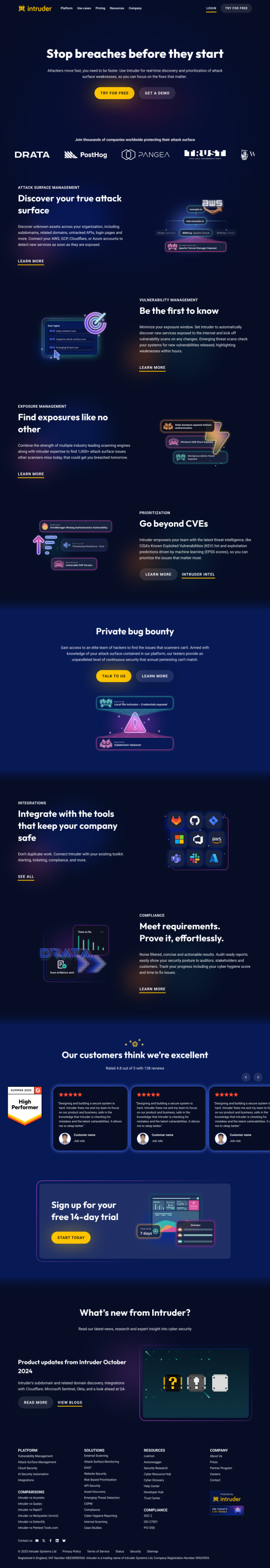
This was one of the first graphics we revised that reflected the new approach Intruder was taking to its visuals. We then began to roll this out across our brand surfaces.
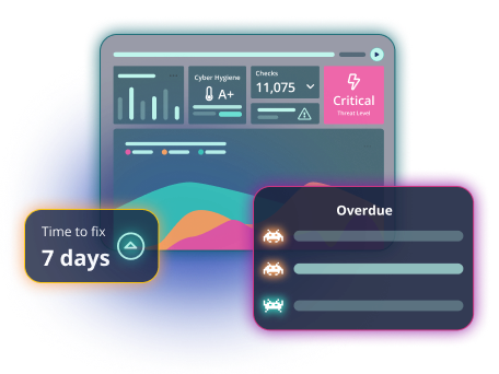
We later came up with a treatment of our existing icon library increasing the number of graphics we could produce exponentially.
This new style continued to develop over time as we develop over time as we sought to implement it across every brand surface.
As part of this we developed a technique to rapidly scale graphics across the platform which reduced our overheads massively and could be easily passed on to any contractors we needed.
Impact
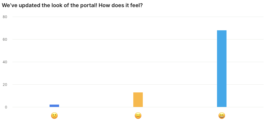
The level of brand integration hadn’t existed within Intruder before now. More than that customers really seemed to love the change too. When we interviewed them before and after the release, and monitored their feedback in the form of micro-surveys post release the feedback was overwhelmingly positive.
Wherever we surfaced the brand it now drew from the same design library consistently and the Product Design team shifted to being a team that oversaw design as a whole at Intruder.
This led to much closer ongoing work with Marketing in addition to Product and the scaling of the team in time to meet demand.
Customers overwhelmingly received the changes positively.
Want to chat?
I’m always interested to hear about new opportunities, chances to collaborate,
or even just ideas people are exploring. Let’s connect.