Evolving a cybersecurity brand for enterprise growth
Intruder's retro gaming brand was beloved by its SMB customers and actively undermining its enterprise sales pipeline. The brief was to grow up without losing the personality that made it distinctive, with no dedicated timeline and a team that could only work on it between other commitments.
Context
Intruder had built a strong position in SMB vulnerability management with a distinctive retro gaming aesthetic. To achieve growth targets, the company needed to win enterprise deals against established players - Tenable, Qualys, Crowdstrike, Rapid7. The core tension: how does Intruder mature enough to win enterprise trust without losing the personality that differentiated it?
Leadership had specific concerns: would Intruder be taken seriously at industry conferences next to major competitors? Could the visual identity hold up in lengthy enterprise sales cycles? How does Intruder signal 'enterprise-ready' without looking generic?
I was able to pull the full design team to focus on this, alongside support from Marketing and Engineering. My primary stakeholder was the founder and CEO.
The problem
Rather than accepting the assumption that the brand was the blocker, I started by validating the problem - through sales team interviews, customer research (including recently lost enterprise deals), competitive audit, and an internal brand audit mapping every touchpoint.


The feedback from Sales was clear: the brand's retro aesthetic was curbing expectations of what the product was capable of, even as they universally loved its character. Cybersecurity professionals are risk-averse - Intruder didn't pattern-match their expectations of an enterprise-scale solution.
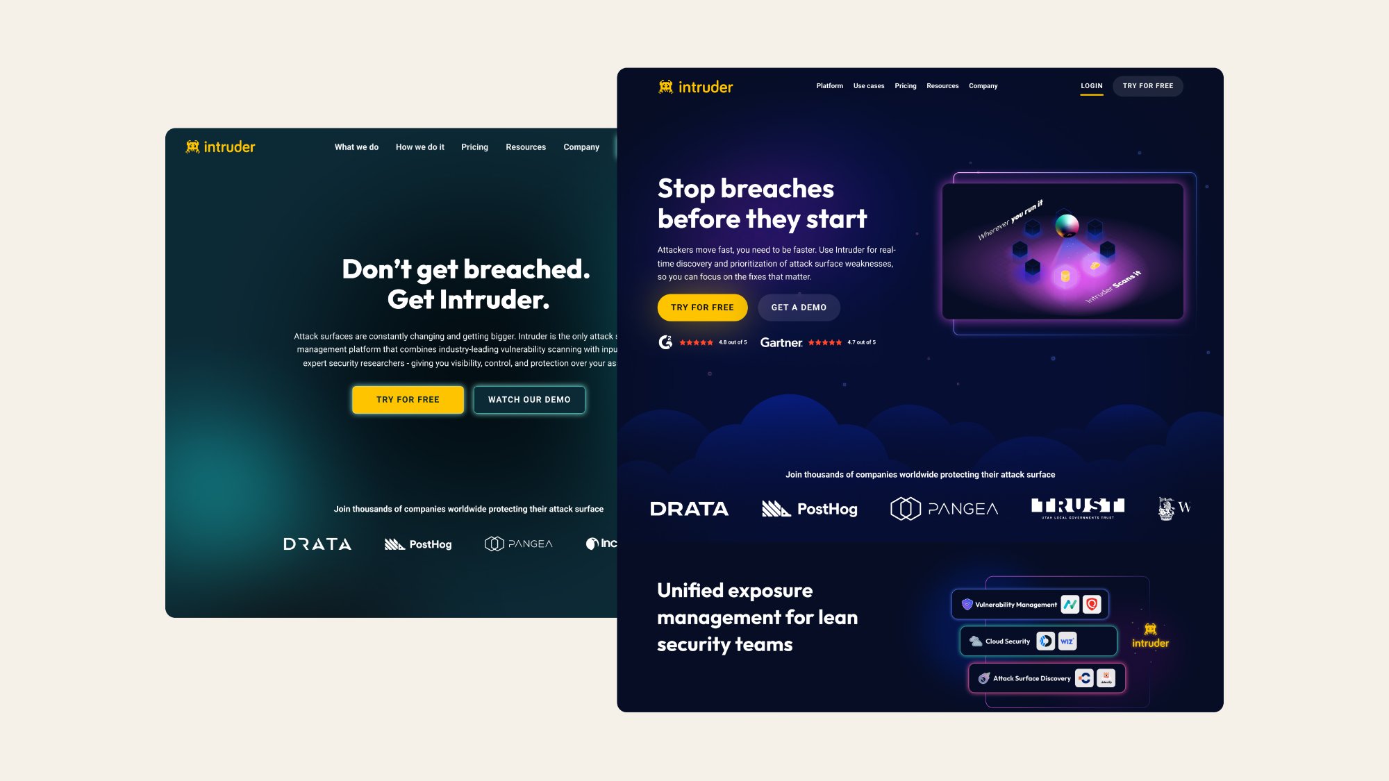
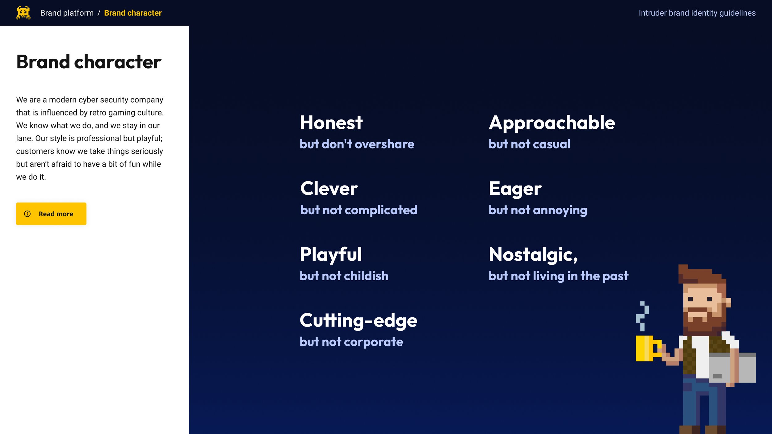
Cybersecurity professionals are risk-averse, and customers consistently valued Intruder for the peace of mind it offered them. The brand needed to convey that same reassurance at enterprise scale. The shift we landed on: from 'playful' to 'quietly confident.'
Intruder needed to move from 'playful' to 'quietly confident.' The brand had to mirror enterprise expectations without sacrificing the personality that made it distinctive.
Research and strategic framing
I worked with leadership to establish core brand principles before touching any visual direction. The existing brand guidelines gave us a clear baseline to work from - the character and voice were right, the visual expression needed to grow up.
Concept exploration
Before committing to a direction, I explored the full space of what Intruder could become. Four moodboards mapped the aesthetic territory available to the brand.
Pixelation: rejected. Would entrench the perception problem rather than address it.
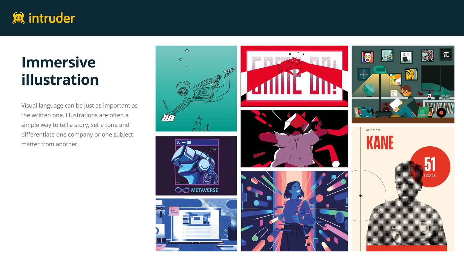
Immersive illustration: strong editorial quality but hard to execute consistently in-house.
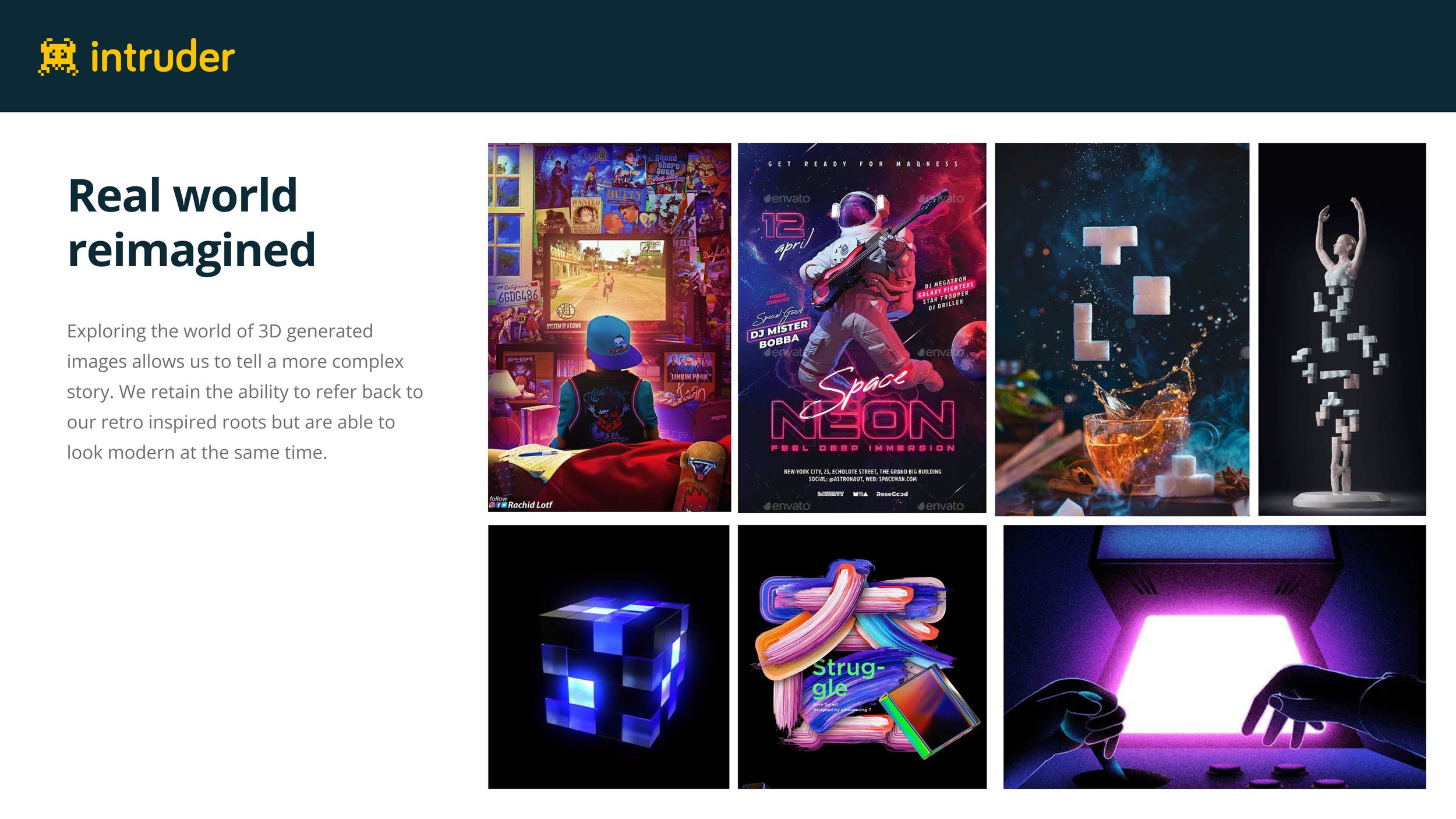
Real world reimagined: 3D and synthwave. This direction informed the winning concept.
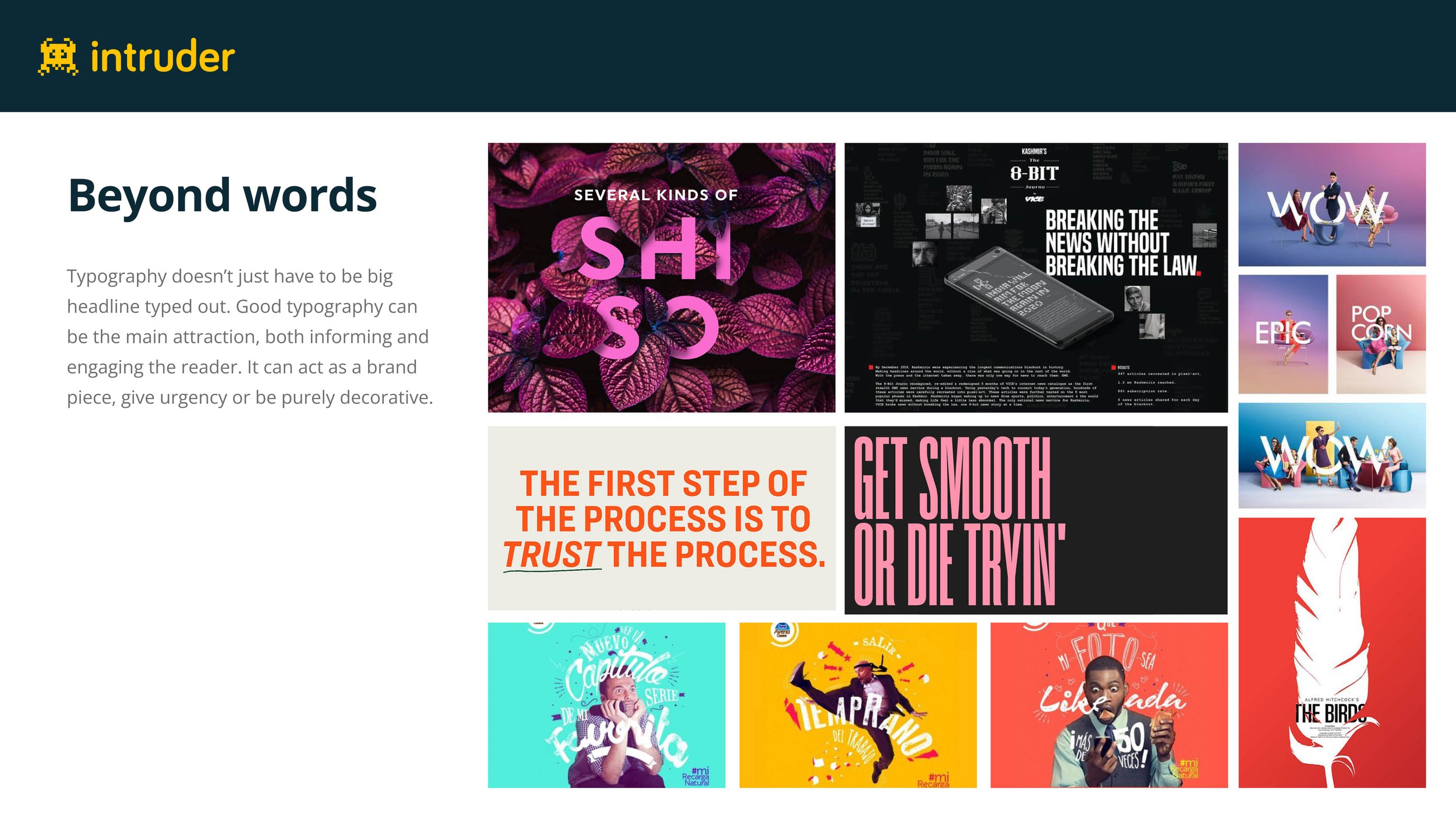
Beyond words: powerful for messaging but reduces flexibility across product and event contexts.
Each of these early discussions generated a lot of feedback. Off the back of that feedback we explored three new directions based on the influences described. These took the form of moodboards and concept descriptions, which were iterated on in response to feedback from senior leadership, customer-facing teams, and ideal customer profile (ICP) customers.
From these moodboards I developed three distinct directions - each with a name, a set of principles, and an applied aesthetic - which were iterated on in response to feedback from senior leadership, customer-facing teams, and ideal customer profile (ICP) customers.
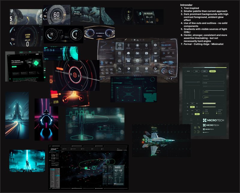
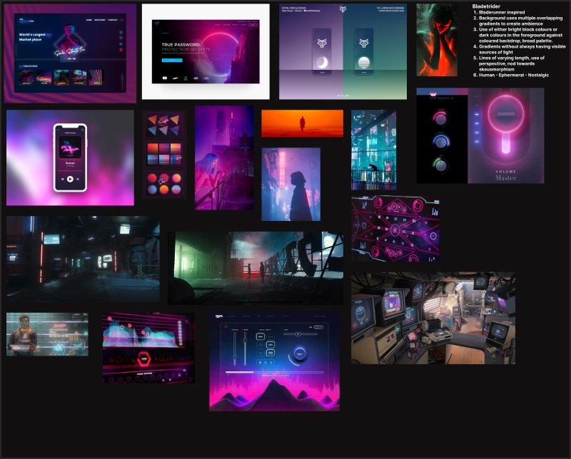
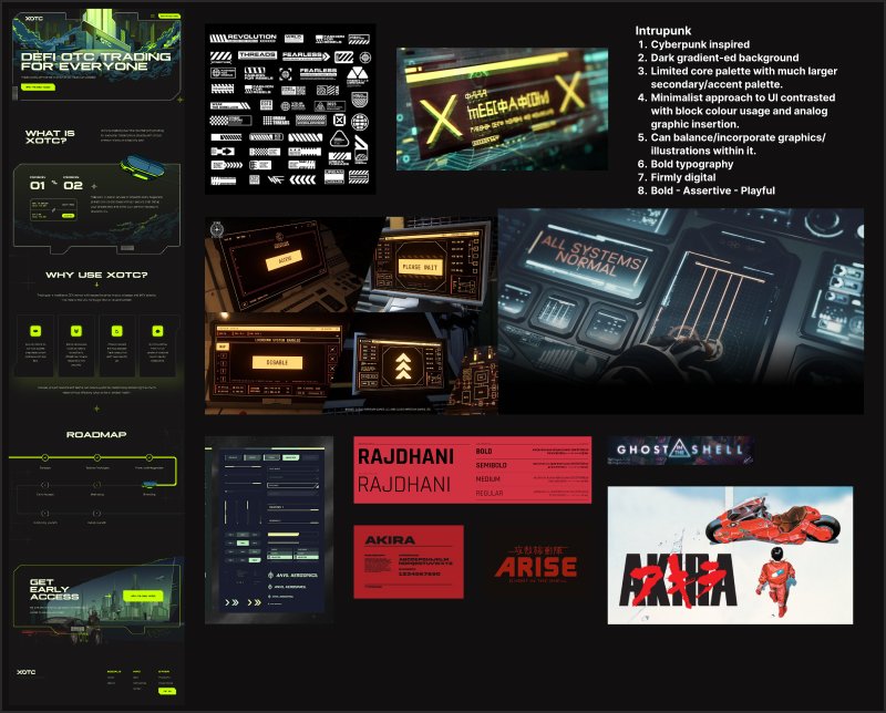
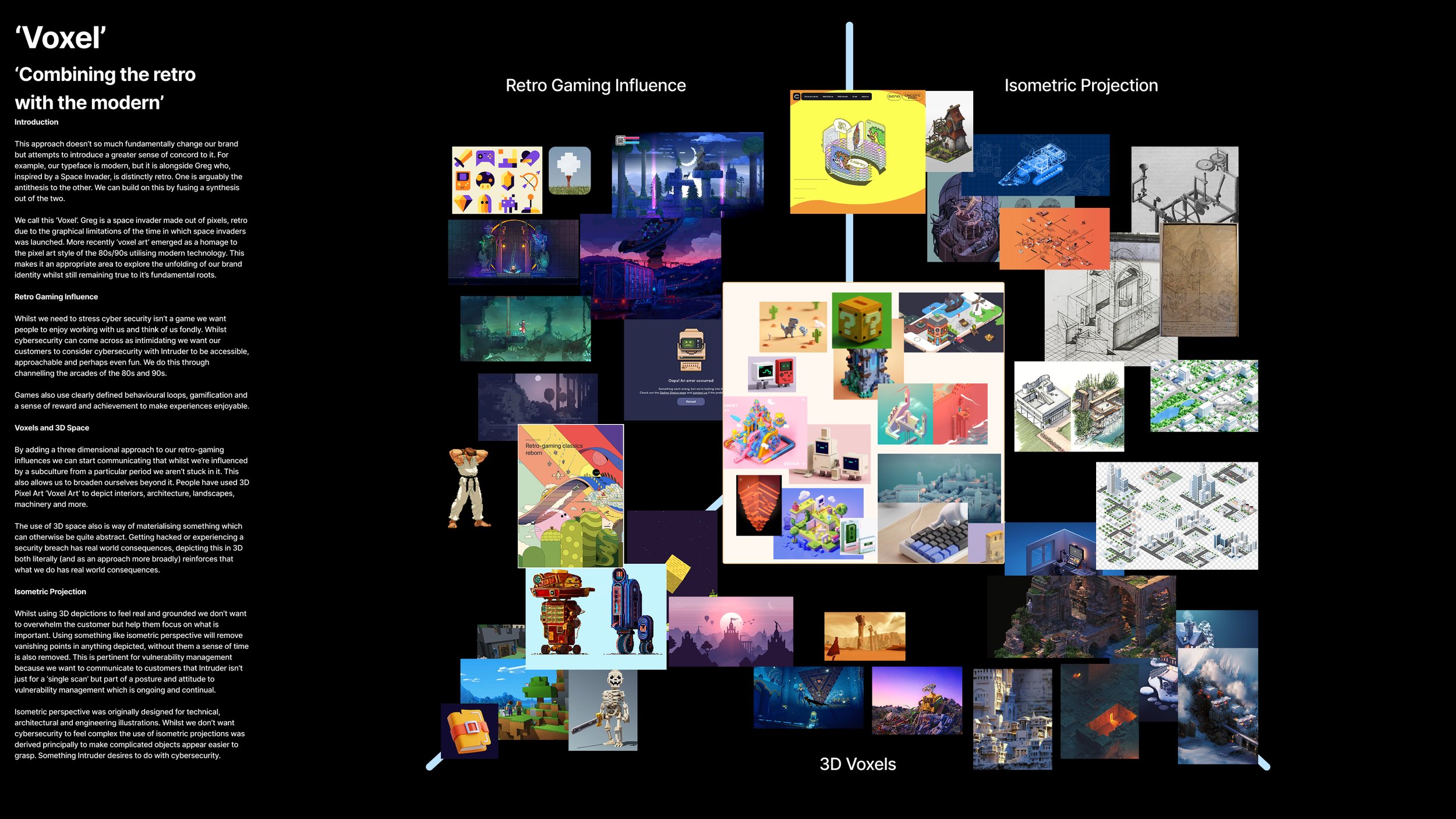
None of the three options was adopted wholesale. Instead they became reference points for a synthesis direction - the 'Voxel' concept - which fused the retro gaming roots with contemporary 3D and isometric visual language.
Solution
What we kept
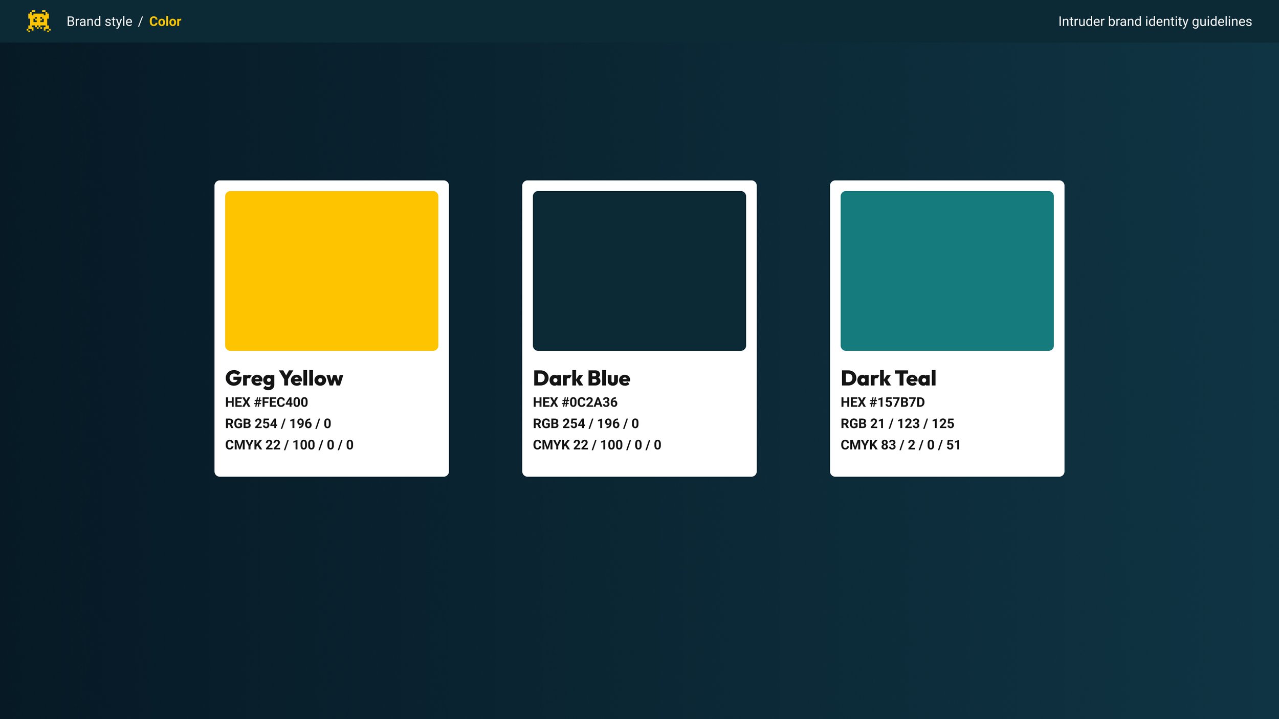
- Intruder's logo - universally loved, internally and externally - retained unchanged
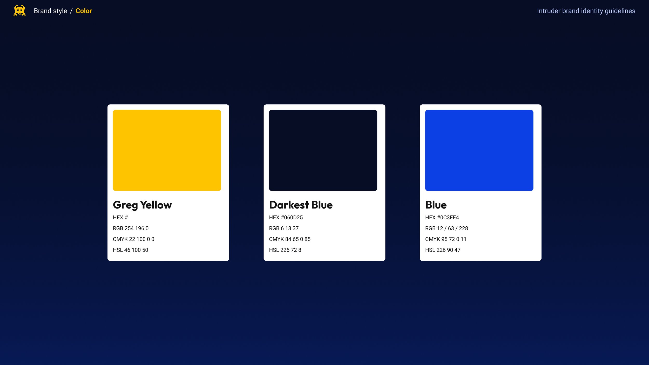
- Greg Yellow as the primary accent colour, carried across the evolution
- Typography was not fundamentally changed - time constraints and the degree of debate it generated made this the right call
What we evolved
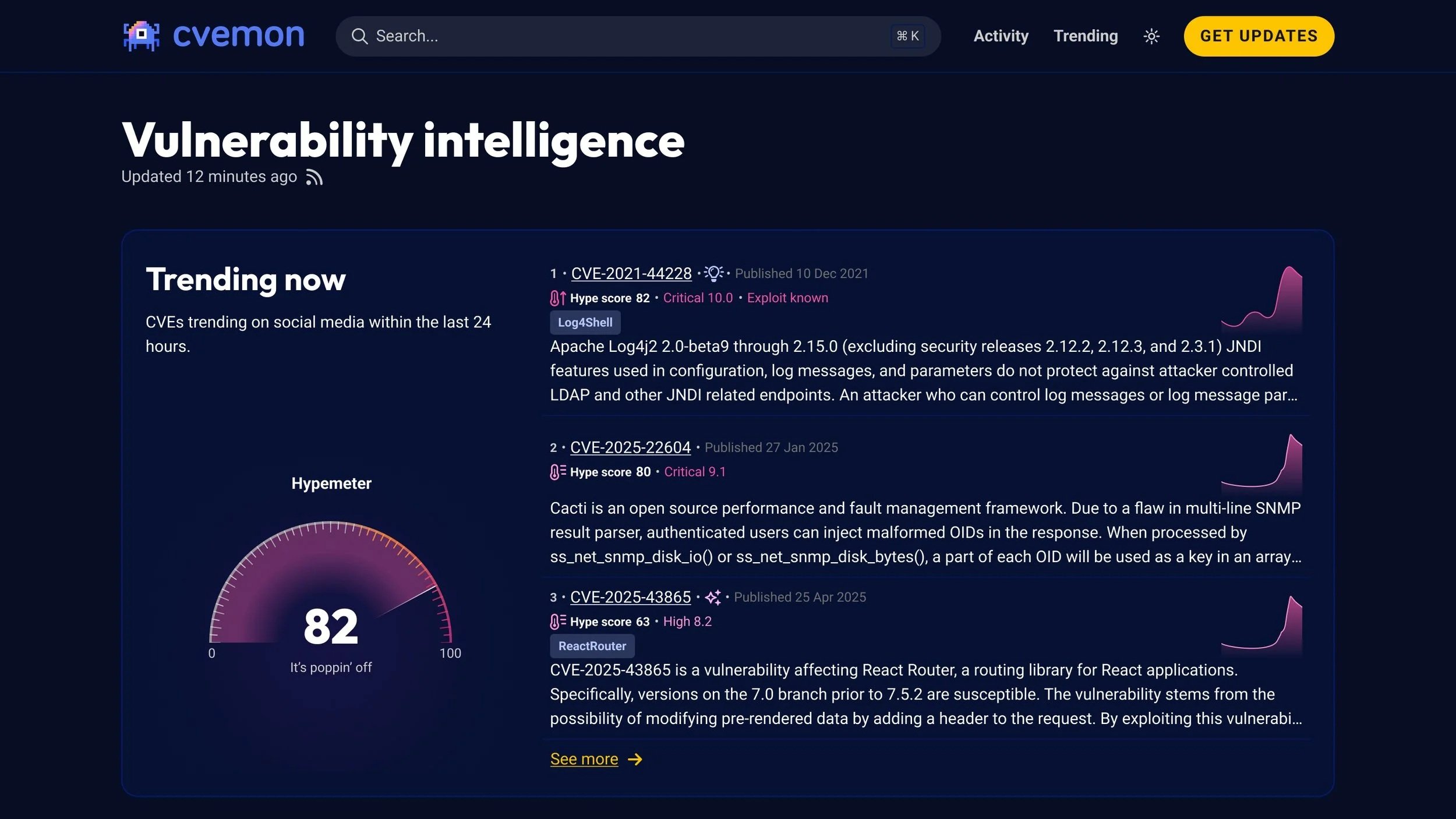
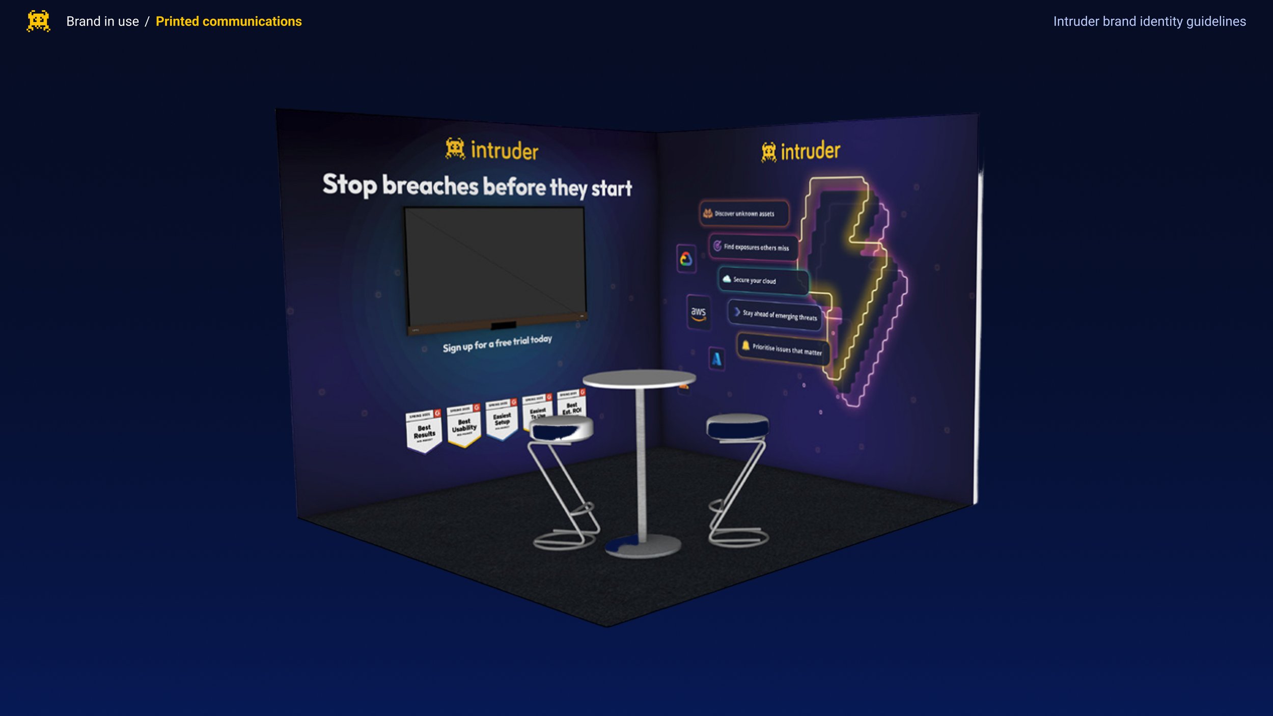
- Moved from pixel imagery to synthwave and neon aesthetics - deliberately nostalgic but read as contemporary by both internal and external audiences
- Darkened the overall background palette, brightening foreground elements for sharper visual contrast
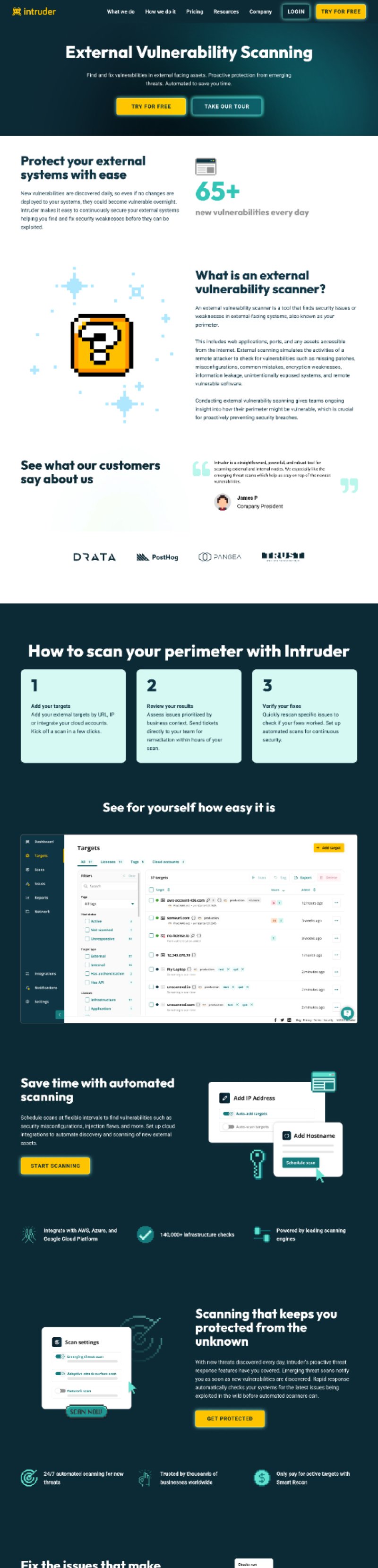
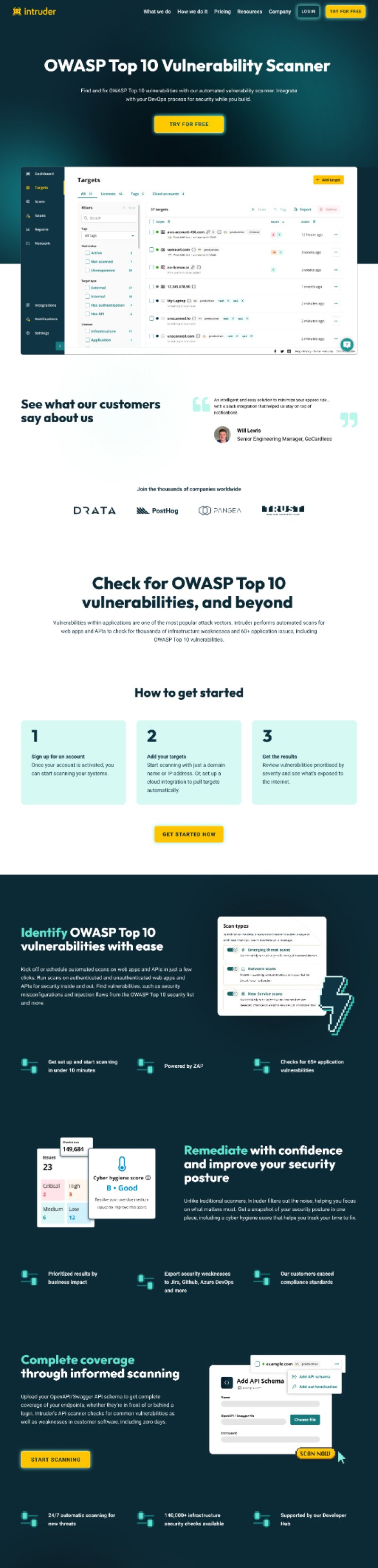
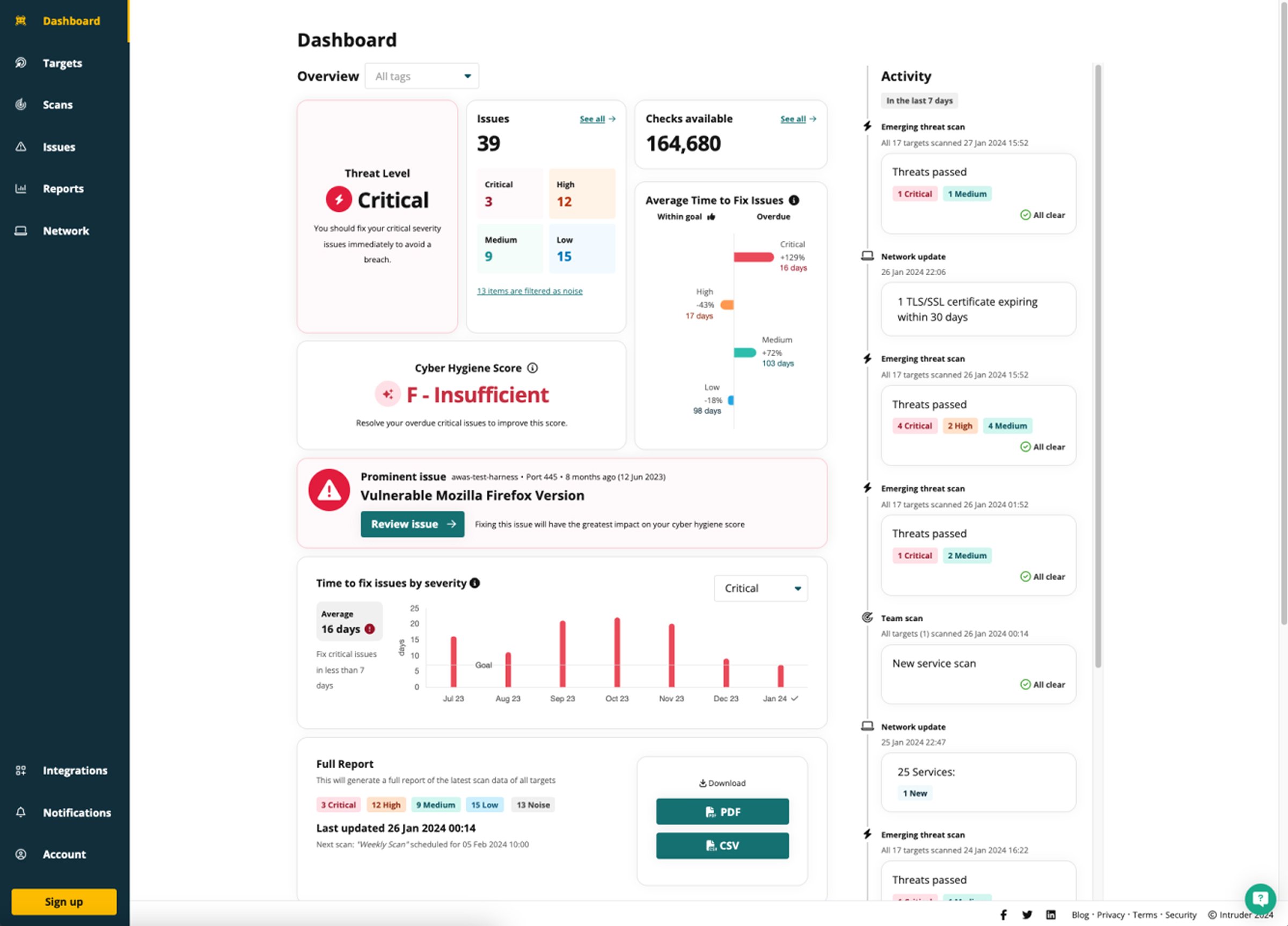
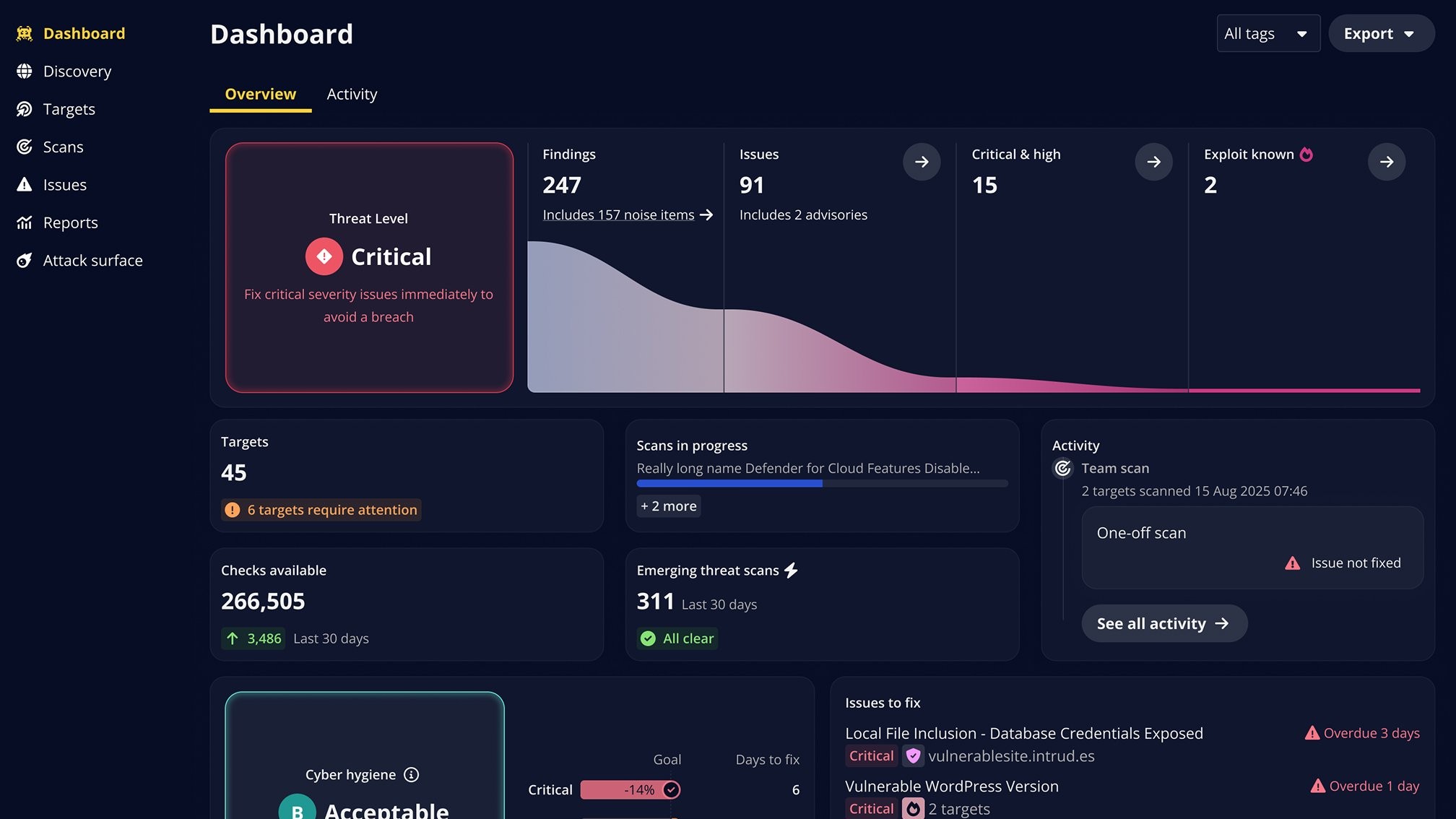
- Consciously diverged marketing from product - marketing leaned into messaging, visualisations and graphics; the product moved toward a more formal register aligned with enterprise expectations


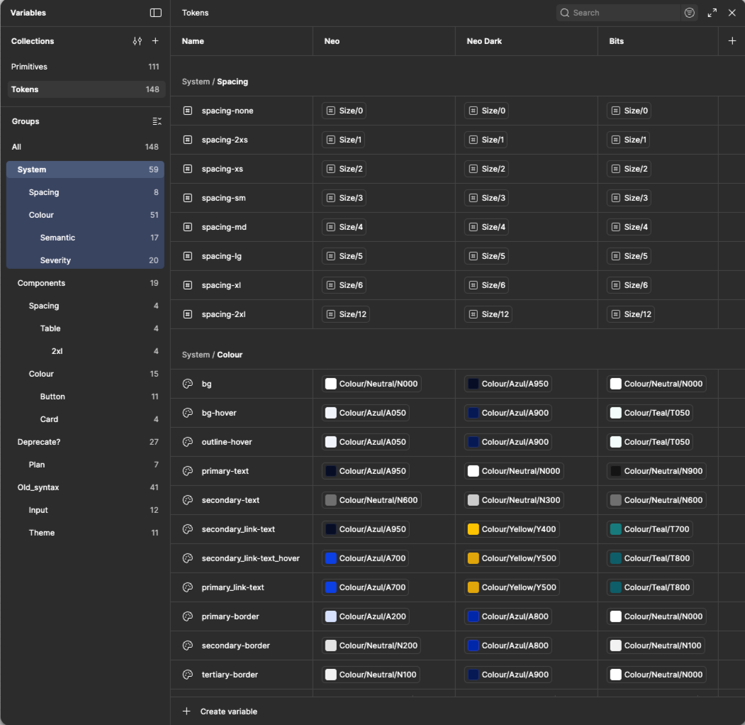
Design system
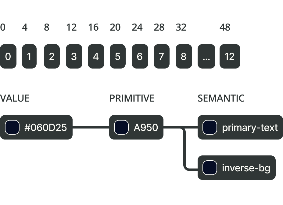
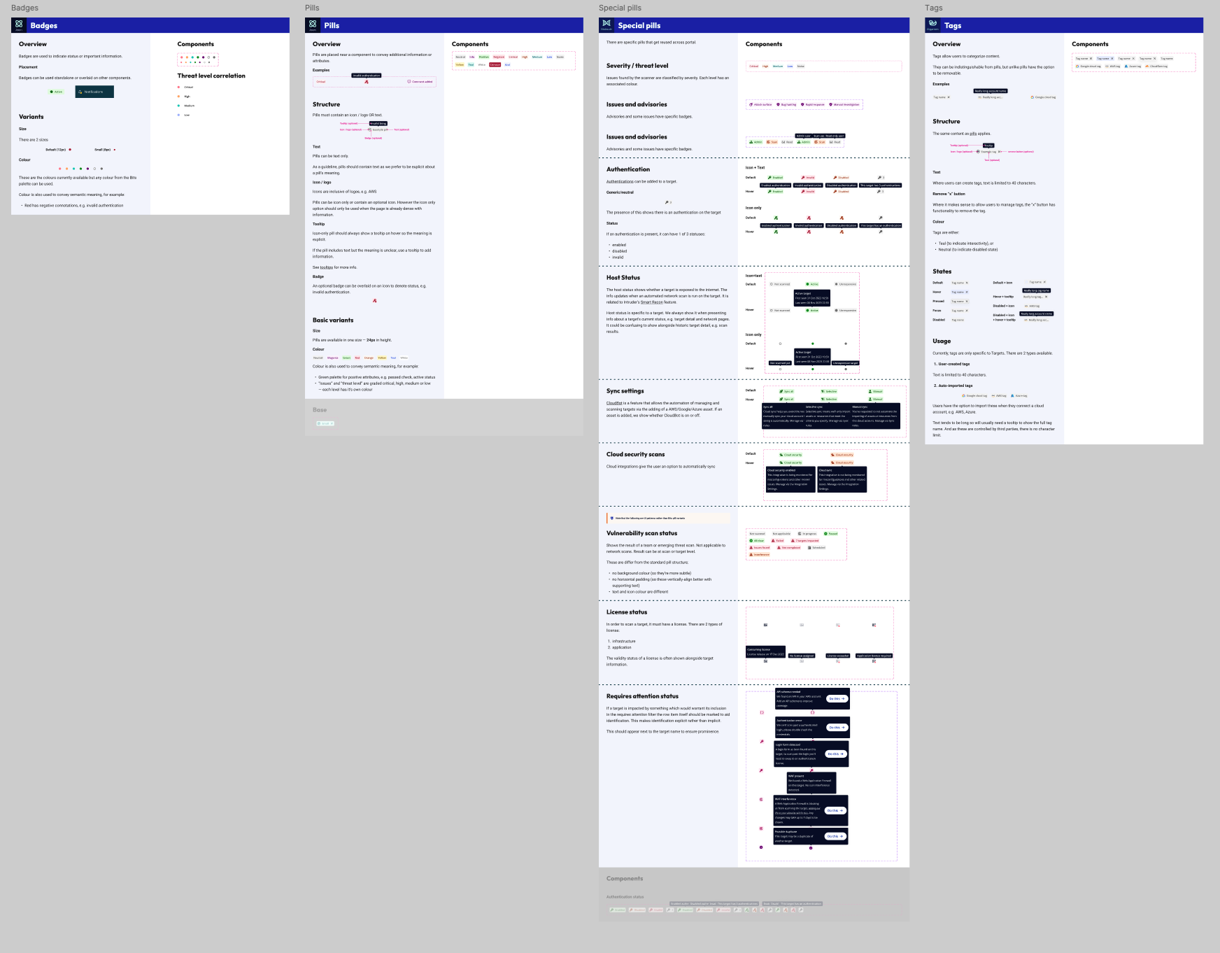
Core product updates were facilitated by a revised version of Intruder's design system 'Bits' - including an explicit 12-column grid, a 4px implicit grid, and both primitive and semantic tokenisation. Working closely with engineering, I prioritised components for immediate impact and ensured backwards compatibility to avoid total rewrites during rollout.
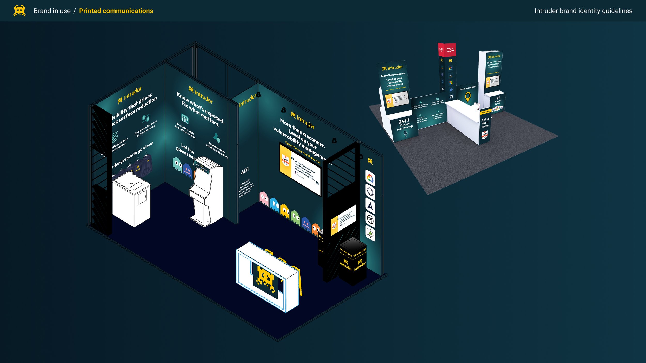
Brand in the wild
The brand system proved flexible enough for external partners to use effectively. Working with Blublu, I provided guidelines and reviewed work to ensure brand continuity as they created promotional content.
Constraints and trade-offs
- No budget - everything produced in-house, which shaped the visual directions we could pursue and ruled out certain types of photography and illustration
- Bandwidth - the full design team contributed, but nobody was on it full-time. I planned and rotated team members in and out based on availability
- Hard deadline - public brand touchpoints had a fixed date; the product followed in phases, which meant accepting some inconsistency during rollout
Rollout was phased deliberately: marketing surfaces first (advertising, site, conference materials), then product integration (design system, portal tokens, component revisions). Getting the external-facing brand right before touching the product meant we could test the direction in market before committing to deeper implementation.
I deprioritised my IC product work to maintain creative direction and project leadership. Output temporarily dipped in exchange for long-term leverage - a deliberate trade.
I maintained creative direction throughout and owned the design system implementation. One designer contributed significantly to asset creation under my direction, with two others contributing more selectively.
Outcomes
At the first major industry conference after the rebrand, Intruder's stand consistently drew larger crowds than competitors with significantly bigger budgets, a shift the CEO noted as one of the most visible markers of the brand's new credibility.
The capacity gain was driven primarily by the revised design system, component reuse and semantic tokenisation reduced build overhead and streamlined engineering handover, freeing the team to take on more projects without growing headcount.
Whilst there had been no budget for external creative talent, when leadership saw the impact of the changes we'd made I was able to successfully lobby for the recruitment of a dedicated Brand and Campaigns designer who worked across both Product and Marketing. This allowed us to dedicate the focus of one individual, under my oversight, to cultivating Intruder's brand assets. It also freed up our product designers to focus exclusively on product design going forwards.
Reflections
The decision not to change typography was right under the constraints - but it's the element I'd return to first with more time and budget. The synthwave direction worked, but there's a more fully committed version of this evolution that goes further.
The divergence between marketing and product brand was the most interesting decision we made - and one I'd defend. Enterprise buyers experience the brand in sales contexts before they experience it in the product. Getting those two registers right for their respective audiences was worth the additional complexity.
The biggest constraint was the absence of budget for external creative talent. Everything done in-house meant the ambition of the concept was always shaped by what the team could execute. A different resource model would have unlocked more of what the Voxel direction could have been.