Crafting a metrics framework to guide product success
Intruder had no consistent way to evaluate whether a product change had actually worked. Every release was debated on instinct, and personal reputation got tied to the outcome. I proposed a framework to fix that, and it ended up changing how the entire company made decisions.
Context
Intruder measured success through ad hoc financial indicators with no consistent framework for evaluating product changes. Feature releases were assessed individually by senior leadership through lengthy debates, making it nearly impossible to tie revenue impact to specific user behaviours - and tying personal reputation to each endorsed release in the process.
Together with the Head of Customer Success, I approached the VP of Product with a proposal that went on to be adopted company-wide as the shared means of measuring success for all product teams.
The problem
Without a persistent consensus on what metrics mattered, demonstrating genuine progress over time was near-impossible. Definitions could be debated, alternatives proposed, the landscape was always shifting. We identified four things any proposed framework had to pass four tests:
- Depict customer value - metrics had to stand in for the value that made customers want to pay
- Encourage learning - incentivise discovering new ways to increase product value, not just optimising what already existed
- Visualise bottlenecks - show where the limiting factor to growth was at any point, and how it moved as changes were made
- Direct attention - anyone in the organisation, looking at the metrics, should know what they could do to drive growth
Research and insight
With buy-in from the VP of Product, I followed Matt Lerner's approach to identifying North Star and Key Driver metrics , using survey data, user interviews, and Intruder's BI tool Count to map what growth actually looked like for the product.
New and existing customers felt Intruder's value at a consistent moment: the first time they found and fixed a serious security issue they hadn't known about. Free trials where at least one issue was found converted at 10.27%, compared to 2.88% where no issues were found - a 257% difference. Trials finding five or more issues converted at 14.4%, roughly double those finding only one to four.
For existing customers, the value was felt differently but just as consistently: Intruder mattered most when it continued to surface newly published vulnerabilities quickly. Retention wasn't about features , it was about ongoing vigilance.
Across diverse customer types, one phrase came back consistently: the value Intruder held for them was "Peace of Mind." That became the lens for the North Star metric.
Strategic reframe
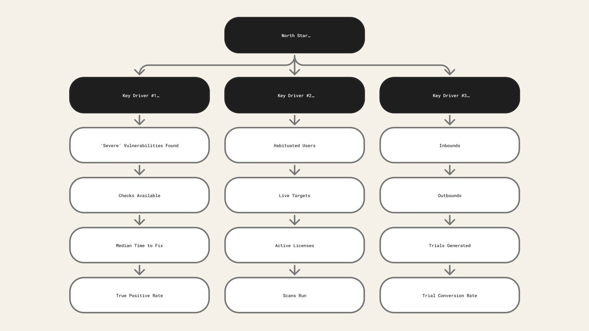
After determining that Intruder's North Star was a severe vulnerability found and fixed, we mapped the full path from Traffic to Revenue - identifying where the product created or destroyed value at each stage.
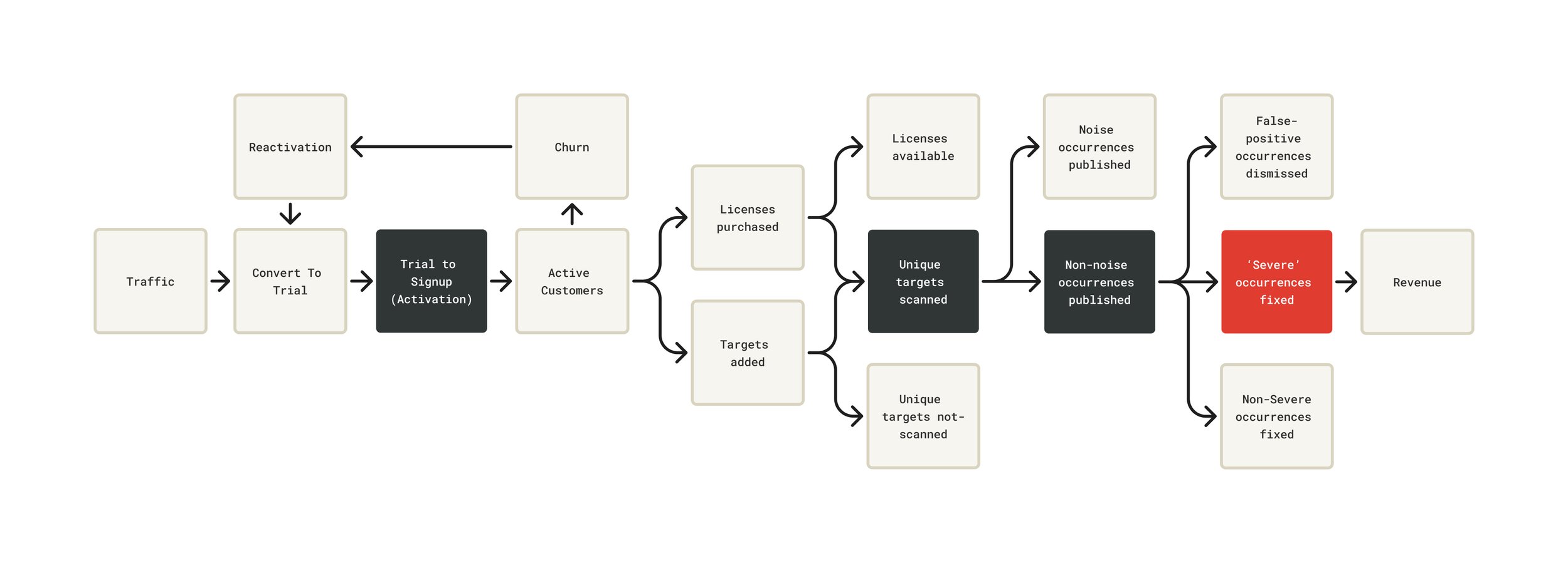
Three key drivers sat beneath the North Star, each with specific levers we could pull:
- Trial to signup (activation) - inbounds, outbounds, site conversion, trial conversion rate
- Unique targets scanned - habituation, targets added, licences used, scans run by type
- Non-noise occurrences published , genuine security issues surfaced, filtering out false positives and low-severity noise , severity, checks available, time to fix, true positive rate
Every product decision became traceable to a single question: does this increase the likelihood and volume of issues being found and fixed? That became the lens for prioritisation, for evaluating new features, and for thinking about the trial experience. It also changed what "activation" meant - from "user runs their first scan" to "customer reaches the point where Intruder has found something real."
Implementation
The framework was built into Count, Intruder's BI tool - with the North Star at the top, three Key Drivers beneath it, and the specific levers beneath each driver, each with live data and trend lines.
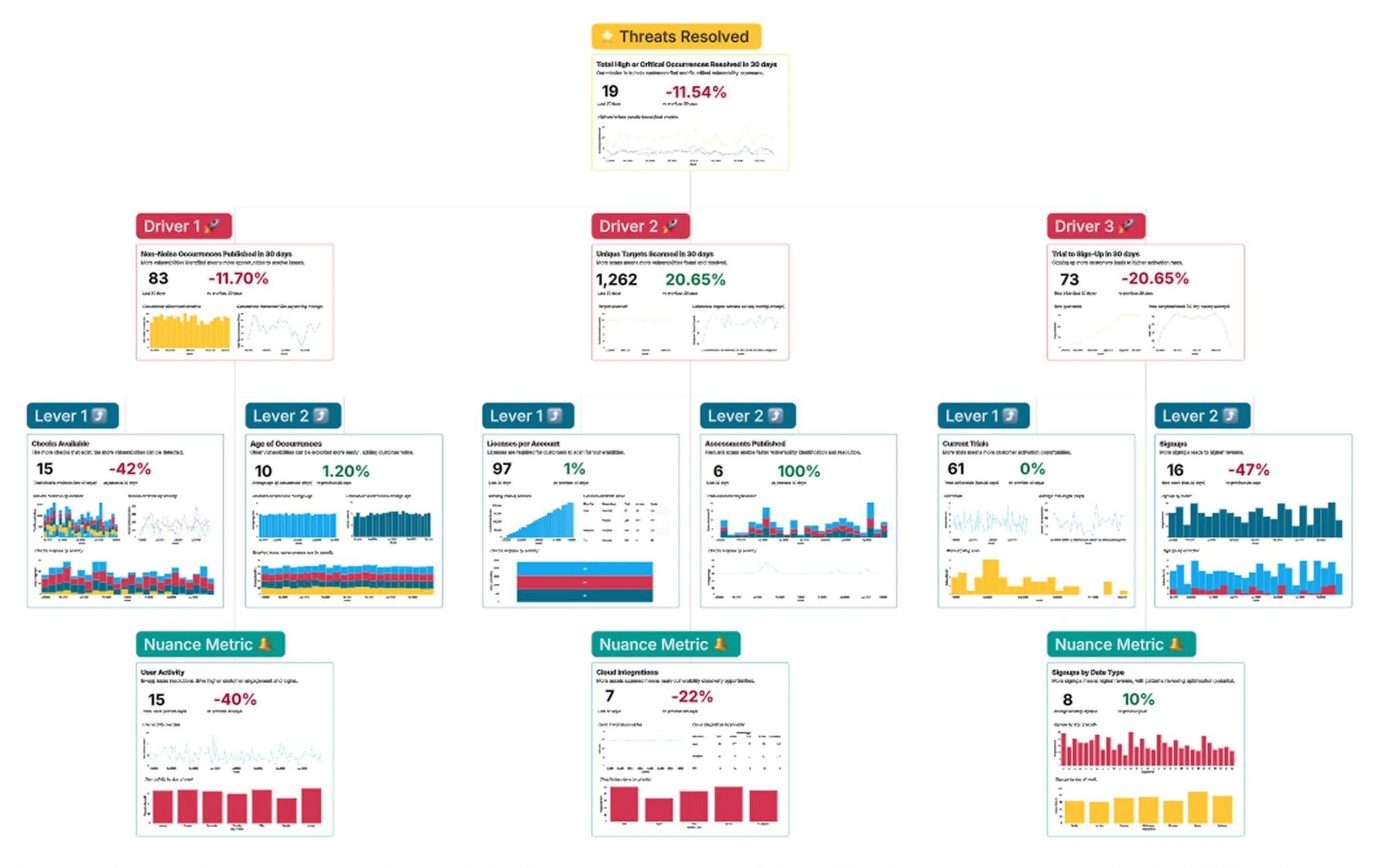
"The thing that sparked us moving away from those other tools and going more towards this data-driven approach to OKRs was Naomi, our Head of Support, and Keith, our Head of Design."
Andy Hornegold, VP Product at Intruder , Count webinar: Making OKRs Work"I sat down with Keith, our Head of Product Design, and we tried to work out the key drivers. This really for me is about understanding at a top level whether all of the levers and components are moving in the right direction."
Andy Hornegold, VP Product at Intruder , Count webinar: Making OKRs WorkCount subsequently featured the framework in their Making OKRs Work webinar as a case study for prospective customers. With clear bottlenecks now visible, we were able to argue for product squads assigned to specific key drivers - delegating accountability for outcomes rather than output.
With the framework in place and squads assigned to specific drivers, the next question was whether it would actually change what we built. The features that followed weren't speculative , each one traced directly back to a lever in the framework that wasn't moving fast enough.
Improvements driven by the framework
The framework didn't just change how we talked about success - it directly unlocked product decisions that hadn't had a framework for prioritisation before.
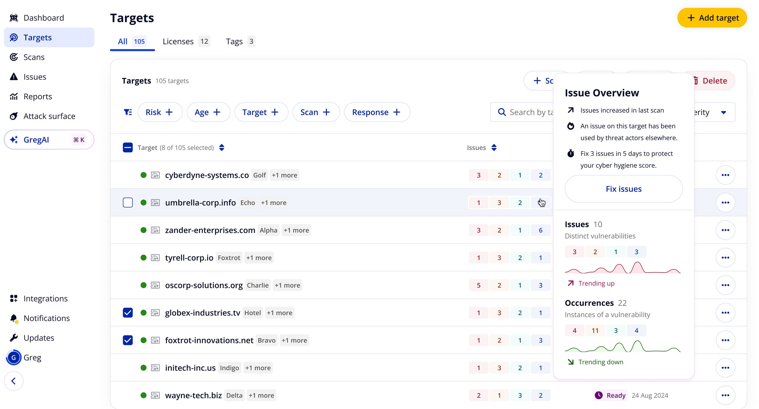
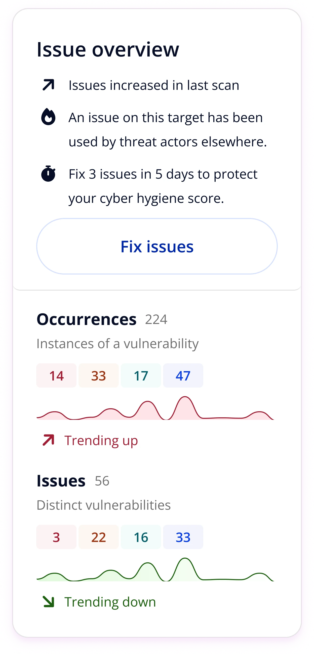
Issue overview popovers
One of the first light-touch improvements: surfacing richer context at-a-glance in the targets table. Popovers gave customers issue counts by severity, trend data, and a direct path to fix - cutting down triage time without requiring any navigation.
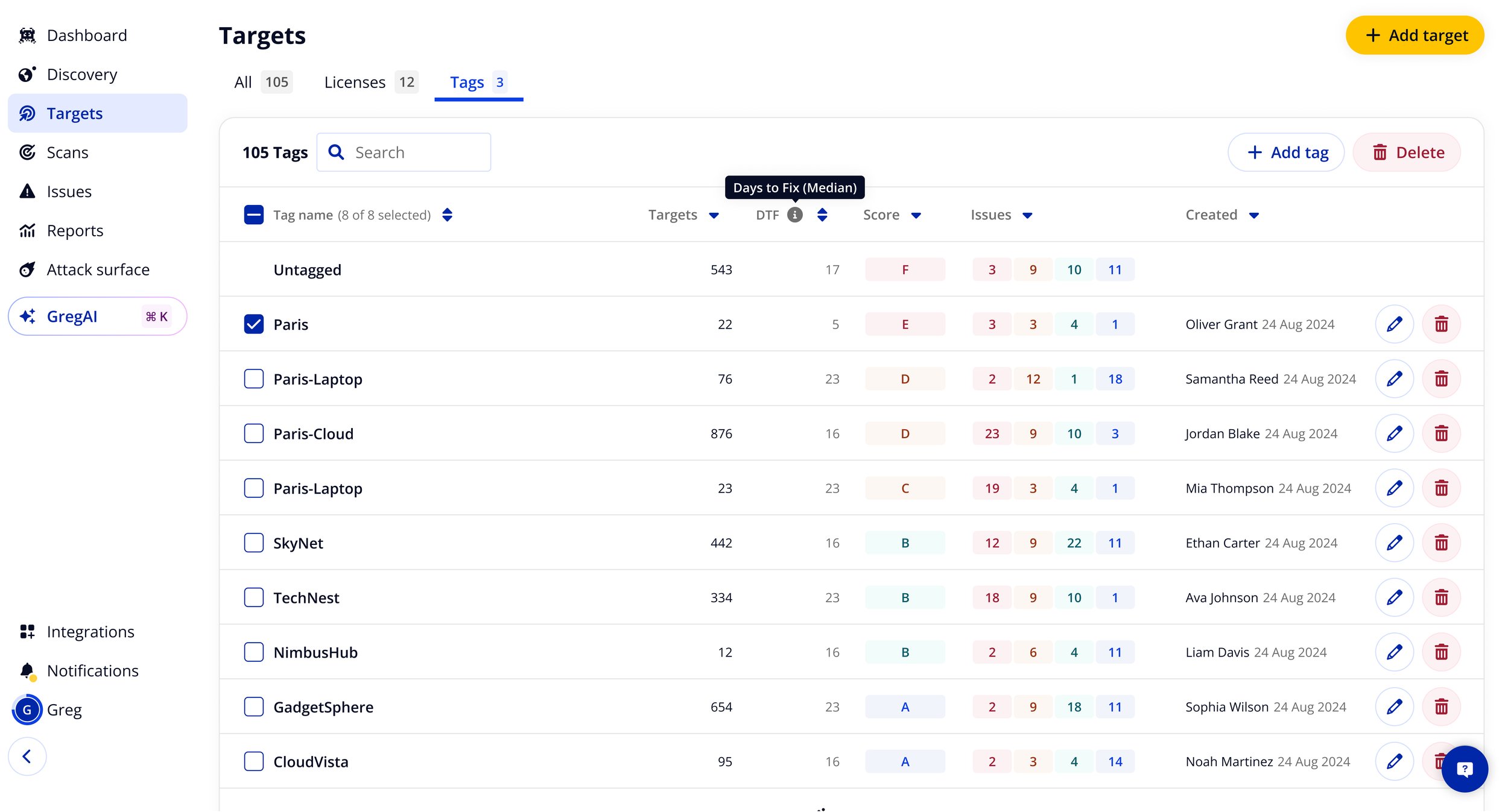
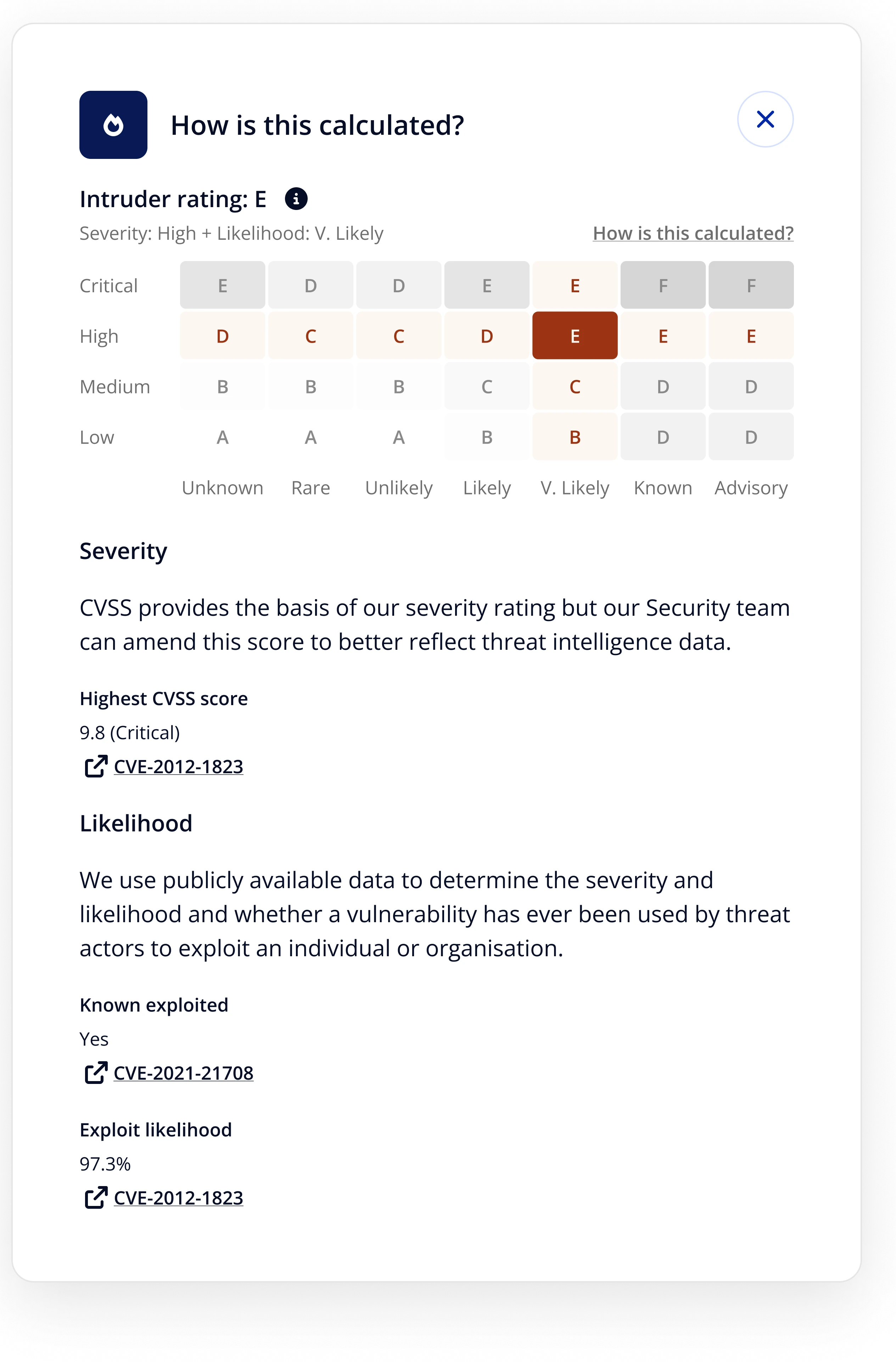
Cyber hygiene scoring by tag
I iterated on the tags table - a previously neglected feature - to surface vulnerability counts by severity, a cyber hygiene score (A–F), and median days to fix per tag group. This had never been provided to customers before, and solved problems that had been thought to require a full multi-tenancy feature set. For enterprise customers, median days to fix reduced by 10× when this was clearly surfaced.
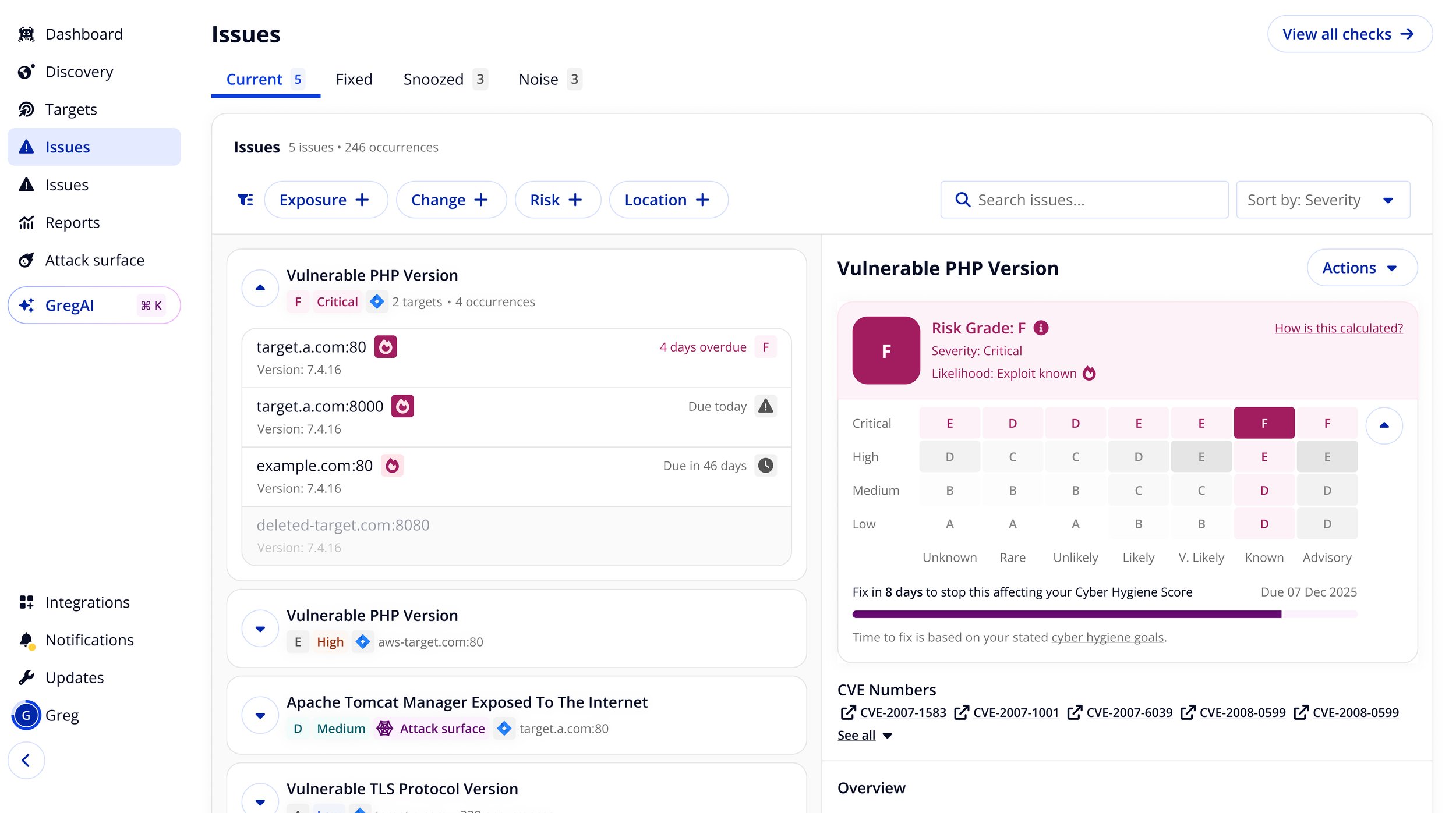
Exploit data in hygiene scoring
The next step was tying exploit likelihood into the hygiene score itself. Previously, scoring relied on severity alone. Combining severity with exploit likelihood - whether a vulnerability was actively used in the wild - let us surface genuinely high-risk issues that moderate severity scores would have buried.
Scan coverage and licence flow
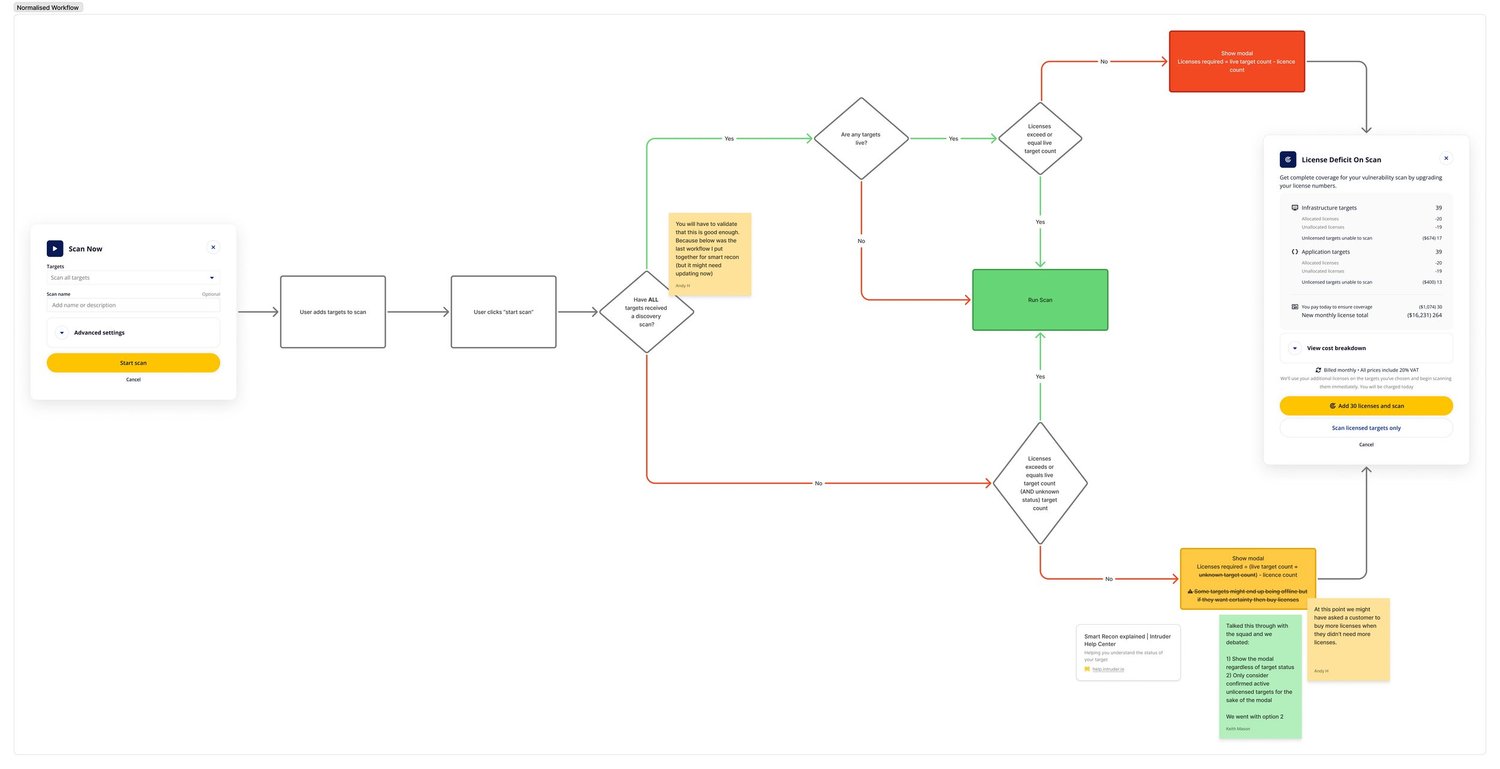
I introduced the concept of 'Coverage' into the portal , a single metric showing what percentage of a customer's unique targets had been scanned in the last seven days. It was a direct response to one of the key driver levers: increasing unique targets scanned.
Alongside this, I designed a scan flow that handled licence deficits transparently at the point of scanning rather than blocking the user or triggering unexpected charges.
Outcomes
Reflections
This project was as much about organisational change as product design. The hardest part was not building the framework - it was convincing people to adopt a new way of thinking about success. The external validation from Count helped, but the real lever was working bottom-up: getting individuals to feel the framework served their interests before asking the organisation to commit to it.
If I were doing it again, I'd move faster to formalise the squad structure that followed. The framework created clarity that the organisation wasn't yet structured to act on, and that gap created friction in the short term.