The problem
The Argos app had a good conversion rate for collections in store however historically had an issue with actually getting customers to turn up and pay for these collections. This is because customers historically would reserve products through a channel like the App before shopping around to find more competitive prices for the same product elsewhere.
Strategically the business worked to address this by introducing the FastTrack proposition forcing pre-purchase for customers if certain criteria were met on the part of the product. Initially the only change on Apps as part of this was the presenting of the 'pay now' proposition as the primary means to obtain an in-store collection. This largely addressed the first problem but also raised the issue of checkout attrition amongst digital customers on all channels. On mobile channels this was particularly a challenge so we began to explore ways to address it.
Customers wanted to be able to convert without stress or signing up to anything they felt uncomfortable with. They also generally only wanted to collect one or two items at short notice from their local store. This called into question the conventional wisdom on the usefulness of the trolley which was used mainly by customer to shortlist products, not necessarily to collate a purchase.
The approach
We began to ask the question, why can't customers convert from the product page? New services like Apple and Android pay could enable us to circumvent any potential attrition in the checkout entirely and enable a form of one-click purchase. The majorly obstacle to this was Argos's varied fulfilment options. Argos didn't have universal stock coverage and so it was important to be able to communicate product availability whenever a purchase decision was to be made. This made it too complicated to do on the product details page itself but perfectly suited to a new form of interstiutary page that took the form of a stripped down basket built around one product with a heavy emphasis on fulfilment options. This was to attempt to coax predominantly cash paying Argos customers to retain the service they had gotten used to, easy reservations, but also commit to following through on the reservations they had made.
Below is an initial map of how I imagined the process unfolding.


Initial screens for the 'Get-it-now' (GIN) product-page
The initial change to the product details was the introduction of a new primary call to action which we at first called 'Get it now'. This relegated 'Add to trolley' to the same function as the 'Add to wishlist' button and there was a potential argument that the lines between those two features could become increasingly blurred as time went on if the new functionality proved successful.
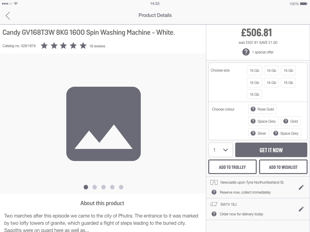
iPad view of the revised product page
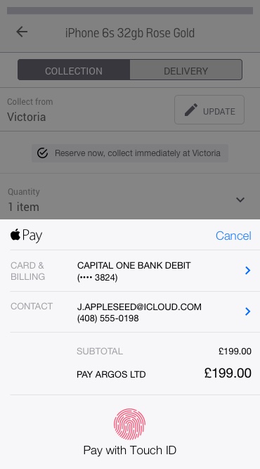
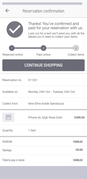
Mobile collection screen succession

Mobile delivery screen succession

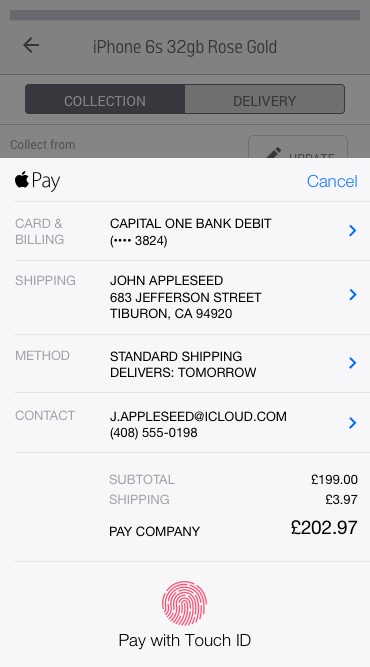

Organising a collection was significantly easier than organising a delivery, namely as you didn't have to validate delivery locations. Despite this, in our exploration of the issue Apple and Android pay seemed robust enough to handle both options.
The approach itself was well received. Despite this, the technical work required to facilitate functionality like Apple or Android Pay was an ongoing issue that raised questions about the feasibility of rolling it out in the short term. This is even with us working closely with staff from Apple throughout this period. Regardless, there were several key learnings from the project that had a lower technical cost that could be brought over into subsequent projects.
I produced the wireframes, documentation, collaborated directly with the developers and key stakeholders to determine the ideal approach to this project. The user interface design and execution of the brand's visual language was undertaken by a dedicated designer, not myself.
Selected Works
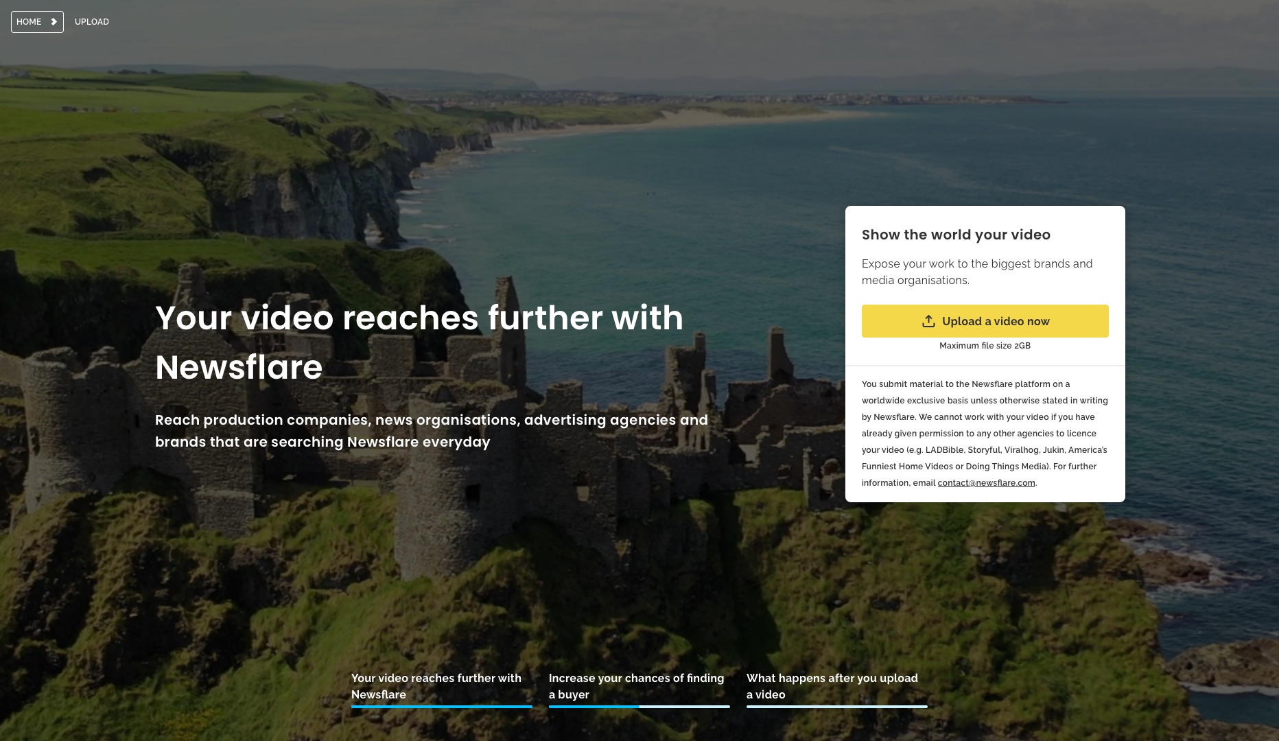
Scaling Newsflare's Video PipelineResearch, Experimentation, Process Mapping, Information Architecture, UI Design

Brand refresh rollout at NewsflareProject Management, Design Systems

Leading growth hacking at NewsflareInterviews, Experimentation, Marketing
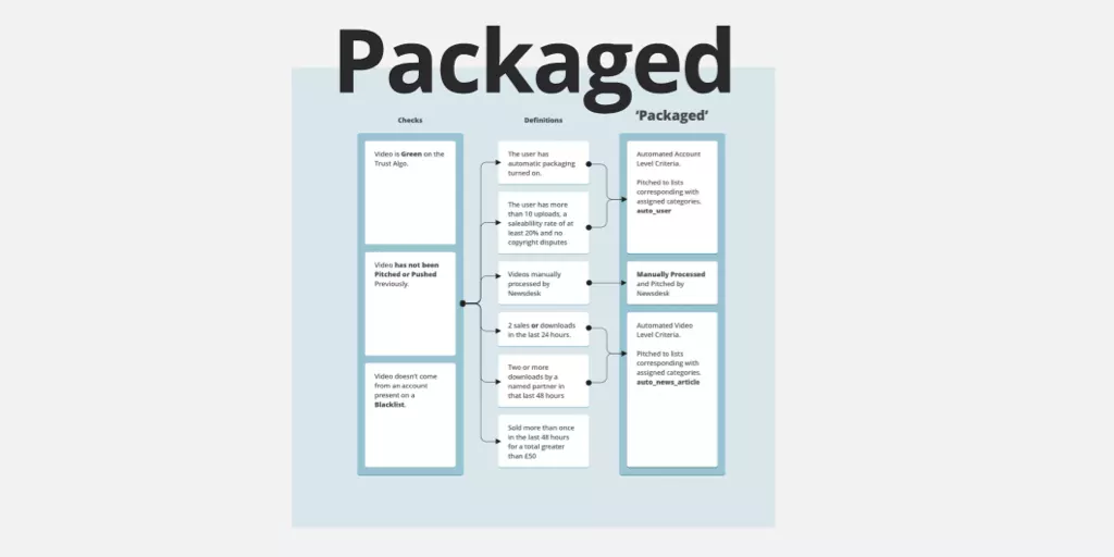
Scaling video processing at NewsflareProject Management, Research, Process Mapping

Breaking news content distributionResearch, Journey Mapping, Process Optimisation

Assessing Newsflare's AppResearch, Interviews, Product Assessment, Screen Flows
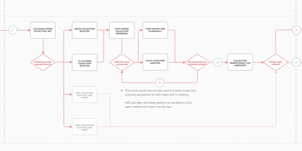
Redesigning Sainsbury's click and collectResearch, Onsite, Journey Mapping, Process Optimisation

Redesigning kiosk collectionsResearch, Onsite, Journey Mapping, Process Optimisation
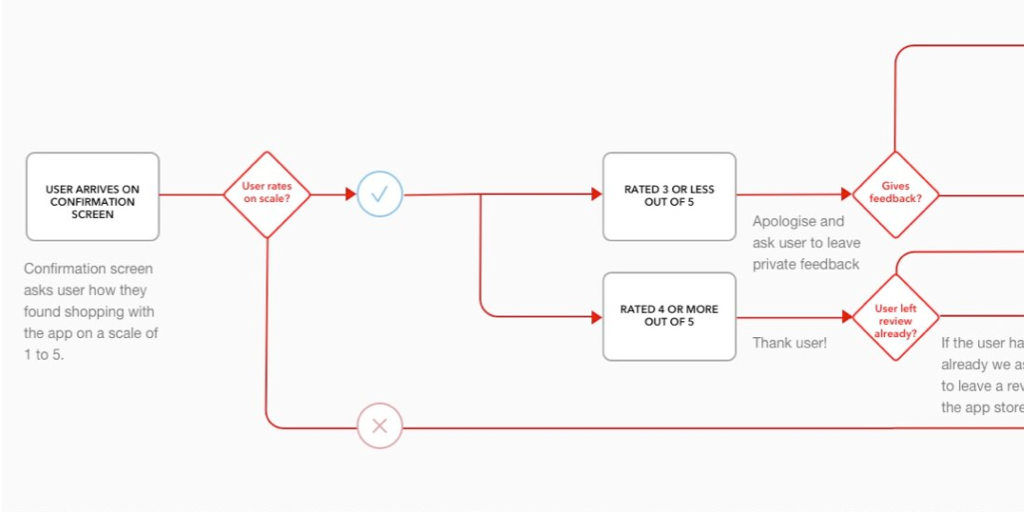
Feedback mechanisms in AppsScreen flows, User Engagement

App navigation at ArgosResearch, Screen Flows

HouseTrip property listing redesignResearch, Information Architecture, Interface Design
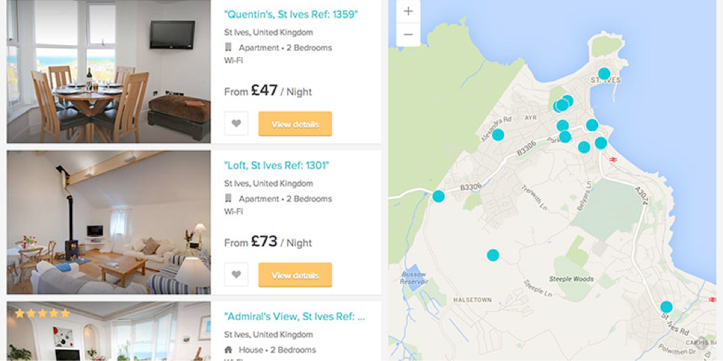
Improving search conversion at HouseTripInformation Architecture, Interface Design

HouseTrip checkout reskinInterface Design

HouseTrip Tripmaker conceptConcept Exploration, Interface Design
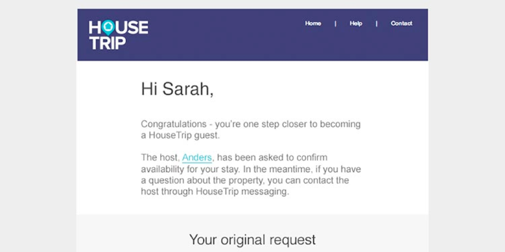
HouseTrip email-on-enquiryInterface Design
Contact
Email
keith.stewart.mason at gmail dot com
LinkedIn
@iamkeithmason