This project started as part of an initiative to get better feedback from customers on their experience of Apps. Business stakeholders were sensitive to bad ways to ask for feedback but were keen that some measure of qualitative feedback be garnered by users. Initially in a kick off discussion the subject of small feedback platforms in places like Airports came up. These were quick low-effort means of offering feedback at the end of going through something like Security or Passport control.

There was no reason we couldn't apply the same reasoning here. Historically there has been a strong tradition of interrupting a users journey within digital platforms to ask for feedback. However, the placement at the end of a journey, like real-life examples of security controls in airports seems more sensible. There are an increasing number of articles online corroborating this realisation. In light of this reasoning, we began to look at the appropriate place to insert our feedback request. We quickly settled on reservation and delivery confirmation screens.
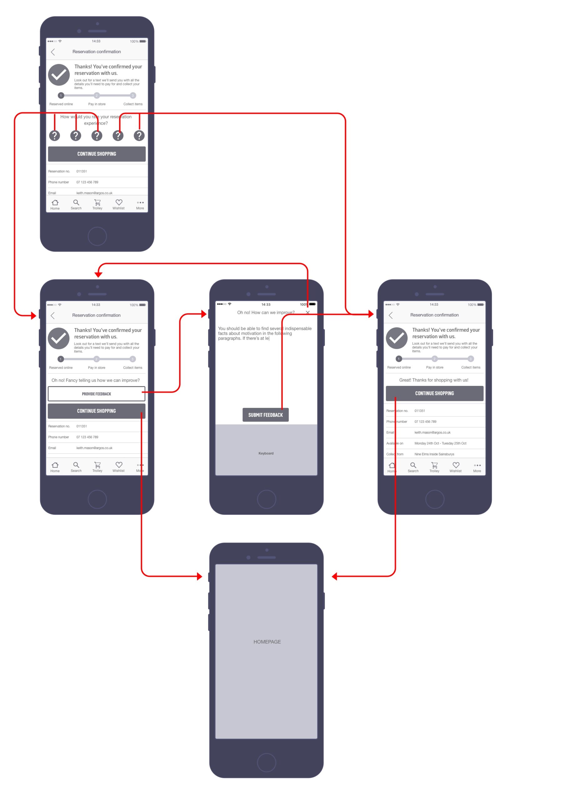
Initial flows to demonstrate my thinking on the review process.
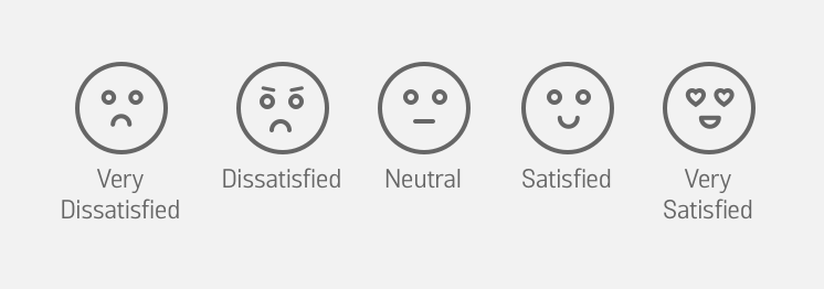
Whilst working on this we also wanted to do something actionable with this feedback. As a result we, based on thinking regarding NPS ratings, decided that if users rated us 4 or greater out of 5 that it'd be great if we asked them to share this publicly in the form of a review. If a customer-rated us less than 4 out of 5 we would instead funnel the user to a means of leaving direct feedback with Argos staff. There was some discussion over whether or not this constituted a dark pattern but it was felt that if we could funnel negative feedback directly to customer support representatives, especially considering the context of being at the end of a transactional journey that this was actually beneficial to everyone involved.

Flows demonstrating the logic behind which we'd solicit feedback.
The approach was well received by the business and in guerilla sessions and as a module was something we could look at implementing in other areas of the app under certain conditions after the projects initial release.
Landing screen
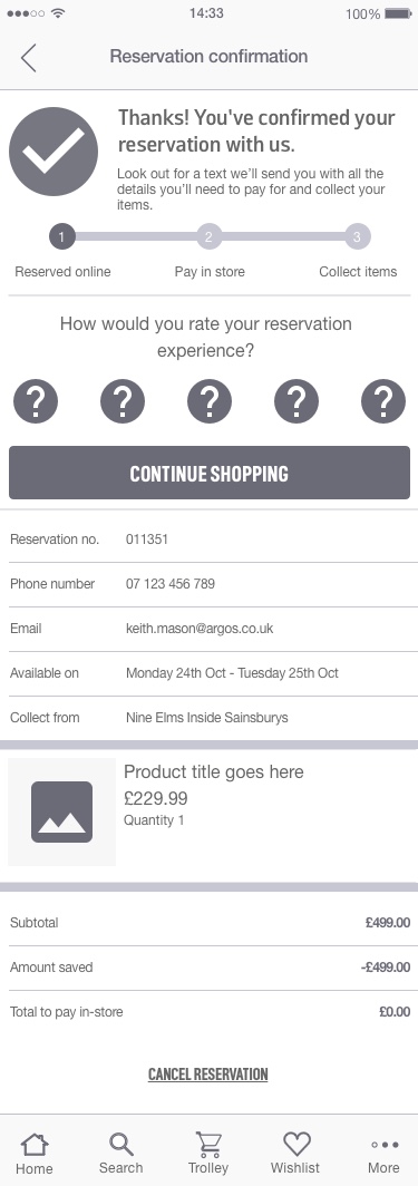
Positive response

Negative responsive

I produced the wireframes, documentation, collaborated directly with the developers and key stakeholders to determine the ideal approach to this project. The user interface design and execution of the brand's visual language was undertaken by a dedicated designer, not myself.
Selected Works
Scaling Newsflare's Video PipelineResearch, Experimentation, Process Mapping, Information Architecture, UI Design

Brand refresh rollout at NewsflareProject Management, Design Systems

Leading growth hacking at NewsflareInterviews, Experimentation, Marketing
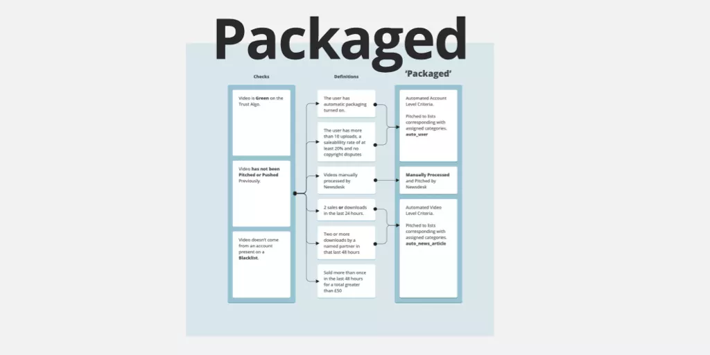
Scaling video processing at NewsflareProject Management, Research, Process Mapping

Breaking news content distributionResearch, Journey Mapping, Process Optimisation

Assessing Newsflare's AppResearch, Interviews, Product Assessment, Screen Flows
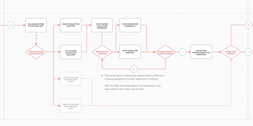
Redesigning Sainsbury's click and collectResearch, Onsite, Journey Mapping, Process Optimisation

Redesigning kiosk collectionsResearch, Onsite, Journey Mapping, Process Optimisation
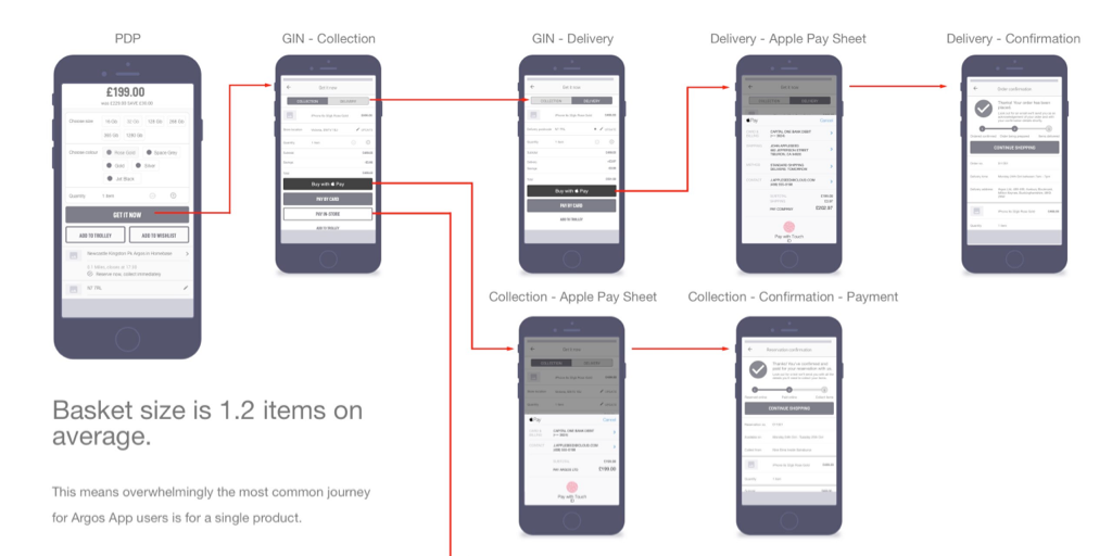
Improving Argos collection ratesScreen Flows, Process Optimisation

App navigation at ArgosResearch, Screen Flows

HouseTrip property listing redesignResearch, Information Architecture, Interface Design
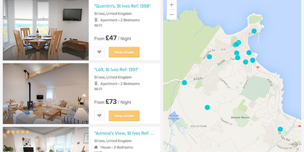
Improving search conversion at HouseTripInformation Architecture, Interface Design

HouseTrip checkout reskinInterface Design

HouseTrip Tripmaker conceptConcept Exploration, Interface Design
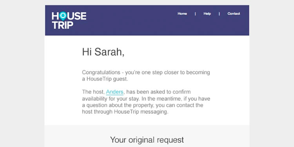
HouseTrip email-on-enquiryInterface Design
Contact
Email
keith.stewart.mason at gmail dot com
LinkedIn
@iamkeithmason