When I joined the Argos team the navigation on the Apps channel was one of the first major things we looked at. The channel was radically inconsistent in its handling of navigation across both Android and iOS and whilst it was evident early on that this was creating much more work; for both Argos and its customers their was a real appetite to take advantage of the distinctives offered by each platform.
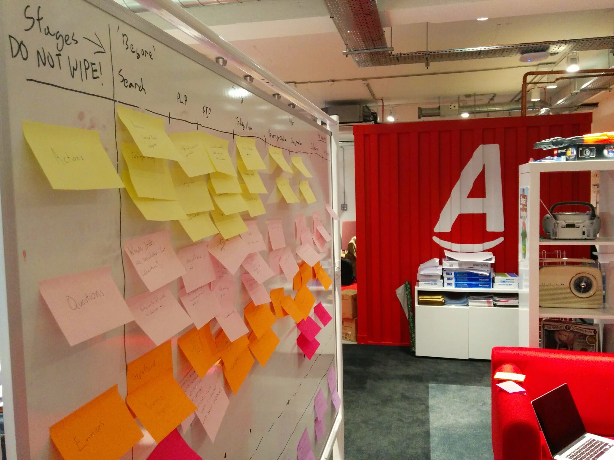
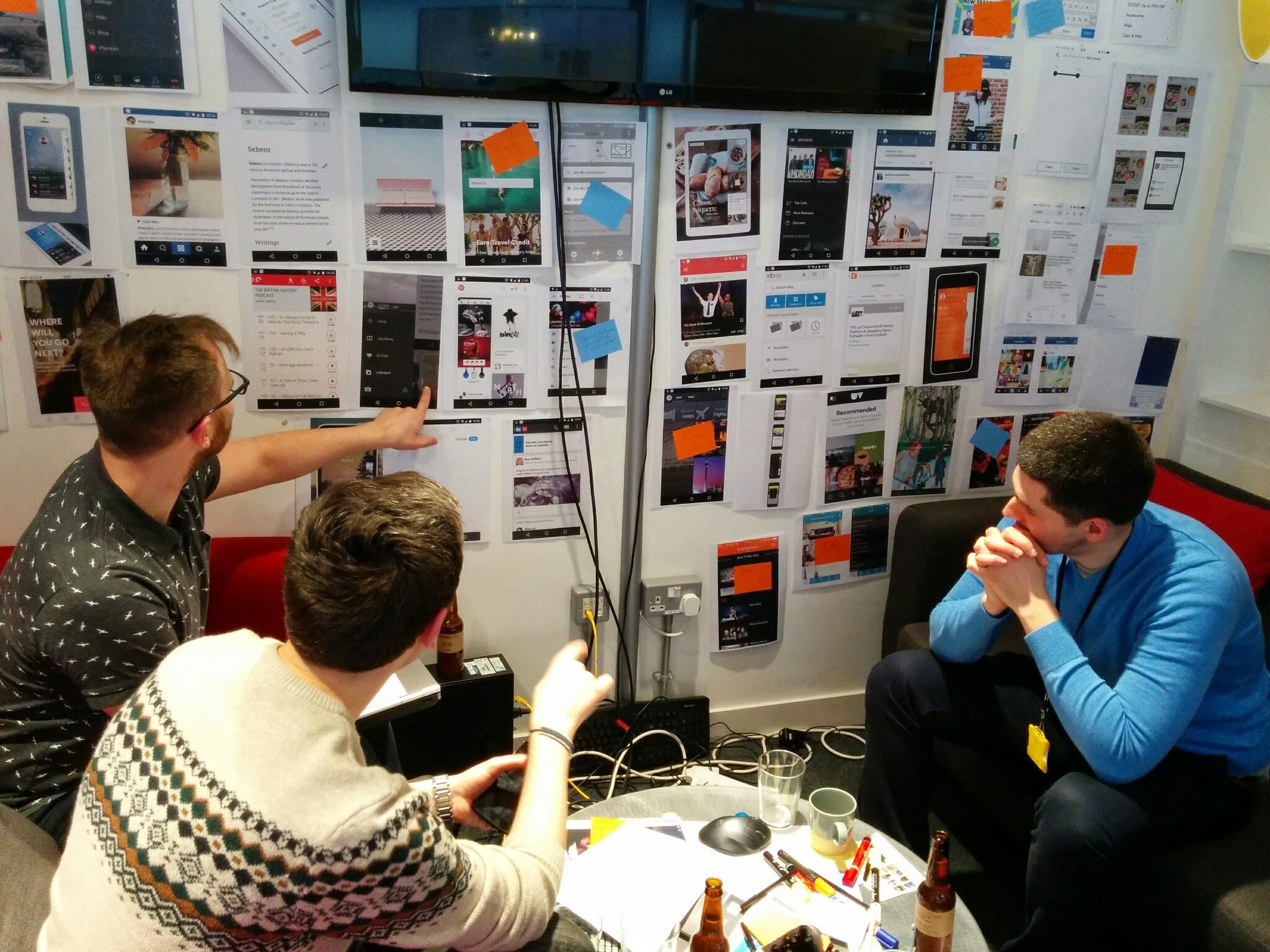
Initially I kicked off the work by leading a workshop with the existing Apps team to get a sense of the existing state of affairs internally focusing on perceived existing issues with navigation and aspirational approaches the team was eager to work towards. I also asked the teams to walk through several scenarios from the perspective of a customer profile generated from what we knew of the typical Argos Apps user. From this I got a good sense of both the team I was working with and their impressions, based on their extensive knowledge of potential opportunities that existed to improve the navigation. The workshop also generated several ideas from amongst the team that we were keen to take into user testing to validate as quickly as possible.
Initial group ideation

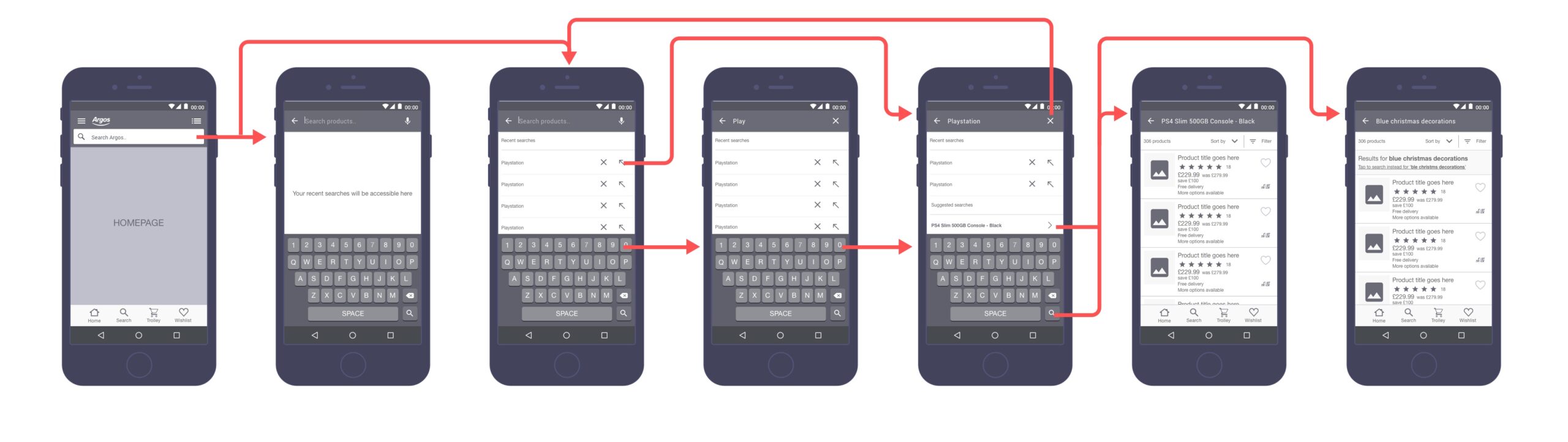
The below diagram shows work I undertook in light of user testing that showed that Argos users, for a variety of reasons, really prioritised search as a primary means of navigation. Initially the browse and search process were presented as equally weighted to customers but we saw a real improvement in the conversion funnel of the Apps by prioritising the latter experience.
The general approach we went with in the end is drawing on the existing and well known patterns associated with each platform. For Android this was Material Design and the iOS equivalent. Despite this we worked hard to ensure the logic was consistent across the two platforms whilst ensuring this move didn't negatively impact the overall experience.
Hey there, this is the default text for a new paragraph. Feel free to edit this paragraph by clicking on the yellow edit icon. After you are done just click on the yellow checkmark button on the top right. Have Fun!
Despite their differences we worked to ensure consistency across the platforms. We also worked to standardise the number of header variations we had so that we could provide a framework to customers that would enable them to feel more confident and comfortable using the app.
Android navigation variants

iOS navigation variants

On the respective overflow menus, the handling of each per channel was superficially quite different but was intended to be logically consistent. The content in both was to be the same but accessible in ways familiar to users of each platform.
Android overflow navigation

iOS overflow navigation

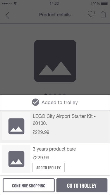
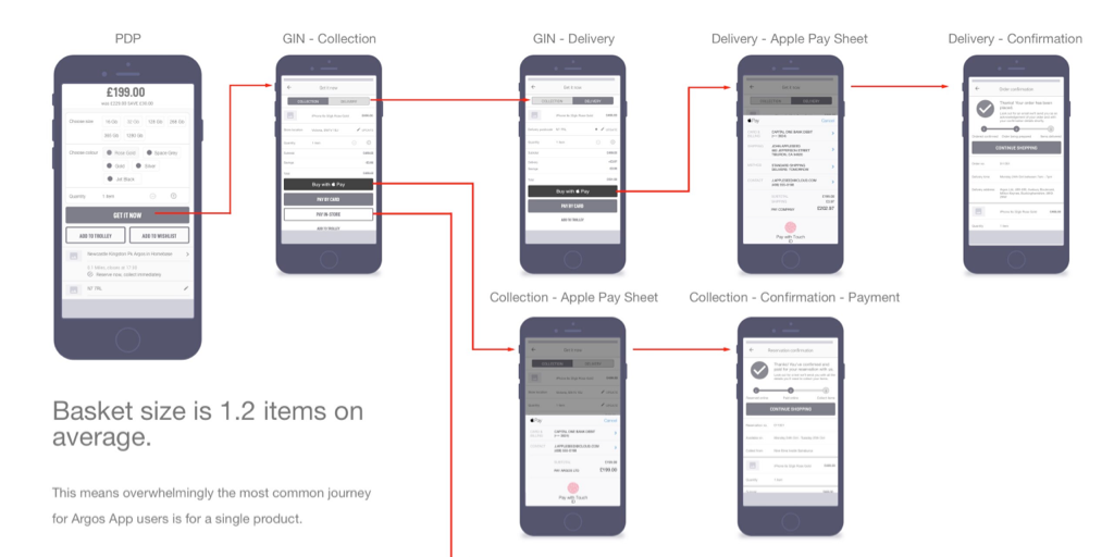
The other change was in the existing behaviour regarding how the App responded to users adding items to their basket. The existing behaviour was to display an onscreen notification confirming the action had taken place. This worked in a fashion but did nothing to push the user down the funnel. The basket size across all channels was fairly low, so we could assume that once a customer had one item we were confident they might be ready to checkout.
The new proposal was that when a user added an item to the trolley an overlay would slide in confirming the action. In addition to this it would create a space in which we could cross-sell products to customers and give a clear call to action, directing the user to visit the trolley and checkout with their items. This would tackle both the issue of inaction on the part of the user when a product was added to trolley and attempting to increase average basket size.
Before: Onscreen notification
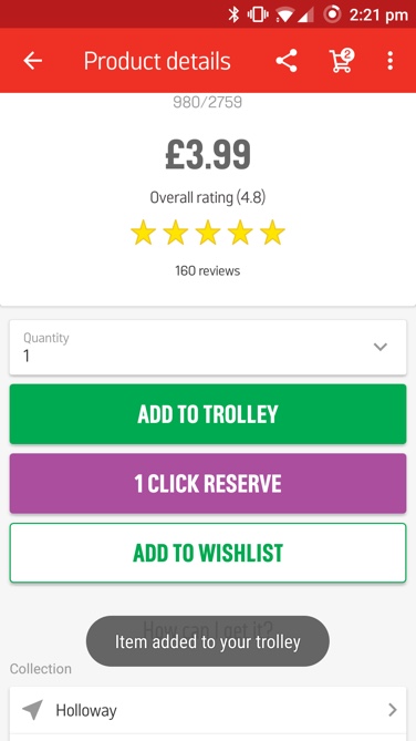
After: Overlay with added cross-sell region
I produced the wireframes, documentation, collaborated directly with the developers and key stakeholders to determine the ideal approach to this project. The user interface design and execution of the brand's visual language was undertaken by a dedicated designer, not myself.
Selected Works
Scaling Newsflare's Video PipelineResearch, Experimentation, Process Mapping, Information Architecture, UI Design
Brand refresh rollout at NewsflareProject Management, Design Systems

Leading growth hacking at NewsflareInterviews, Experimentation, Marketing
Scaling video processing at NewsflareProject Management, Research, Process Mapping

Breaking news content distributionResearch, Journey Mapping, Process Optimisation

Assessing Newsflare's AppResearch, Interviews, Product Assessment, Screen Flows
Redesigning Sainsbury's click and collectResearch, Onsite, Journey Mapping, Process Optimisation

Redesigning kiosk collectionsResearch, Onsite, Journey Mapping, Process Optimisation
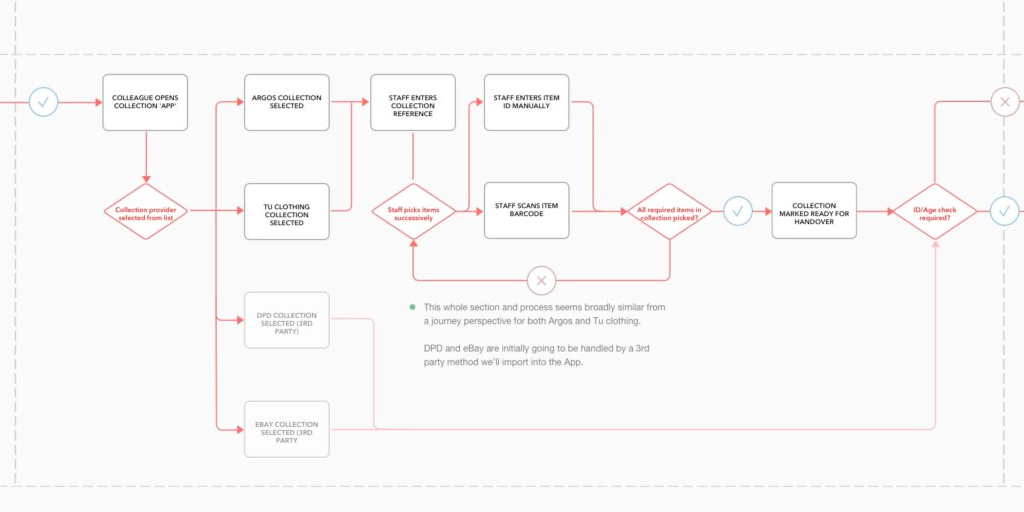
Improving Argos collection ratesScreen Flows, Process Optimisation
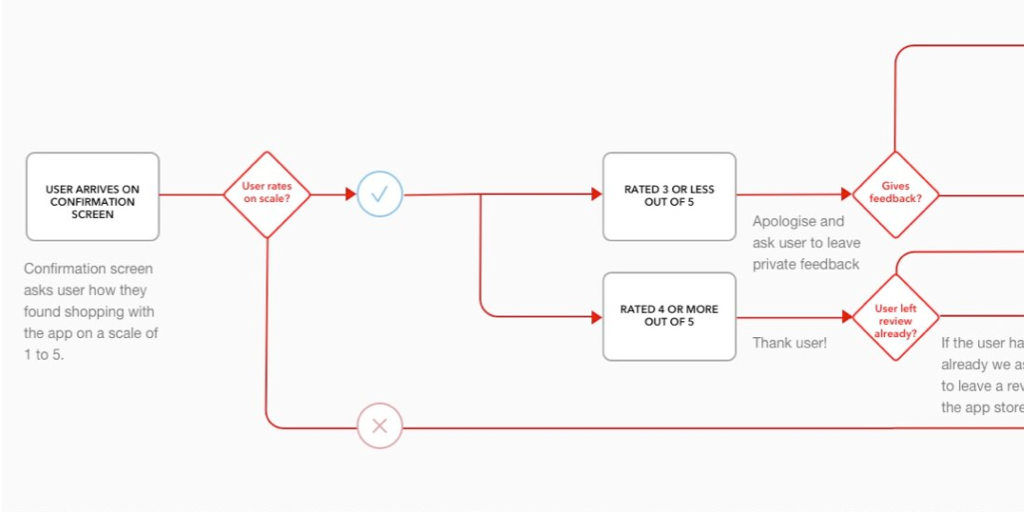
Feedback mechanisms in AppsScreen flows, User Engagement

HouseTrip property listing redesignResearch, Information Architecture, Interface Design
Improving search conversion at HouseTripInformation Architecture, Interface Design

HouseTrip checkout reskinInterface Design

HouseTrip Tripmaker conceptConcept Exploration, Interface Design
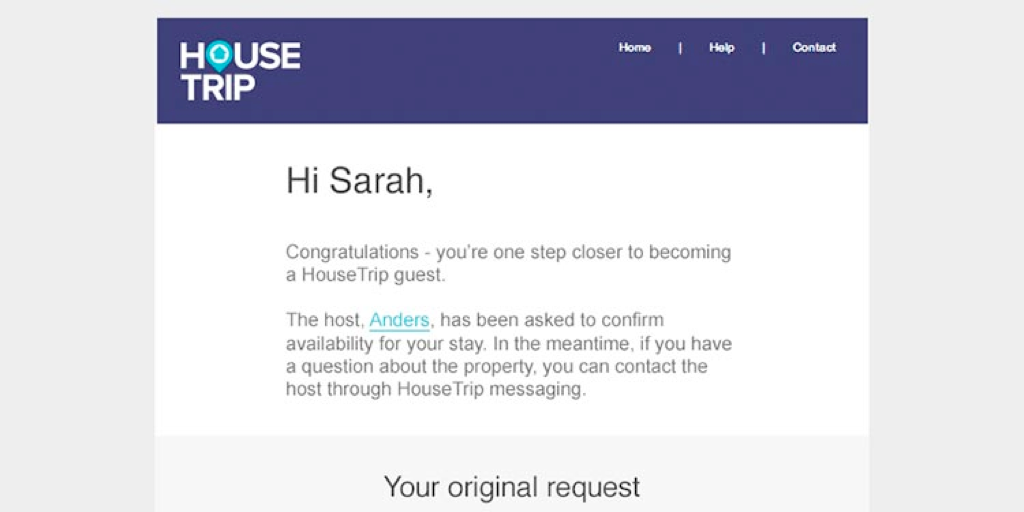
HouseTrip email-on-enquiryInterface Design
Contact
Email
keith.stewart.mason at gmail dot com
LinkedIn
@iamkeithmason