I was approached to work on the Click and Collect experiences at Sainsbury's. The existing system had mixed amounts of success and whilst was functional had a number of reported issues both by customers and staff.
We started off by initially going into stores and finding out how the process worked across all levels.
Whilst a long term strategic addressing of the journey was needed we began to work on a shorter term tactical fix to the existing issues.
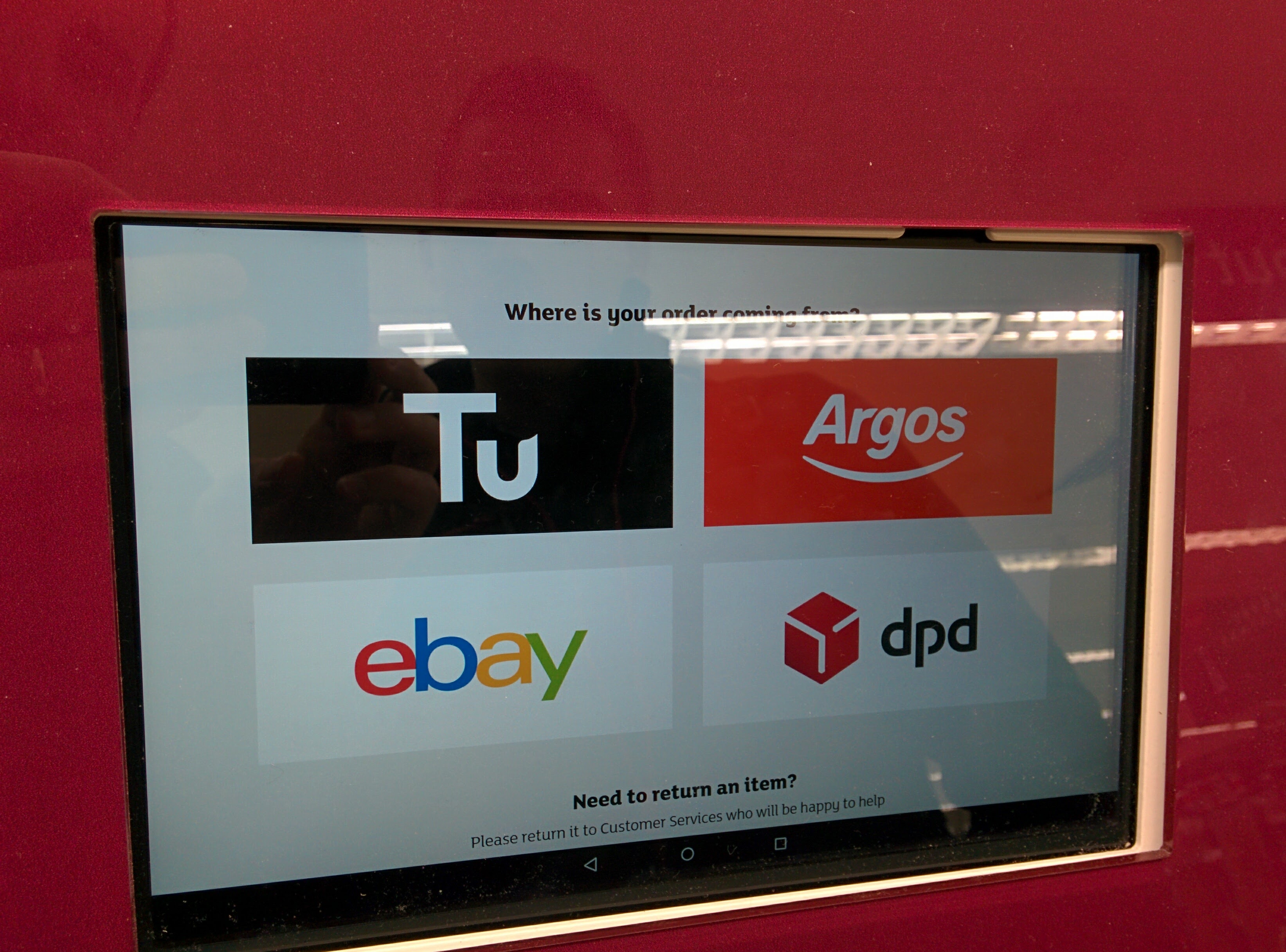
Examples of the existing approach


We soon realised that the opportunities in this journey spanned multiple touchpoints and users.
Customer issues
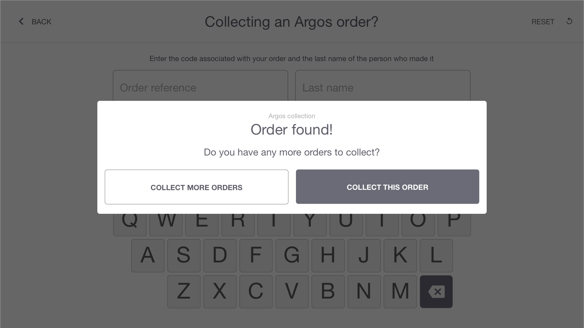
- Customer had to enter varied information depending on fulfilment provider (Tu clothing, Argos, eBay or DPD).
- Interface was at times unresponsive to user input.
- Relied on native keyboard increasing complexity of interface interactions (users could enter emojis as an order reference number etc.).
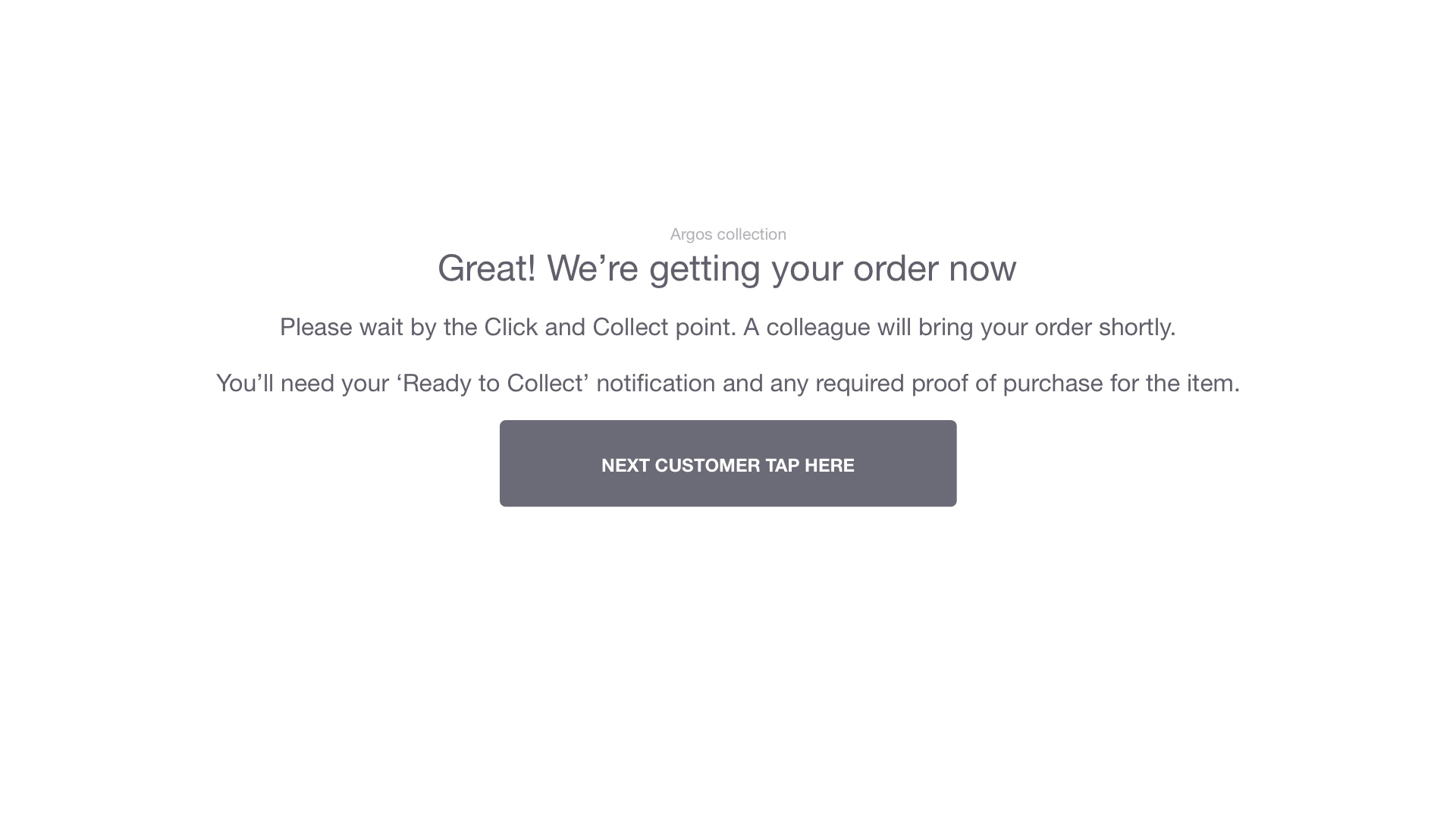
- Customers were left waiting for an undetermined period of time during the parcel picking process.
Staff issues
- Staff had to respond to picking requests across 4 different providers using 3 different mobile devices.
- Interfaces weren't consistenly optimised for mobile screen sizes.
- Interfaces were found to be confusing to staff despite training.
- Time to complete picking process for parcels was unnecesarrily long due to interface complexities.
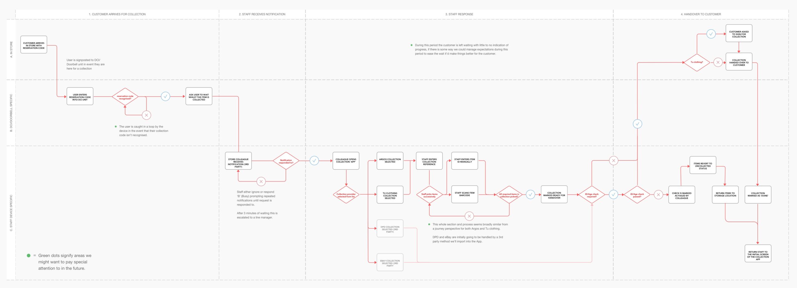
With these points in mind I began to map out an idealised version of the existing flow at the time. A longer term strategic outline was later produced that focused on streamlining the handovers from one part of the process to the next. The main issue being that there were several different types of closed systems involved in this journey that didn't flow neatly from one system to the next. Whilst this wasn't easy to solve in the short term, we began to see how we could strip down the existing interfaces and rebuild them to be better optimised for mobile screens.
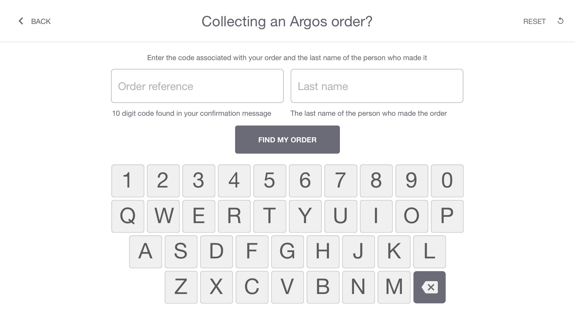
For the first part of the process which involved the customer directly (1B on the map), the four collection methods all require superficially different data to register the customers arrival. Ideally we'd aggregate the disparate approaches into one method focused on the differences in the ‘Order Reference’ field being used to determine the order fulfilment provider (Argos, eBay, DPD etc.).
All orders have a unique reference number associated with them. These codes differ in structure according to their respective handler (Argos, eBay etc.) - it'd be simpler for the user if we can enable the system, rather than the customer to determine who the order is registered with for picking purposes
For other parts of the journey that were more staff centric we had to scale down picking interfaces which were either poorly optimised or not optimised at all for mobile devices. Collaborating with our teams tech-lead I also began to map out other parts of the journey (3C on the map).
We couldn't completely overhaul the journey due to existing restrictions on the system but we could look for opportunities to bring clarity to what was currently an at times overwhelming experience for store staff.

The above is an example of mapping out initial flows we had to accommodate Tu clothing deliveries. In this case 'Parcel Intake'.
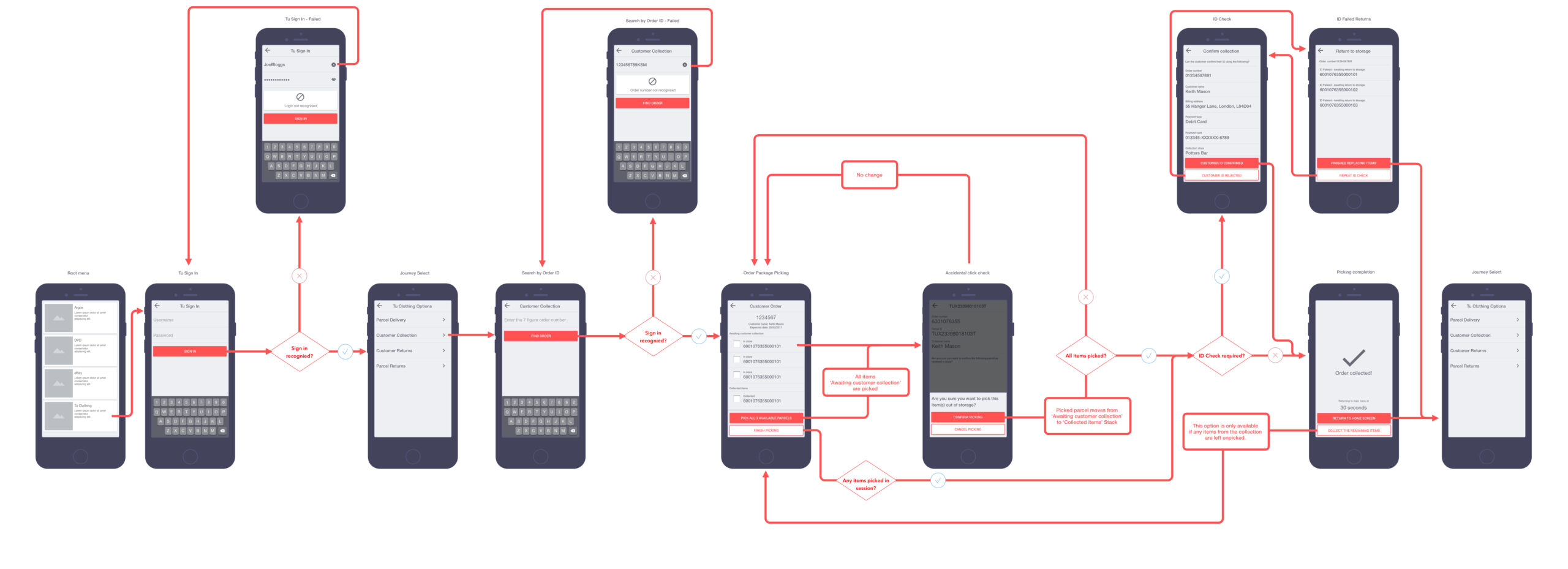
The above is an example of mapping out initial flows we had to accommodate Tu clothing deliveries. In this case 'Customer Collections'.
Given the short term nature of the fix we could afford to break down the experiences in their consitutient parts and treat them as smaller projects on their own. We could also roll-out the changes at different parts of the journey. The quickest being the customer facing portions of the journey (1B on the map) and the more extensive work being the complete overhaul or creation for the first time of mobile interfaces for staff parcel picking (3C on the map).
This was a great project to work on with a journey spanning multiple devices and types of user.
I produced the wireframes, documentation, collaborated directly with the developers and key stakeholders to determine the ideal approach to this project. The user interface design and execution of the brand's visual language was undertaken by a dedicated designer, not myself.
Selected Works
Scaling Newsflare's Video PipelineResearch, Experimentation, Process Mapping, Information Architecture, UI Design

Brand refresh rollout at NewsflareProject Management, Design Systems

Leading growth hacking at NewsflareInterviews, Experimentation, Marketing
Scaling video processing at NewsflareProject Management, Research, Process Mapping

Breaking news content distributionResearch, Journey Mapping, Process Optimisation

Assessing Newsflare's AppResearch, Interviews, Product Assessment, Screen Flows

Redesigning kiosk collectionsResearch, Onsite, Journey Mapping, Process Optimisation
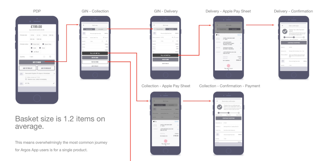
Improving Argos collection ratesScreen Flows, Process Optimisation
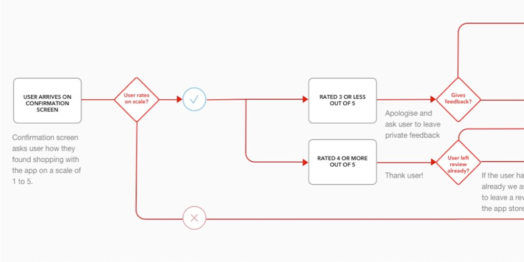
Feedback mechanisms in AppsScreen flows, User Engagement

App navigation at ArgosResearch, Screen Flows

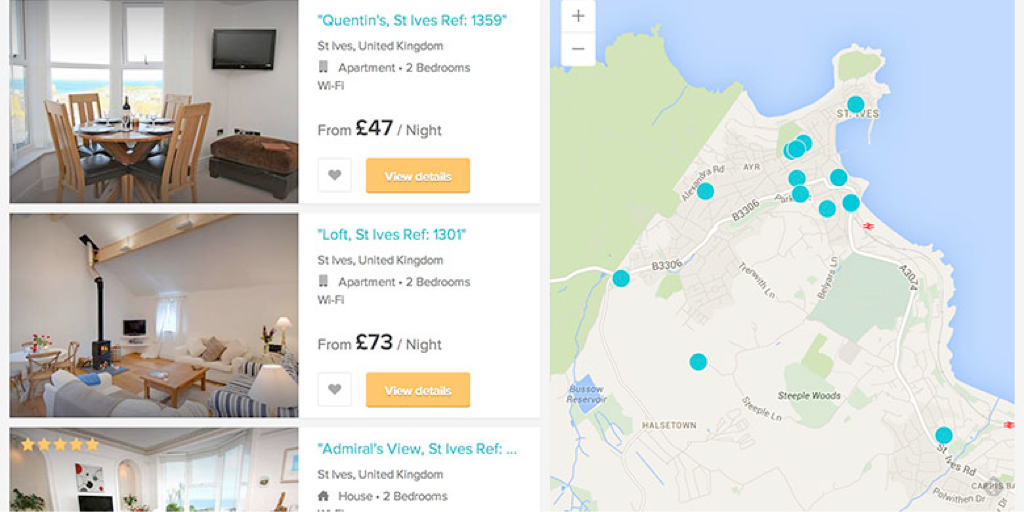
HouseTrip property listing redesignResearch, Information Architecture, Interface Design
Improving search conversion at HouseTripInformation Architecture, Interface Design

HouseTrip checkout reskinInterface Design

HouseTrip Tripmaker conceptConcept Exploration, Interface Design
HouseTrip email-on-enquiryInterface Design
Contact
Email
keith.stewart.mason at gmail dot com
LinkedIn
@iamkeithmason