
I’m Keith, a Product Design Leader interested in building teams, systems, and stories that scale.
Scaled design from craft to strategy, taking teams from delivery partners to executive counterparts shaping product and commercial direction.
Built and mentored senior talent, coaching designers, PMs, CSMs, marketers, and engineers toward evidence-led, growth-oriented, cross-functional collaboration.
Tied user behaviour to business growth, defining strategic and tactical metrics that connected experience outcomes directly to revenue impact.
Systematised design at scale, establishing design ops, research ops, and component libraries that increased speed without sacrificing craft or consistency.
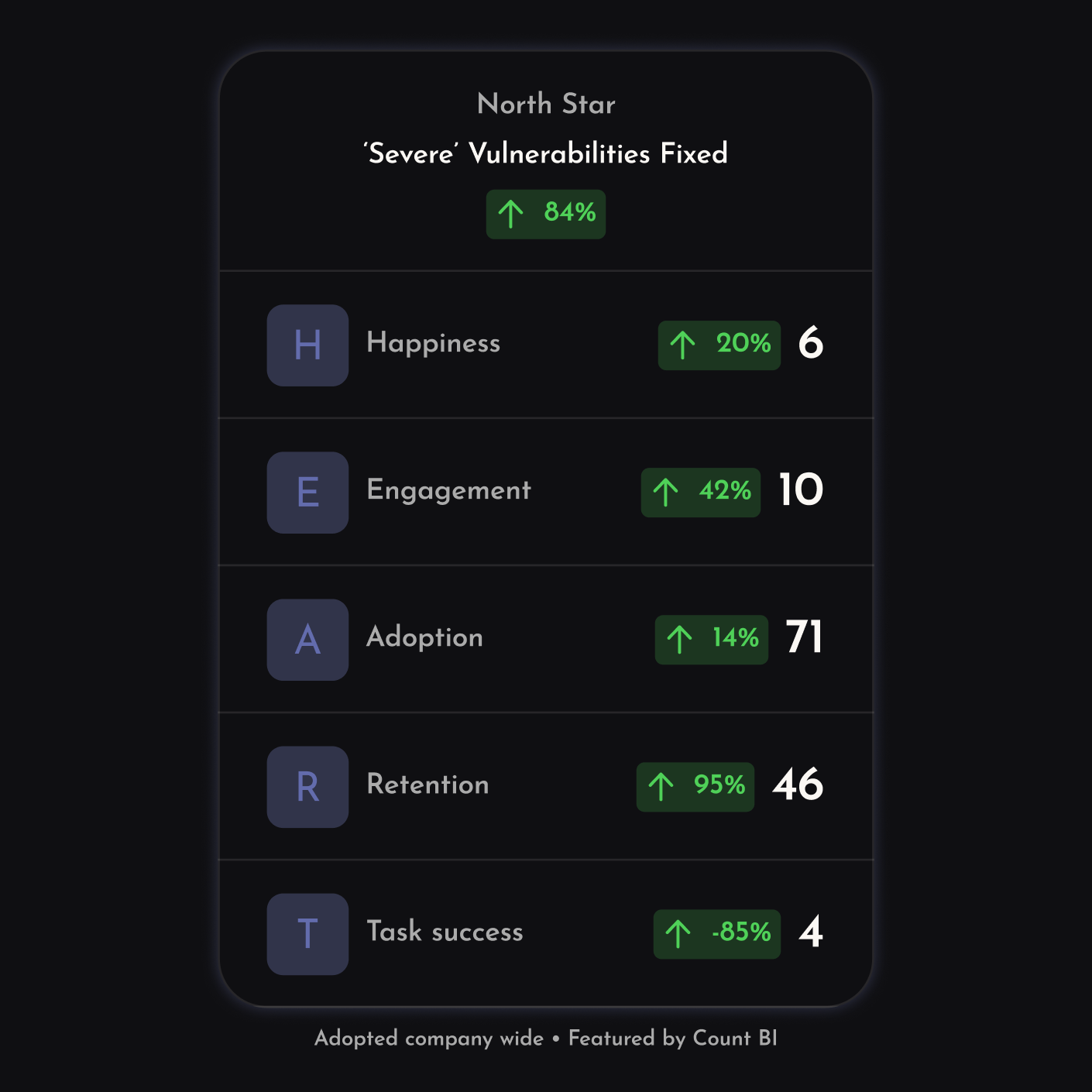
From 21 onboarding steps down to just 1
Outcome: A culture of experimentation, with activation going from ~3.25% to ~9% over 3 months.
User Research
Experimentation
Process Mapping
Building a metrics framework that drives revenue
Outcome: Aligning the product team, and the business, around a customer value driven way of working.
Product Strategy
Metrics Framework Design
Cross-Functional Leadership
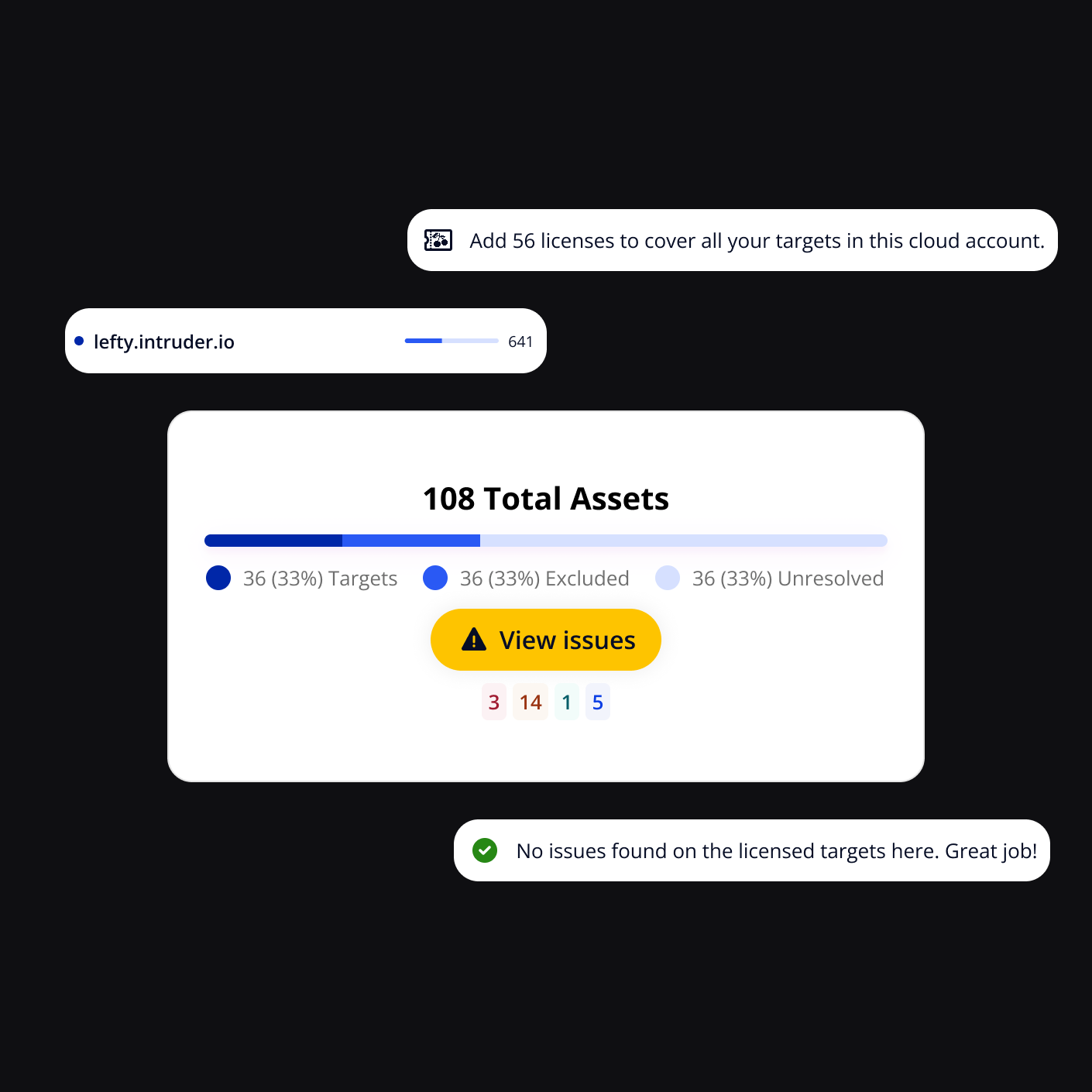
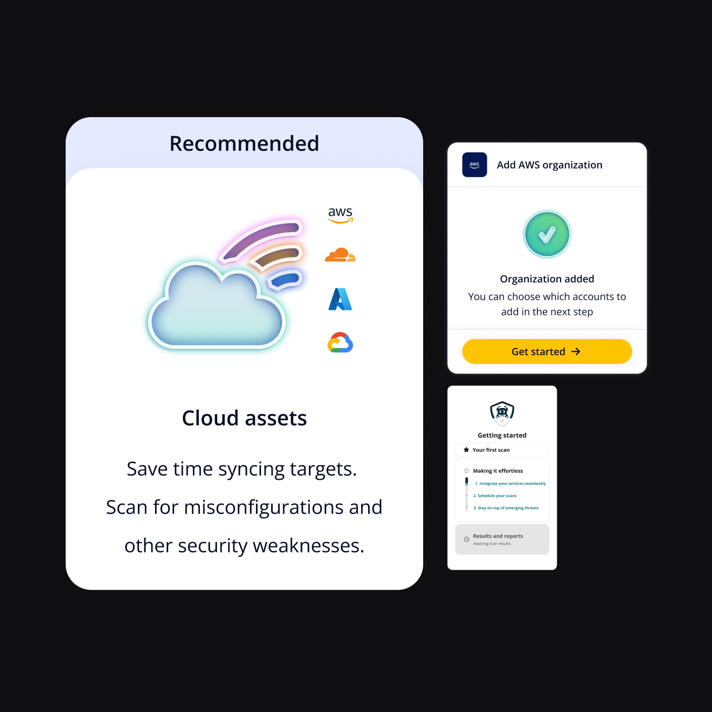
How better asset discovery drove 17x integration adoption
Outcome: >17x the number of Weekly Active Unique Cloud Users (WAUCU)
Strategic UX Leadership
Systems Thinking
Cross-Functional Leadership
Building our own research repository to democratise insights
Outcome: Weekly research by product and design teams to identify and assess high-impact projects.
Strategic User Experience
Research Operations
Systems Design
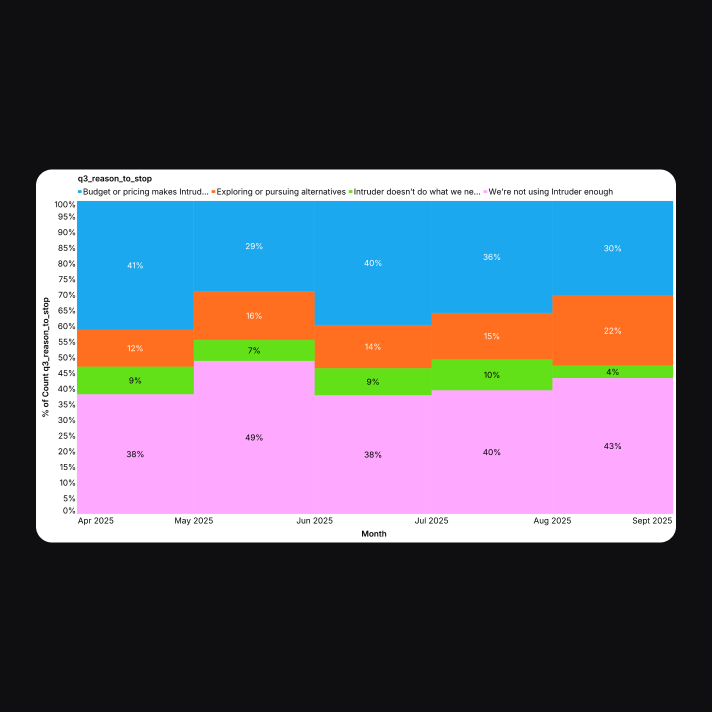
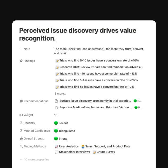
Research to reduce customer churn
Outcome: A culture of experimentation, with activation going from ~3.25% to ~9% over 3 months.
Systems Thinking
Research Synthesis
Market Intelligence
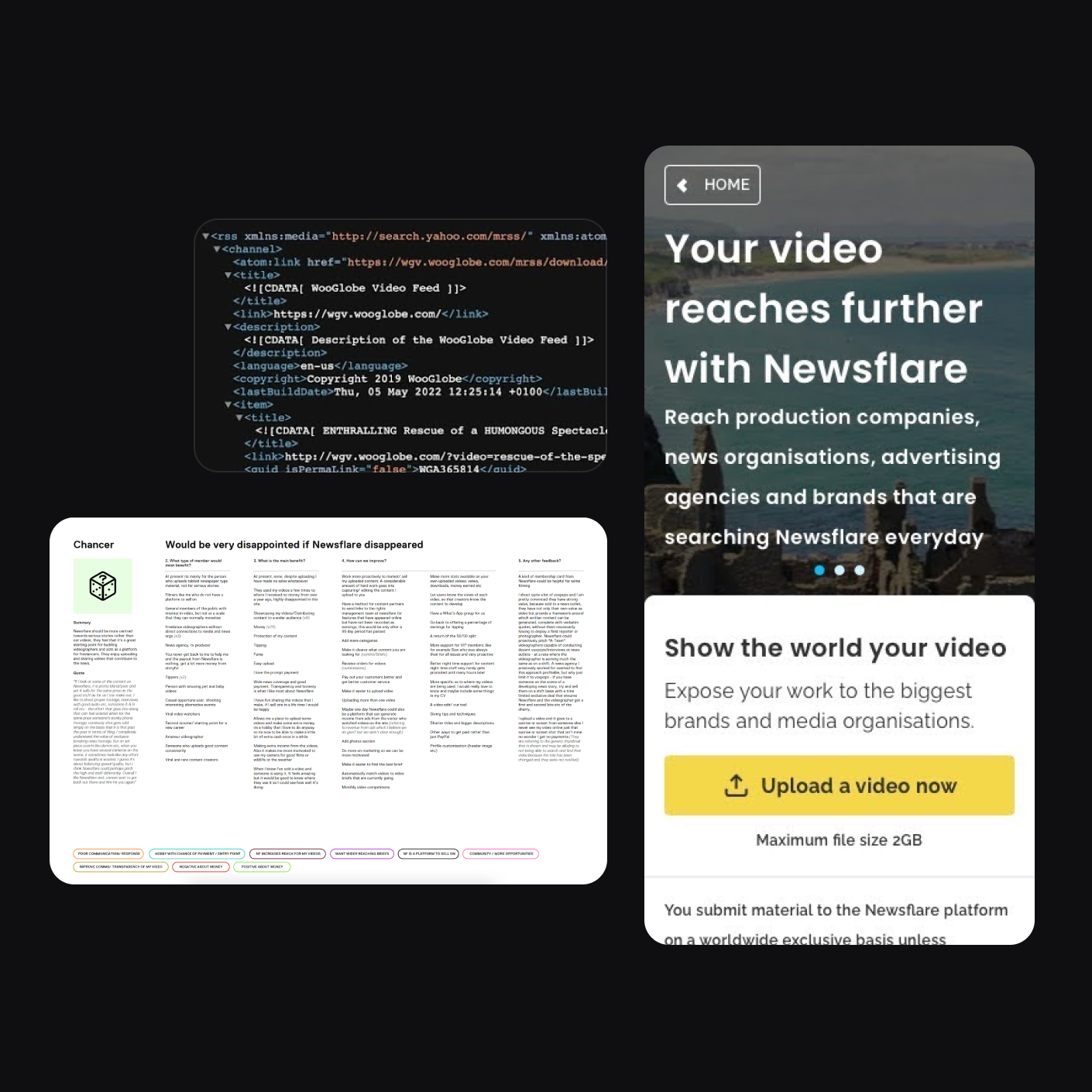
Scaling supply in collaboration with customers at Newsflare
Outcome: Doubled uploads from Content Partners using the redesigned video pipeline
Product Architecture Thinking
Segmented Experience Design
Dual-Track Leadership
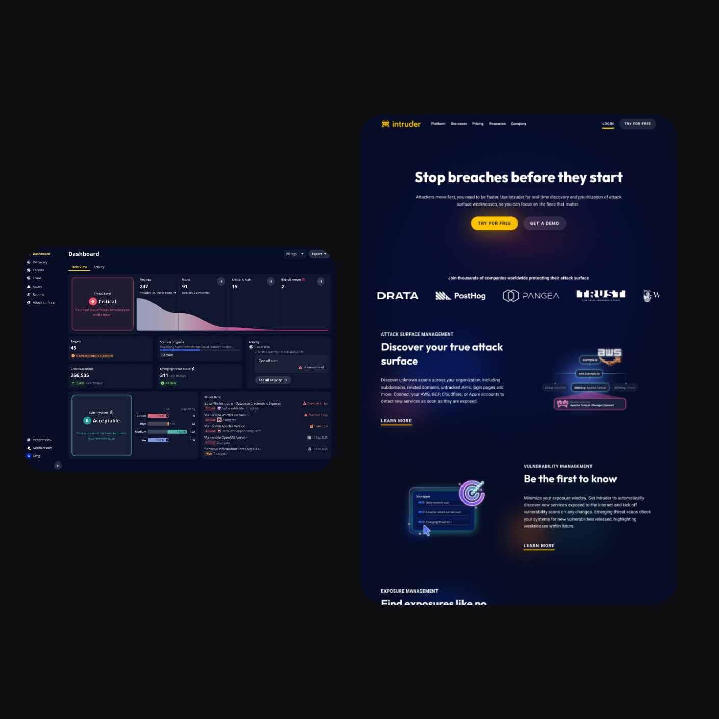
Modernising Intruder's look and feel while creating consistency
Aligning marketing and product under one consistent and tokenised system, reducing design debt to a seamless experience for customers.
Systems Thinking
Design Leadership & Alignment
Creative Direction
Want to chat?
I’m always interested to hear about new opportunities, chances to collaborate,
or even just ideas people are exploring. Let’s connect.
I’m Keith, a Product Design Leader interested in building teams, systems, and stories that scale.
Scaled design from craft to strategy, taking teams from delivery partners to executive counterparts shaping product and commercial direction.
Built and mentored senior talent, coaching designers, PMs, CSMs, marketers, and engineers toward evidence-led, growth-oriented, cross-functional collaboration.
Tied user behaviour to business growth, defining strategic and tactical metrics that connected experience outcomes directly to revenue impact.
Systematised design at scale, establishing design ops, research ops, and component libraries that increased speed without sacrificing craft or consistency.
From 21 onboarding stepsdown to just 1
Introducing a culture of experimentation, with activation going from ~3.25% to ~9% over 3 months.
User Research
Experimentation
Process Mapping
Building a metrics framework that drives revenue
Aligning the product team, and the business, around a customer value driven way of working.
Product Strategy
Metrics Framework Design
Cross-Functional Leadership
How better asset discovery drove 17x integration adoption
Increasing the number of Weekly Active Unique Cloud Users (WAUCU) by 17x
Strategic UX Leadership
Systems Thinking
Cross-Functional Leadership
Research to reduce customer churn
Found ~80% of Churn Survey attributed MRR was linked to customers churning at above benchmark rates, identifying churn as a strategic threat rather than a marginal concern.
Systems Thinking
Research Synthesis
Market Intelligence
Building our own research repository to democratise insights
The rollout of weekly research loops by product and design teams to identify and assess high-impact projects.
Strategic User Experience
Research Operations
Systems Design
Scaling supply in collaboration with customers at Newsflare
Doubled uploads from Content Partners using the redesigned video pipeline
Product Architecture Thinking
Segmented Experience Design
Dual-Track Leadership
Want to chat?
I’m always interested to hear about new opportunities, chances to collaborate,
or even just ideas people are exploring. Let’s connect.
I’m Keith, a Product Design Leader interested in building teams, systems, and stories that scale.
Scaled design from craft to strategy, taking teams from delivery partners to executive counterparts shaping product and commercial direction.
Built and mentored senior talent, coaching designers, PMs, engineers, and others toward evidence-led, growth-oriented, cross-functional collaboration.
Tied user behaviour to business growth, defining strategic and tactical metrics that connected experience outcomes directly to revenue impact.
Systematised design at scale, establishing design ops, research ops, and component libraries that increased speed without sacrificing craft or consistency.
From 21 onboarding stepsdown to just 1
Introducing a culture of experimentation, with activation going from ~3.25% to ~9% over 3 months.
User Research
Experimentation
Process Mapping
Building a metrics framework that drives revenue
I was the first at Intruder to produce a product framework that linked key user behaviours to revenue growth.
Product Strategy
Metrics Framework Design
Cross-Functional Leadership
How better asset discovery drove 17x integration adoption
Increasing the number of Weekly Active Unique Cloud Users (WAUCU) by 17x
Strategic UX Leadership
Systems Thinking
Cross-Functional Leadership
Building our own research repository to democratise insights
The rollout of weekly research loops by product and design teams to identify and assess high-impact projects.
Strategic User Experience
Research Operations
Systems Design
Research to reduce customer churn
Found ~80% of Churn Survey attributed MRR was linked to customers churning at above benchmark rates, identifying churn as a strategic threat rather than a marginal concern.
Systems Thinking
Research Synthesis
Market Intelligence
Scaling supply in collaboration with customers at Newsflare
Increasing uploads from Content Partners by +200% using a new video pipeline that emerged out of close collaboration with customers.
Product Architecture Thinking
Segmented Experience Design
Dual-Track Leadership
Modernising Intruder's look and feel while creating consistency
Aligning marketing and product under one consistent and tokenised system, reducing design debt to a seamless experience for customers.
Systems Thinking
Design Leadership & Alignment
Creative Direction
Want to chat?
I’m always interested to hear about new opportunities, chances to collaborate,
or even just ideas people are exploring. Let’s connect.