I found people wanted to often visit the site several times before making a decision. The trip would be facilitated by one person who collated and shared links with the other individuals going on the trip before making a decision. This exchange of information and decision making was all happening outside of HouseTrip.
Sharing property information and discussing the trip was often done through email or in person but the discussion itself was happening away from HouseTrip. This created a separation between aspects of the customer booking experience and the site which meant there was an increased lead time on the booking and ultimately a chance of the customer failing to complete the booking through HouseTrip.
Airbnb had evidence of previous attempts to help people make bookings based on shortlists.
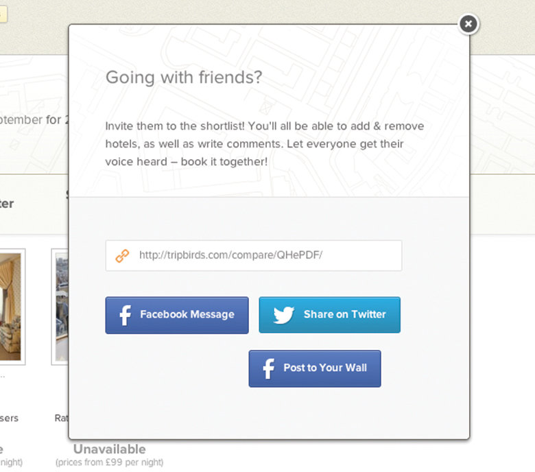
Tripbirds combined the means to compare accommodation facilities and share your findings with others.
I saw that it was important to give people a means to collate shortlists for particular trips in addition to giving customers the ability to share these shortlists with others. By bringing individuals on to HouseTrip to help make these holiday decisions we could streamline the enquiry process and reinforce HouseTrips presence as a holiday brand in the minds of our customers.
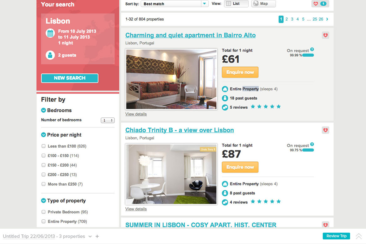
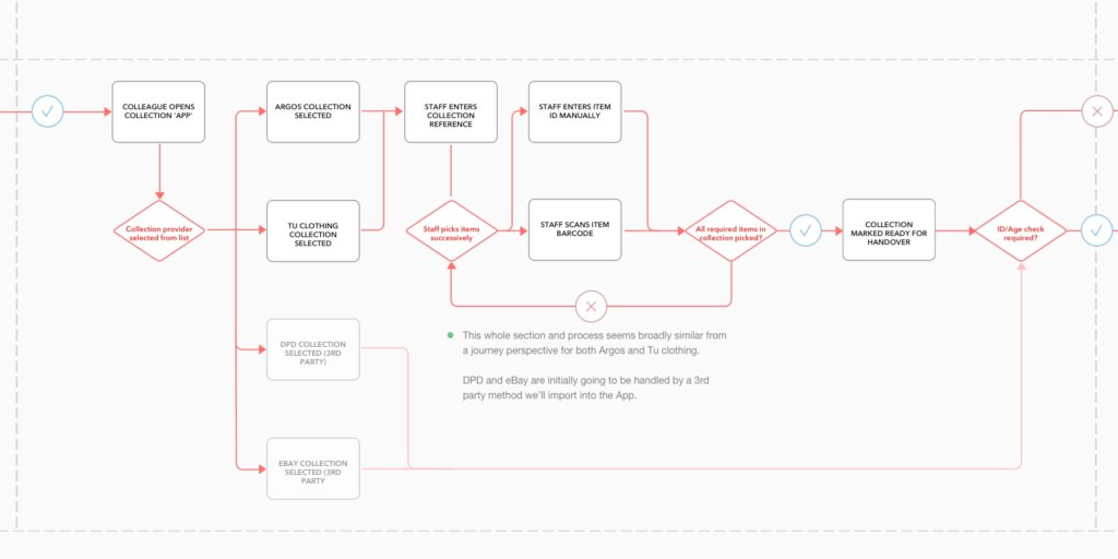
- The shortlist functionality could be persistent up until booking (shown here as a persistent footer)
- Customers could interact with it to have the footer expand as an overlay over the existing page
- Once interacting with the Tripmaker you can see a list of your existing shortlisted properties - people can vote or view in detail previously shortlisted properties
- If they choose to view a property in detail we could load in the property page behind the overlay before minimising it where individuals could proceed to make a booking

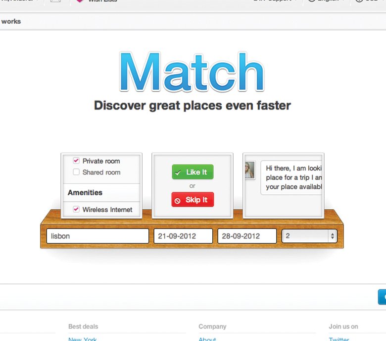
The bar at the bottom of the screen would be people's entry into the shortlisting process.
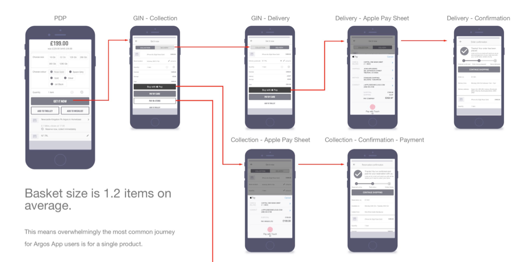
Tripmaker viewing options


The arrows to the left of the property image would be the means by which people could vote on their preference for the property - I felt giving customers the ability to leave a simple 'Yes' or 'No' for the property was the most straightforward way people could add their opinions concerning a property. These votes would accumulate as the party voted to let the popular choices float to the surface.
This could have been extended further to allow people to define high-level requirements for their trip as means of filtering the shortlist down further - it'd naturally follow that you could send multiple enquiries to all the properties you finalise in your shortlist.
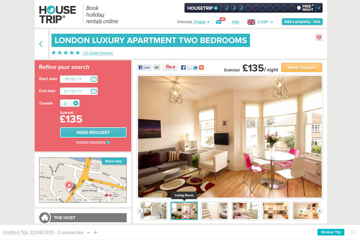
Clicking on a thumbnail image would cause the corresponding property page to load behind the overlay on click before contracting down into the persistent footer. This would leave a user free to view in detail any property page and make a booking or just jump back into the shortlisting process.
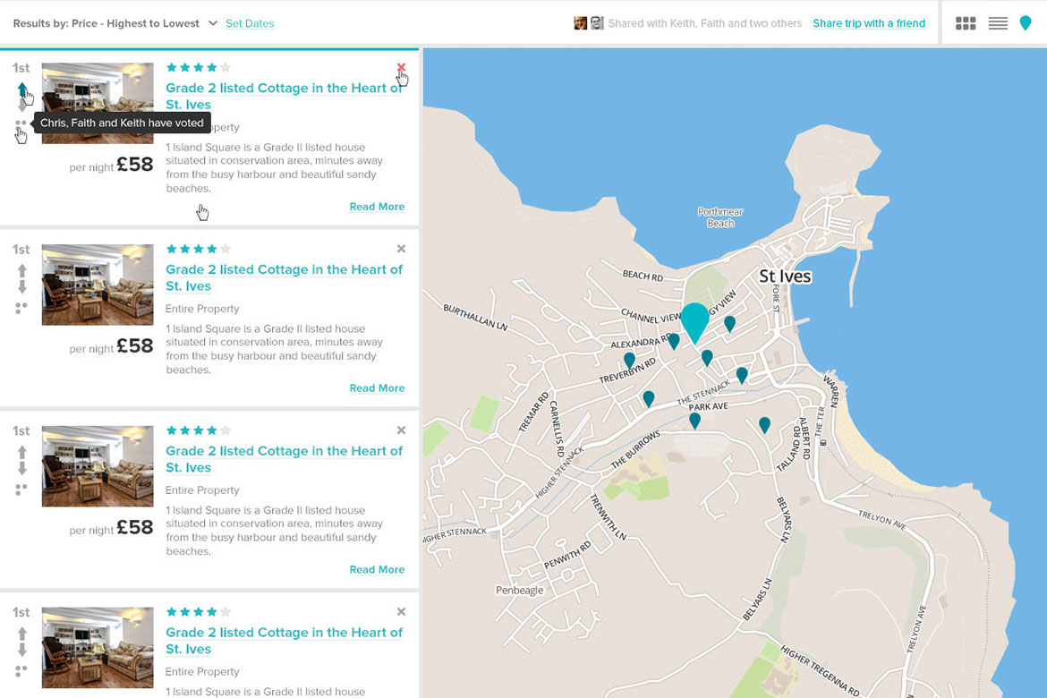
The project was a quick exploration in how we could possibly improve the property selection process for guests. The project could of been pushed further given time but was predominantly visual in nature rather than addressing the nature of the flow itself at the time - despite this it highlighted several issues with the existing flow namely a failure to accomodate the group nature of holiday bookings of this type. We also took several concepts and developed them further (such as the map view) that eventually found their way online.
Selected Works
Scaling Newsflare's Video PipelineResearch, Experimentation, Process Mapping, Information Architecture, UI Design
Brand refresh rollout at NewsflareProject Management, Design Systems

Leading growth hacking at NewsflareInterviews, Experimentation, Marketing
Scaling video processing at NewsflareProject Management, Research, Process Mapping

Breaking news content distributionResearch, Journey Mapping, Process Optimisation

Assessing Newsflare's AppResearch, Interviews, Product Assessment, Screen Flows
Redesigning Sainsbury's click and collectResearch, Onsite, Journey Mapping, Process Optimisation

Redesigning kiosk collectionsResearch, Onsite, Journey Mapping, Process Optimisation
Improving Argos collection ratesScreen Flows, Process Optimisation
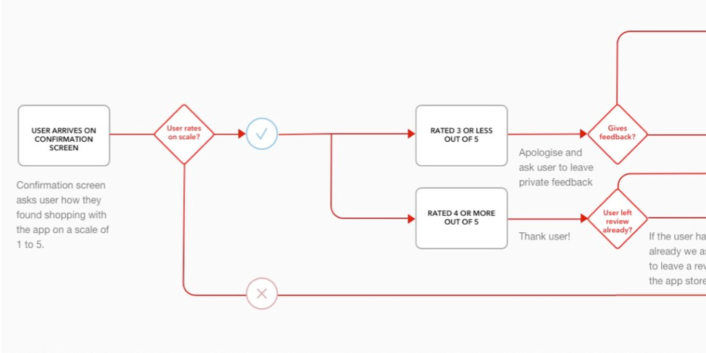
Feedback mechanisms in AppsScreen flows, User Engagement

App navigation at ArgosResearch, Screen Flows

HouseTrip property listing redesignResearch, Information Architecture, Interface Design
Improving search conversion at HouseTripInformation Architecture, Interface Design

HouseTrip checkout reskinInterface Design
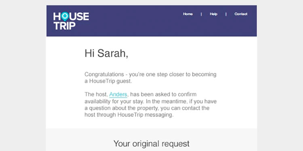
HouseTrip email-on-enquiryInterface Design
Contact
Email
keith.stewart.mason at gmail dot com
LinkedIn
@iamkeithmason